Remove this Banner Ad

Portfolio AFL REDESIGN 2026

🥰 Love BigFooty? Join now for free.

Part 13 - RICHMOND TIGERS

View attachment 2459712

Shorts:
Black for home - Black (maybe yellow?) for clash

Changes:
Home:
  • Basically nothing, just deeper yellow instead of highlighter yellow

Clash
  • Again basically nothing, just deeper yellow instead of highlighter yellow
Additional notes
- Instead of white shorts when in home jumper playing away (For example vs Carlton), wear yellow shorts!
black shorts with clash too!
 
Part 12 - PORT ADELAIDE POWER

View attachment 2459566

Shorts:
Black for home - Teal for clash

Changes:
Home:
  • Change completely to original away jumper
  • Looks so much more interesting and cooler than current I believe

Clash
  • Inverse of home jumper
  • With teal base as the colour is unique and I believe Port should embrace the teal looks so cool
Additional notes
  • I know Port fans are gonna hate this redesign and I am sorry in advance lol.
  • I just really think teal should be embraced as current jumper set and current logo is just so boring
  • For SHOWDOWNS every single one regardless of being home or away, Port wear the Prison Bars with white shorts (to ensure they don't clash with adelaide's home)
Not my ideal by a long shot, but this as Home is definitely more interesting & unique than what we have now. Re the Clash, I reckon too much teal doesn't look great IRL, so a white version might be better
 
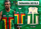
Part 15 - TASMANIA DEVILS

View attachment 2459718

Shorts:
Green for home - Cream for clash

Changes:
Home:
  • Note* THIS IS NOT MY DESIGN CONCEPT I FOUND IT OFF SOMEONE ELSE ON THIS BOARD PLEASE REMIND ME WHO'S CONCEPT THIS IS
  • T design in state colours with green back

Clash
  • Similar to home just cream base
  • And two tone green T
green & cream is such a nice colour combo

god i hope they use it in some capacity
 

Log in to remove this Banner Ad

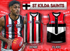
Part 16 - ST KILDA SAINTS

St Kilda Saints puma copy.png

Shorts:
White for home - Black for clash

Changes:
Home:
  • Change Home into candy stripe jumper (one of the best jumpers in the AFL I reckon + iconic with NAS + I think tri panel is boring and doesn't look symmetrical at all)
  • White base home kit now to avoid clash as they clash with normally everyone

Clash
  • Black base clash
  • Bring back iconic crusader jumper
 
Part 2 - BRISBANE LIONS

View attachment 2447010

Shorts:
Maroon for Home + BLUE for Clash

Changes:
Home
  • Change cuffs to blue (I don't mind the yellow either now)
  • Update lion on jumper (Someone please tell me who made this lion! I forgot Thanks)

Away
  • Make a full Fitzroy kit
  • Change Lion to fitzroy monogram
  • Wear blue shorts instead of white

Additional info
- Wear bears kit with maroon shorts in every QClash VS Gold Coast

This is awesome, although there is one glaring oversight with the designs. None of them seem to feature the gold premiers AFL logo which will feature on the Lions guernseys again next season!
 
Costa Sports.

The “Costa Lion” is one of this board’s most famous designs! It got a run in a lot of concepts around here circa the paddle pop lion era.
 
Part 10 - HAWTHORN HAWKS
View attachment 2447538

Shorts:
Brown for home - Brown for clash

Changes:
Home:
  • Remove brown shoulder pads
  • Remove hawthorn logo under Tasmanian sponsor
  • Remove stripes on the back of jumper so it is an all gold back just like it was in their dynasty era

Clash
  • Since home is light and now majority yellow, don't need a yellow clash so clash is a brown base
  • Go to iconic hawk design
  • But tweak that design to have a brown base/back instead of the gold one
love that 90's style clash
 
Note* THIS IS NOT MY DESIGN CONCEPT I FOUND IT OFF SOMEONE ELSE ON THIS BOARD PLEASE REMIND ME WHO'S CONCEPT THIS IS
I would hate to take that credit for what was such a simple design but I believe that would be myself. Really love what you've done with the cream and two-tone green for the Away!
 
Part 4 - COLLINGWOOD MAGPIES

View attachment 2447018

Shorts:
Black for home (sometimes white depending on clash) - Black for clash

Changes:
Home:
  • Go back to white base and black shorts like Collingwood had their entire history before 2000s
  • Get rid of the random collingwood logo above the sponsor

Away:
  • Bring back black base for Clash to be worn in games against teams like Geelong
  • Bring back the Swooping Magpie!

Additional info
  • If Collingwood were to go back to the white base home, this would resolve all clashes in their rivalry games against Carlton, Essendon and Richmond
  • So do it please!
Literally my dream guernsey combination
 
I would hate to take that credit for what was such a simple design but I believe that would be myself. Really love what you've done with the cream and two-tone green for the Away!
Yes thank you so much! I'll edit that post with you're credit now. Absolutely love that Tasmania design you've made
 

Remove this Banner Ad

Remove this Banner Ad

Portfolio AFL REDESIGN 2026

🥰 Love BigFooty? Join now for free.

Back
Top