Navigation
Install the app
How to install the app on iOS
Follow along with the video below to see how to install our site as a web app on your home screen.
Note: This feature may not be available in some browsers.
More options
Style variation

-
Guest - BigFooty Tipping 2026 - Get on! - $500 first prize - Weekly Prizes - Click to Join
PLUS Your club board comp is now up!
-
 BigFooty Tipping Notice Img
Weekly Prize - Join Any Time - Tip Opening Round
The Golden Ticket - Official AFL on-seller of MCG and Marvel Medallion Club tickets and Corporate Box tickets at the Gabba, MCG and Marvel.

You are using an out of date browser. It may not display this or other websites correctly.
You should upgrade or use an alternative browser.
You should upgrade or use an alternative browser.
Workshop Jumper Ideas for 2026
- Thread starter Rubber Arm
- Start date
- Tagged users None
🥰 Love BigFooty? Join now for free.
GenericUsername202
Club Legend
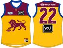
I like it. The trims are the fitzroy blue, the maroon is the original fitzroy maroon and the yellow is the bears.An idea of a Brisbane clash jumper if they moved on from the Fitzroy and Bears gurnsey and just have their home and this.
- Joined
- Oct 27, 2016
- Posts
- 6,135
- Reaction score
- 11,298
- AFL Club
- Collingwood
- Other Teams
- Packers, Raptors, Renegades
I feel like I should hate it but I don't for some reason, would be a cool 'out there' concept for Gather RoundAn idea of a Brisbane clash jumper if they moved on from the Fitzroy and Bears gurnsey and just have their home and this.
memes_about_carlton
Flaggers 2025
Just make the switch to pink next year please.....
Jumper I made with a two tone pink like the home, (but the two tones are actually DIFFERENT enough to see the emblem...)

Jumper I made with a two tone pink like the home, (but the two tones are actually DIFFERENT enough to see the emblem...)
Log in to remove this Banner Ad
- Joined
- Mar 30, 2014
- Posts
- 3,045
- Reaction score
- 5,231
- AFL Club
- Brisbane Lions

- Other Teams
- Dolphins, Seattle Kraken
The blue really doesn't work as a cuffI feel like I should hate it but I don't for some reason, would be a cool 'out there' concept for Gather Round
- Joined
- Jul 4, 2012
- Posts
- 6,072
- Reaction score
- 10,218
- Location
- County Grant
- AFL Club
- Geelong
- Other Teams
- Toronto Blue Jays
Here's my 'Go West' jumper for the Eagles for Gather Round or possibly WA Day.

GC definitely should be using blue with their pink jumper rather than charcoal as it's supposedly one of their colours but then I reckon they should be using yellow for their logo instead of two-tone red on home 
- Joined
- Apr 18, 2005
- Posts
- 35,054
- Reaction score
- 31,846
- AFL Club
- Melbourne
This is elite. Could you do it so the top is joined like a T?And Tasmania
View attachment 2272868
- Joined
- Apr 18, 2005
- Posts
- 35,054
- Reaction score
- 31,846
- AFL Club
- Melbourne
Love it!An idea for a VCFL themed Country Game jumper for Geelong.
View attachment 2288365
Swap white for navy?
Here's my 'Go West' jumper for the Eagles for Gather Round or possibly WA Day.
View attachment 2418522
You forgot the hats

- Joined
- Jul 4, 2012
- Posts
- 6,072
- Reaction score
- 10,218
- Location
- County Grant
- AFL Club
- Geelong
- Other Teams
- Toronto Blue Jays
Could certainly do that. Went with the white base to reflect the Vic Country jumper.Love it!
Swap white for navy?


I love it, but I feel like the blue should be darker?Nothing original, just using the current designs with their pink and blue.
View attachment 2421393
View attachment 2421392
Don’t hate it but would prefer if they leaned into the lighter shaded “Miami Vice” baby blue like the Miami Heat did. I actually quite like the pink & charcoal scheme though.Nothing original, just using the current designs with their pink and blue.
View attachment 2421393
View attachment 2421392
Surely the suns adopt the pink full time? It is so, so popular.
Saucy
Debutant
- Joined
- Sep 25, 2016
- Posts
- 139
- Reaction score
- 234
- AFL Club
- Essendon
Nothing original, just using the current designs with their pink and blue.
View attachment 2421393
View attachment 2421392
Attachments


GenericUsername202
Club Legend

Gold Coast should be going all in the miami vibe. Even more relevant considering Miami is also a catchment on the coast.
Would love to see a mockup of their current pink but the charcoal replaced with the baby blue
Gold Coast should be going all in the miami vibe. Even more relevant considering Miami is also a catchment on the coast.
- Joined
- Apr 9, 2015
- Posts
- 1,360
- Reaction score
- 3,924
- AFL Club
- Carlton
- Other Teams
- Melbourne City FC, Southampton FC
They’ve done some pink and blue merch this year so it must be on their radar as an optionWould love to see a mockup of their current pink but the charcoal replaced with the baby blue

🥰 Love BigFooty? Join now for free.
I honestly think the pink is best kept in small doses, I like the idea of it being a true alternate jumper with no specific use. It feels similar to NBA with the their set up.
GenericUsername202
Club Legend
It gives The suns an identity though. Their current colours are generic and their kits aren't even good to look at. If you have a white, pink and a teal blue going, you'll get a lot of people on board. Just from how cool that colour scheme is alone.I honestly think the pink is best kept in small doses, I like the idea of it being a true alternate jumper with no specific use. It feels similar to NBA with the their set up.
- Joined
- Jun 23, 2021
- Posts
- 2,830
- Reaction score
- 3,161
- AFL Club
- Melbourne
- Other Teams
- LA dodgers LA Kings Melbourne Aces
Yes, it should be like the Giants Never Surrender jumperI honestly think the pink is best kept in small doses, I like the idea of it being a true alternate jumper with no specific use. It feels similar to NBA with the their set up.
On the flip side of this, the New Zealand Breakers rebranded to pink and blue and they look horrendous.It gives The suns an identity though. Their current colours are generic and their kits aren't even good to look at. If you have a white, pink and a teal blue going, you'll get a lot of people on board. Just from how cool that colour scheme is alone.
Agree with thisI honestly think the pink is best kept in small doses, I like the idea of it being a true alternate jumper with no specific use. It feels similar to NBA with the their set up.
I thought the pink kit looked great in gather round, everytime I’ve seen it since, I’ve liked it less and less.
jumperfan
Club Legend
- Joined
- Nov 17, 2023
- Posts
- 2,561
- Reaction score
- 5,241
- AFL Club
- St Kilda
- Other Teams
- Footy
Pink as a colour for them is great but the design of the guernsey itself is still terrible. Lipstick on a pig.Agree with this
I thought the pink kit looked great in gather round, everytime I’ve seen it since, I’ve liked it less and less.
Similar threads


- Replies
- 51
- Views
- 3K