Remove this Banner Ad

News New Jumpers for 2026

🥰 Love BigFooty? Join now for free.

Those jumpers were putrid. Grey is literally so uninspiring.

We have a colour in our pallette that literally clashes with absolutely no one (Teal).
In my opinion the grey guernsey sucked because the AFL forces clubs to use white shorts. It would have looked elite with grey shorts
 
I love how people on hear complained because the clubs were going too weird with jumper designs, and now its boring.

For me boring is good, remember that their away/clash jumper designs may have to be used on Grand final day.

Leave pre season and gather round for the out there designs, and keep the classic designs for home and away coming along!!!!
 
Port to me has one of the best kit sets going around.

The home is great and im a huge fan of the white inverse as a principle for a clash jumper and theirs lends itself nicely to that, as does Freos.

I see this as a bit of if it aint broke noting i hope they do some wild shit for gather round etc.

If you baseline model is solid home/clash that you like to wear, we get weird with the specific round jumpers i reckon thats good work.
 

Log in to remove this Banner Ad

Port to me has one of the best kit sets going around.

The home is great and im a huge fan of the white inverse as a principle for a clash jumper and theirs lends itself nicely to that, as does Freos.

I see this as a bit of if it aint broke noting i hope they do some wild shit for gather round etc.

If you baseline model is solid home/clash that you like to wear, we get weird with the specific round jumpers i reckon thats good work.
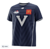
It looked better in 2021 with the joined V being bigger, they made it worse splitting the Vs apart and making it smaller. I usually don't like colourless guernseys, but their colourless clash is really appealing to me for some reason.
 
Assuming new shorts sponsor for us, Keri Juice Co?

View attachment 2495737
Don't know how I feel about this. The dangers of excessive juice consumption are widely known, and the impact it can have on families is devastating. Wish we would go back to innocent and harmless alcohol.
 
I love how people on hear complained because the clubs were going too weird with jumper designs, and now its boring.

For me boring is good, remember that their away/clash jumper designs may have to be used on Grand final day.

Leave pre season and gather round for the out there designs, and keep the classic designs for home and away coming along!!!!
an immediate ban on 'cartoon' jumpers* used during regular/finals season .... all home, away and clash jumpers must confine their design to a strictly enforced template that respects history/heritage

well beyond time afl starts laying down some design rules ... and enforcing them

* if [and thats a big 'if'] 'cartoon' jumpers must be used - then limit that to preseason/training
 
Don't know how I feel about this. The dangers of excessive juice consumption are widely known, and the impact it can have on families is devastating. Wish we would go back to innocent and harmless alcohol.
XXXX is basically water, mate. Probably ml for ml, better for you than juice.
 

Remove this Banner Ad

I feel like New Balance deserves more criticism. They have legit used the same template for Brisbane year in, year out. It comes off uninspired, cheap and lazy
Melbourne have had the same template for 10 years.
 
I feel like New Balance deserves more criticism. They have legit used the same template for Brisbane year in, year out. It comes off uninspired, cheap and lazy
Been trying to tell people this for years New Balance is trash but no one wants to listen
 
Last edited:

🥰 Love BigFooty? Join now for free.

an immediate ban on 'cartoon' jumpers* used during regular/finals season .... all home, away and clash jumpers must confine their design to a strictly enforced template that respects history/heritage

well beyond time afl starts laying down some design rules ... and enforcing them

* if [and thats a big 'if'] 'cartoon' jumpers must be used - then limit that to preseason/training
define "cartoon"
 
 
I feel like New Balance deserves more criticism. They have legit used the same template for Brisbane year in, year out. It comes off uninspired, cheap and lazy
Interesting take, I would argue the opposite. I think it's a clean template that doesn't need altering and its proven the test of time. Minor tweak would be fixing the small numbers and don't get me wrong I am all for rebranding to refresh when needed (hello Essendon), but the template itself is solid and reinventing the wheel for the sake of it especially for a manufacturer seems expensive and impractical in my opinion.
 

Remove this Banner Ad

Remove this Banner Ad

🥰 Love BigFooty? Join now for free.

Back
Top