Navigation
Install the app
How to install the app on iOS
Follow along with the video below to see how to install our site as a web app on your home screen.
Note: This feature may not be available in some browsers.
More options
-
Mobile App Discontinued
Due to a number of factors, support for the current BigFooty mobile app has been discontinued. Your BigFooty login will no longer work on the Tapatalk or the BigFooty App - which is based on Tapatalk.
Apologies for any inconvenience. We will try to find a replacement.
You are using an out of date browser. It may not display this or other websites correctly.
You should upgrade or use an alternative browser.
You should upgrade or use an alternative browser.
Let's talk Ports! Part 3
- Thread starter bomberclifford
- Start date
- Tagged users None
🥰 Love BigFooty? Join now for free.
Partland Power aPparelWe have a Warren Partland collar V
Log in to remove this Banner Ad
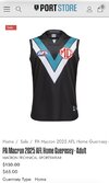
Does anyone actually like the white away strip?
I’m struggling to work out who it appeals to and why it’s better than silver or teal.
But **** the chevrons completely for the clash strip. Or even something like that stealth guernsey we never wore for some reason.
Just do something. Our range is so vanilla.
I’m struggling to work out who it appeals to and why it’s better than silver or teal.
But **** the chevrons completely for the clash strip. Or even something like that stealth guernsey we never wore for some reason.
Just do something. Our range is so vanilla.
Last edited:
There's more than the two main ones.What was Rozee on about with the sneaky peak at the new skins. What a let down. Golden opportunity to provide something fresh. I would've settled for the teal clash the aflw girls were wearing at this point
Always is a few janky efforts to wheel out through the year
Schulzenfest
TheBrownDog
White clash strip is infinitely better than the 'silver' one which just comes out looking like bland dreary grey.
Doctor Feel
Shitposter In Chief
That one gives me hinkleyball nightmares. It was actually the perfect reflection of our football.White clash strip is infinitely better than the 'silver' one which just comes out looking like bland dreary grey.
- Aug 21, 2007
- 34,607
- 118,567
- AFL Club
- Port Adelaide
- Other Teams
- Aston Villa, San Antonio Spurs
Does anyone actually like the white away strip?
I’m struggling to work out who it appeals to and why it’s better than silver or teal.
But **** the chevrons completely for the clash strip. Or even something like that stealth guernsey we never wore for some reason.
Just doing something. Our range is so vanilla.
Great point but also about the black home strip.
The failure chevrons are generic af, the perfect David Koch everyone's second favourite club guernsey, and we have a terrible history with them.
- Moderator
- #9,636
Does anyone actually like the white away strip?
I’m struggling to work out who it appeals to and why it’s better than silver or teal.
But **** the chevrons completely for the clash strip. Or even something like that stealth guernsey we never wore for some reason.
Just doing something. Our range is so vanilla.
It's not just us to be fair, it's an industry wide trend to be boring and safe.
There's not even any reason why your clash guernsey needs to use your nominated colours. The SUNS are the only ones to have worked this out, probably because they aren't slaves to 'tradition'.
Time for the magenta bars away stripGreat point but also about the black home strip.
The failure chevrons are generic af, the perfect David Koch everyone's second favourite club guernsey, and we have a terrible history with them.
(refer to daveyjoneslockerroom fred)
Still not keen on the little separation between the chevrons.
I don't buy into "failure guernseys" & what not just win shit and make them successful, Richmond won stuff all for a gazillion years should they have ditched the sash?
I don't buy into "failure guernseys" & what not just win shit and make them successful, Richmond won stuff all for a gazillion years should they have ditched the sash?
bomberclifford
Importer/Exporter
- Thread starter
- #9,640
Still not keen on the little separation between the chevrons.
I don't buy into "failure guernseys" & what not just win shit and make them successful, Richmond won stuff all for a gazillion years should they have ditched the sash?
They should have rebranded to the Tamil Tigers.
I don't mind having a basic/generic home guernsey. Most in the comp are, and they seem to stand the test of time but the away/clash kits is where we should be showing some flair and not just the home guernsey in white.Great point but also about the black home strip.
The failure chevrons are generic af, the perfect David Koch everyone's second favourite club guernsey, and we have a terrible history with them.
I agree with this.Great point but also about the black home strip.
The failure chevrons are generic af, the perfect David Koch everyone's second favourite club guernsey, and we have a terrible history with them.
But I also think most of the AFL have generic gurnseys which are often labelled as “iconic”.
Adelaide, Collingwood, Geelong, north, Essendon, Richmond, hawthorn, and Melbourne all have extremely boring home strips.
There seems to be a mentaility that any flair in a design is bad.
Schulzenfest
TheBrownDog
- Aug 21, 2007
- 34,607
- 118,567
- AFL Club
- Port Adelaide
- Other Teams
- Aston Villa, San Antonio Spurs
It's not just us to be fair, it's an industry wide trend to be boring and safe.
There's not even any reason why your clash guernsey needs to use your nominated colours. The SUNS are the only ones to have worked this out, probably because they aren't slaves to 'tradition'.
And oddly, we're slaves to "tradition" with our away guernsey design being a colour swapped home despite the guernsey not being in any way traditional to Port Adelaide.
🥰 Love BigFooty? Join now for free.
- Aug 21, 2007
- 34,607
- 118,567
- AFL Club
- Port Adelaide
- Other Teams
- Aston Villa, San Antonio Spurs
I don't mind having a basic/generic home guernsey. Most in the comp are, and they seem to stand the test of time but the away/clash kits is where we should be showing some flair and not just the home guernsey in white.
Basic is fine. Generic is not. I just want to look at it and feel like it's a Port guernsey, which, if we'd won anything over the last 15 years I might regardless, but we haven't. The emotional connection to the SBS guernsey is so much higher because I watched Warren Tredrea win 4 AA guernseys and then lift the Premiership Cup wearing it.
The failure chevrons are a symbol of our descent into the Southern Power. We don't win finals. We eschew the culture that made our club great. We hate accountability. We wear an ode-to-genericism guernsey designed by a 9 year old kid. We're trying to be everyone's second favourite team. We made the community proud. We marginalise club greats who ask for us to have some respect for the history of the club.
- Jul 26, 2020
- 13,967
- 38,452
- AFL Club
- Port Adelaide
- Aug 21, 2007
- 34,607
- 118,567
- AFL Club
- Port Adelaide
- Other Teams
- Aston Villa, San Antonio Spurs
I agree with this.
But I also think most of the AFL have generic gurnseys which are often labelled as “iconic”.
Adelaide, Collingwood, Geelong, north, Essendon, Richmond, hawthorn, and Melbourne all have extremely boring home strips.
There seems to be a mentaility that any flair in a design is bad.
Basic is fine, the league aesthetic is traditional because most of the clubs are 100+ years old. Tradition trumps design.
Look at St Kilda moving from the incredible crusader guernsey back to their traditional tripanel because it felt more like St Kilda to them. While it was a shame for me personally to lose a great guernsey from the league, that was St Kilda embracing tradition.
What we've done though is adopt a traditional looking footy design that has no connection to us at all. It doesn't feel like a Port guernsey, it feels like a footy guernsey in Port colours. So we're just sort of cosplaying a fake tradition that doesn't exist instead of actually utilising our traditions, and that's made worse by the fact that we're one of the most storied, traditional clubs in the league.
At a time where a lot of longterm supporters are wondering where the club they loved went, this just makes things worse. It's the shift to the Southern Power in all but name. We're just customers supporting David Koch's generic franchise.
Time to scrap the chevrons and adopt the prison bars again, even if we can't have them in the traditional black and white. The design is unique to us and will be immediately recognisable as a Port guernsey even in alternate colours. Black and teal is fine by me, it's not black and white but it's better than the current setup. Alternatively, go back to the SBS guernsey. We at least built some tradition in that over the short time that we wore it.
- Aug 21, 2007
- 34,607
- 118,567
- AFL Club
- Port Adelaide
- Other Teams
- Aston Villa, San Antonio Spurs
This is much, much better than our current home guernsey. At least some thought went into it with the "magpie wing" design. It's not generic, it's specific to us. I'd be very happy with that change.
- Aug 21, 2007
- 34,607
- 118,567
- AFL Club
- Port Adelaide
- Other Teams
- Aston Villa, San Antonio Spurs
The SBS range are all far ken horrendous I wouldn't let scorch within a thousand miles of guernsey design.
A horrendous Port guernsey is better than generic Southern Power chevrons
Similar threads
- Replies
- 4K
- Views
- 176K
- Replies
- 4K
- Views
- 123K
- Replies
- 1K
- Views
- 74K


