Portfolio AFL Colour Rush - A Folio By Zoops

Remove this Banner Ad

Apr 20, 2017
1,406
5,414
AFL Club
Melbourne
Other Teams
Vancouver Canucks, Southampton FC
Colour Rush Header 1.png

75 ~ 25

In 1975 colour television was standardised throughout Australia and footy was no longer black and white. The VFL heeded this change as clubs did away with the black and white shorts, and others overhauled their guernseys. 2025 will mark fifty years since Australian Football embraced the change colour television brought and over the years clubs have further experimented with their guernseys, creating iconic and maligned designs along the way. Amongst the wave of more clubs jumping on the retro guernsey bandwagon each year, all 18 clubs will be adorned with a Colour Rush guernsey.

The AFL Colour Rush grants clubs the opportunity to reimagine their history of guernseys altogether and simultaneously create something both contemporary and unique. The under-utilised colours in a club's palette are set to be emphasised as each of the 18 teams will reimagine their design in the name of 1975 and the years since which have given us the likes of the Bounding Roo and the Crusader.

This Is The AFL Colour Rush - A Folio By Zoops
 
Last edited:
Ohhh boy we’re in for another great one, very excited to see this as I hadn’t realised it’s almost 50 years since colour TV came in. You’ve got a big set of shoes to fill after the Reverse Retro portfolio, and hopefully we’ll see another club want to use a design from you!
 

Log in to remove this ad.

Adelaide-Presentation-3.png
Adelaide
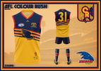
Turn on some turn-of-the-century Coldplay and simultaneously reminisce about the 1999-2005 Crows away guernsey. This guernsey on the other hand is all yellow with the intent to turn into something beautiful. With the rebirth of appreciation for the original Crows logo, this guernsey takes that on board by serving as a contemporary take on the aforementioned away guernsey and also retains their iconic blue yoke and tri-coloured hoops. With a navy blue home guernsey, recent arrays of red when playing away and a darker guernsey for Gather Round, this yellow Colour Rush guernsey rounds out a set of jumpers for The Pride of South Australia.
 
Last edited:
View attachment 1920245
Adelaide
Turn on some turn-of-the-century Coldplay and simultaneously reminisce about the 1999-2005 Crows away guernsey. This guernsey on the other hand is all yellow with the intent to turn into something beautiful. With the rebirth of appreciation for the original Crows logo, this guernsey takes that on board by serving as a contemporary take on the aforementioned away guernsey and also retains their iconic blue yoke and tri-coloured hoops. With a navy blue home guernsey, recent arrays of red when playing away and a darker guernsey for Gather Round, this yellow Colour Rush guernsey rounds out a set of jumpers for The Pride of South Australia.
Looks fantastic, eager to see the rest!
 
View attachment 1920245
Adelaide
Turn on some turn-of-the-century Coldplay and simultaneously reminisce about the 1999-2005 Crows away guernsey. This guernsey on the other hand is all yellow with the intent to turn into something beautiful. With the rebirth of appreciation for the original Crows logo, this guernsey takes that on board by serving as a contemporary take on the aforementioned away guernsey and also retains their iconic blue yoke and tri-coloured hoops. With a navy blue home guernsey, recent arrays of red when playing away and a darker guernsey for Gather Round, this yellow Colour Rush guernsey rounds out a set of jumpers for The Pride of South Australia.
you just don't miss with the crows' designs. the club may want to talk I see this folio getting big eyes on it, come on dees we want a red kit or something different
 
Brisbane-Presentation-2.png
Brisbane
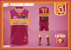
If you are a Queenslander then sing along with me! Brisbane's Colour Rush guernsey reinforces maroon as Queensland's colour. Inspired by the two guernseys worn by the Bears with the original emblem coupled with the addition of white and script motif this serves as the ode to the 1990s. Above the yoke are touches of a lighter shade of maroon more fondly known as cerise. The Lions emblem remains on the front of the guernsey, coupled with a map of Queensland to emphasise the Lions as Queensland's premier team.​
 
View attachment 1920676
Brisbane
If you are a Queenslander then sing along with me! Brisbane's Colour Rush guernsey reinforces maroon as Queensland's colour. Inspired by the two guernseys worn by the Bears with the original emblem coupled with the addition of white and script motif this serves as the ode to the 1990s. Above the yoke are touches of a lighter shade of maroon more fondly known as cerise. The Lions emblem remains on the front of the guernsey, coupled with a map of Queensland to emphasise the Lions as Queensland's premier team.​
this is nice
 
Carlton-Presentation-5.png
Carlton
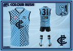
It is only fitting a team known as the Blues ought to embrace all its aspects, not just the simple view of navy with a hint of white. Here, white is eliminated and the blues don a completely blue guernsey covered in Carlton, literally. A simple quarters guernsey idea is fleshed out with a unique pattern of the iconic monogram dividing the guernsey into navy blue and a lighter shade once associated with a confectionary. Unlike Sturt, this jumper whilst not navy blue, aims to be uniquely Carlton. In doing so, it is befitting for a little guy who lives in a blue world where all day and all night, everything he sees is just blue.​
 

(Log in to remove this ad.)

Collingwood-Presentation-2.png
Collingwood
1, 2, 3, 4, the Neo Swooper is here for more. The 1927, '28, '29 and '30 Collingwood 4-peat of premierships is a record that has stood the test of time. This record is arguably why their 1958 miracle triumph over Melbourne was so profound. On this occasion, both the modern and historic combine as the Pies Colour Rush guernsey features the contemporary 'Swooping Magpie' emblem as well as the traditional fencepost magpie alongside four distinct stripes as a nod to the only four-peat in VFL/AFL history. Although, Collingwood has collected sixteen premierships and these aren't overlooked. Above the swooper, there are sixteen stars, commemorating each premiership. The four in gold acknowledge the four-peat meanwhile the others round out Collingwood's trophy cabinet. Who knows, maybe in time for 2025 another star may need to be added too?​
 
Last edited:
Essendon-Presentation-5.png
Essendon
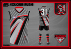
By far the most radical departure from the status quo is reserved for Essendon. The seemingly timeless Bombers logo, first adopted in 1997 finally gets the '90s vibe guernsey it deserves. The bomber wing from the logo replaces the iconic red sash, acting almost as the sash itself. The red and black accents featured on the wing maintain the Essendon identity and serve as the reference to the iconic sash. The darker silver pattern also has multiple lines as a nod to the sash. Lastly, a faint 72 is featured in reference to the club's foundation in 1872. Being one of the more unique guernseys as part of this collection, Essendon fully embrace the Colour Rush concept.​
 
View attachment 1922353
Collingwood
1, 2, 3, 4, the Neo Swooper is here for more. The 1927, '28, '29 and '30 Collingwood 4-peat of premierships is a record that has stood the test of time. This record is arguably why their 1958 miracle triumph over Melbourne was so profound. On this occasion, both the modern and historic combine as the Pies Colour Rush guernsey features the contemporary 'Swooping Magpie' emblem as well as the traditional fencepost magpie alongside four distinct stripes as a nod to the only four-peat in VFL/AFL history. Although, Collingwood has collected sixteen premierships and these aren't overlooked. Above the swooper, there are sixteen stars, commemorating each premiership. The four in gold acknowledge the four-peat meanwhile the others round out Collingwood's trophy cabinet. Who knows, maybe in time for 2025 another star may need to be added too?​
Needs more gold and less black imo, but cracking design
 
View attachment 1922361
Essendon
By far the most radical departure from the status quo is reserved for Essendon. The seemingly timeless Bombers logo, first adopted in 1997 finally gets the '90s vibe guernsey it deserves. The bomber wing from the logo replaces the iconic red sash, acting almost as the sash itself. The red and black accents featured on the wing maintain the Essendon identity and serve as the reference to the iconic sash. The darker silver pattern also has multiple lines as a nod to the sash. Lastly, a faint 72 is featured in reference to the club's foundation in 1872. Being one of the more unique guernseys as part of this collection, Essendon fully embrace the Colour Rush concept.​
that is crazy in a good way
 
Fremantle-Presentation-3.png
Fremantle
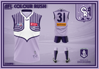
Fremantle is a club visually identified by its unorthodox approach to its identity. The Dockers' Colour Rush design is inspired by their staple colour of purple and its connection with music. Purple Haze by Jimi Hendrix and Prince's Purple Rain are two notable cases of purple's musical flavour but a lot closer to home and the Dockers exists a third usage of it. Famous Dockers supporter Kevin Parker, known more so by his musical pursuits with Tame Impala serves as the main inspiration for this Colour Rush design. Freo's famous anchor returns but is matched with a far lighter shade of purple, similar to that featured on the album cover of the 2015 Tame Impala album, Currents. The pattern above the anchor takes its inspiration from the art featured on the album, bridging the two eras of Fremantle guernseys, the anchor and the embrace of purple. This Colour Rush guernsey ultimately creates a lighter alternative design for a club best defined by its unique visual history.​
 
Geelong-Presentation-4.png
Geelong
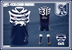
The Cats' Colour Rush guernsey pays homage to its early history as a foundation member of the VFL. Geelong's hoops remain but are inspired by those seen in their early guernseys and heritage designs. Added to this is the prominence of the modern cat logo featured on their secondary logo. In place of the emblem from which the cat is derived, is their heritage emblem, recently seen on their 1963 throwback guernsey worn in 2023. With a maligned alternative guernsey history and others barely ever seen, Geelong's Colour Rush guernsey is a true blend of the old and the new.​
 
Needs more gold and less black imo, but cracking design
The major reason why I was so cautious with the amount of gold featured in my Collingwood design is down to my Reverse Retro concept. The comments below this Swoop Luke Instagram post best explain it. I've tried to create each jumper so that it can be enjoyed more by fans of the club in question, rather than it just being something that I might like, granted that's somewhat difficult because I also tried for each design to be unique in its own right. It's primarily why I wanted a Bears design as I've tended to mock up Fitzroy concepts more often than others and is also why I elected not to go down the Argentina route for North Melbourne.
 
Last edited:
Gold-Coast-Presentation-1.png
Gold Coast
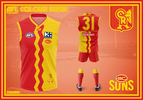
An influence of tradition and the contemporary grants Gold Coast its most unique design since the Suns debuted the fan-favourite wave in 2011. The Suns Colour Rush design is inspired by the iconography which best represents the club and the Gold Coast itself. The sun, sand, beaches and surf lifesaving all associated with the Gold Coast grants the Suns an unconventional half-and-half design. The GC emblem remains, placed in a more traditional spot and also forms part of the number panel on the back of the guernsey. For a club looking to turn the corner with a bold new era, here's hoping the Suns Colour Rush guernsey encapsulates their bold new era.​
 
View attachment 1923317
Geelong
The Cats' Colour Rush guernsey pays homage to its early history as a foundation member of the VFL. Geelong's hoops remain but are inspired by those seen in their early guernseys and heritage designs. Added to this is the prominence of the modern cat logo featured on their secondary logo. In place of the emblem from which the cat is derived, is their heritage emblem, recently seen on their 1963 throwback guernsey worn in 2023. With a maligned alternative guernsey history and others barely ever seen, Geelong's Colour Rush guernsey is a true blend of the old and the new.​
Shocked Ice Cube GIF

this hits
 
View attachment 1923317
Geelong
The Cats' Colour Rush guernsey pays homage to its early history as a foundation member of the VFL. Geelong's hoops remain but are inspired by those seen in their early guernseys and heritage designs. Added to this is the prominence of the modern cat logo featured on their secondary logo. In place of the emblem from which the cat is derived, is their heritage emblem, recently seen on their 1963 throwback guernsey worn in 2023. With a maligned alternative guernsey history and others barely ever seen, Geelong's Colour Rush guernsey is a true blend of the old and the new.​
I'd buy this jumper.
 
Greater-Western-Sydney-Presentation-3.png
Greater Western Sydney
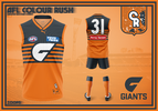
The youngest club in the league has not faltered with their identity, however, the moniker of "The Orange Team" deserves a fitting orange guernsey. Instead of the recent trend of the emblem atop a simple field of orange, the Giants' Colour Rush guernsey is somewhat inspired by another staple of Western Sydney sport. The Giants' yoke remains as does the emblem's position in the centre, but is accompanied by five charcoal hoops. Greater Western Sydney's Colour Rush guernsey is not only a uniquely orange garb but is one that is easily identifiable as both a footy guernsey and uniquely at home in the GWS gallery of guernseys.​
 
Last edited:

Remove this Banner Ad

Back
Top