

KeepOnKeepingOn
Senior List
- Joined
- Apr 22, 2013
- Posts
- 216
- Reaction score
- 404
- Location
- Adelaide
- AFL Club
- Essendon
- Other Teams
- West Adelaide
Follow along with the video below to see how to install our site as a web app on your home screen.
Note: This feature may not be available in some browsers.

 BigFooty Tipping Notice Img
Weekly Prize - Join Any Time - Tip Round 6
The Golden Ticket - Corporate tickets, functions, Open Air Boxes at the Adelaide Oval, ENGIE, Gabba, MCG, Marvel, Optus & People First Stadiums. Corporate Suites at the Gabba, MCG and Marvel.


Log in to remove this Banner Ad
Media logos, to be used in the media (obviously), and on some merchandise, particularly kids merch.
North Melbourne logo. Very simple, really. I've chosen "Hearts to Hearts" because it would mean far more to the North players than their official motto "Victoria Amat Curam" would, and it's a logo that they can take pride in.
What it would look like on their jumpers can be seen if you click here.
Media logos, to be used in the media (obviously), and on some merchandise, particularly kids merch.
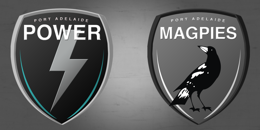
It's similar to Collingwoods pre-1991 magpieIsn't that Collingwood's magpie?
It's similar to Collingwoods pre-1991 magpie

Only difference is Ports Magpie doesn't have a white patch on its neck and it's more detailed
Sadly they're not mineWow do you ever wear those to the footy?

Isn't that Collingwood's magpie?
")


I have edited Quadzilla's original mock to include teal.Incomplete Port Adelaide unification logo concept.


