Competition Design a NSW Primary School's Football Jumper!

Remove this Banner Ad

Apr 7, 2013
40,931
82,668
Burn City
AFL Club
Port Adelaide
Other Teams
Liverpool FC
Hey everyone,

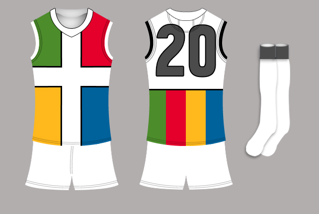
We've been contacted by ashsta77 who is in charge of coordinating and coaching the football team at a primary school in NSW, who have unfortunately been using League jerseys for years. So, we have been tasked with coming up for ideas for his school's jumper! This is an awesome opportunity I think, to design something fresh and original and in a state where the sport isn't exactly very big, especially at junior levels.

As far as guidelines, the jumper design should cover these bases
  • White based
  • The house colours red, yellow, blue & green featured equally (specifically PANTONE 185 C, PANTONE 1235 C, PANTONE 3015 C and PANTONE 363 C respectively)
  • Grey may also be featured as it appears on the logo
Additionally
  • The school logo incorporates the four house colours above, which surround a Christian cross. Due to reasons beyond our control the logo cannot be provided
  • In addition to the above point, a logo does not need to be produced or placed on the jumper.
The jumper designs will need to be submitted within a week, as it takes time to produce them and they need to be ready for the next school competition.

Happy designing!
 

Log in to remove this ad.

35j9pxl.jpg
 
Primary School Jumper.png
Or we lighten the grey and have it on the back:
Primary School Jumper 2.png
I added the red and green on the numbers to even up the colour distribution. That can go if you don't need the colours EXACTLY even :p
Here's how it looks without the outlines: White numbers and black numbers
Screen Shot 2015-04-21 at 12.50.08 pm.png Screen Shot 2015-04-21 at 12.51.09 pm.png
 
Just a side note, aren't all schools' house colours red, green, yellow and blue?
Yes, I believe the logo the school introduced just a year ago described in the op has an emphasis on the equality of the houses, or something. So it's not so much about the colours themselves but the equal distribution (I hope I'm getting this right)
 

(Log in to remove this ad.)

Wow! Thank you for all the responses so far! I appreciate all of your work.

Thank you Dylan8 for his great interpretation and posting of my request:)

In response to a few queries:

I can't believe how close some of you are to our logo. I don't have permission to post the actual logo but for your reference and for other designers, the top left uses red, top right yellow, bottom left blue and bottom right green (Adonis1997's design coincidently follows this).
Don't feel that you have to work with what I've told you in regards to the emblem design, utilising the four colours in some way on the white-based guernsey, shorts and socks is the important part.
As Dylan8 said, we are keen for all house colours to be represented on the guernsey as it forms the design principle and theme behind our new emblem.
I understand that a lot of schools feature the four colours in their houses but our school decided that we would add these elements to our updated logo in 2014. As part of the whole process we found that not many educational institutions tended to incorporate the house colours into their actual emblem.

Thanks again for the work so far and please don't hesitate to contact me with any queries.
 
View attachment 126464
Or we lighten the grey and have it on the back:
View attachment 126468
I added the red and green on the numbers to even up the colour distribution. That can go if you don't need the colours EXACTLY even :p
Here's how it looks without the outlines: White numbers and black numbers
View attachment 126470 View attachment 126471
that top one is pretty much exactly what i had in my head to do.
if you don't mind i'm going to go ahead and do it anyway, but maybe change a few things on it just to differentiate the two.
if you do, then i'll think of something else.
 
I can't believe how close some of you are to our logo. I don't have permission to post the actual logo but for your reference and for other designers, the top left uses red, top right yellow, bottom left blue and bottom right green (Adonis1997's design coincidently follows this).
Purely a fluke.
that top one is pretty much exactly what i had in my head to do.
if you don't mind i'm going to go ahead and do it anyway, but maybe change a few things on it just to differentiate the two.
if you do, then i'll think of something else.
Go ahead.
 

Remove this Banner Ad

Back
Top