Remove this Banner Ad

Portfolio Fancyscum's A-League Revamp

🥰 Love BigFooty? Join now for free.

The MV device on the shirt is very nice! Logo is much better too. Probably would look cleaner without the "Football Club" though.
The centre of the logo is a bit empty without the Football Club I felt, but I'm happy to change it.

Whats the deal with the A-League logo itself? How did that come about?
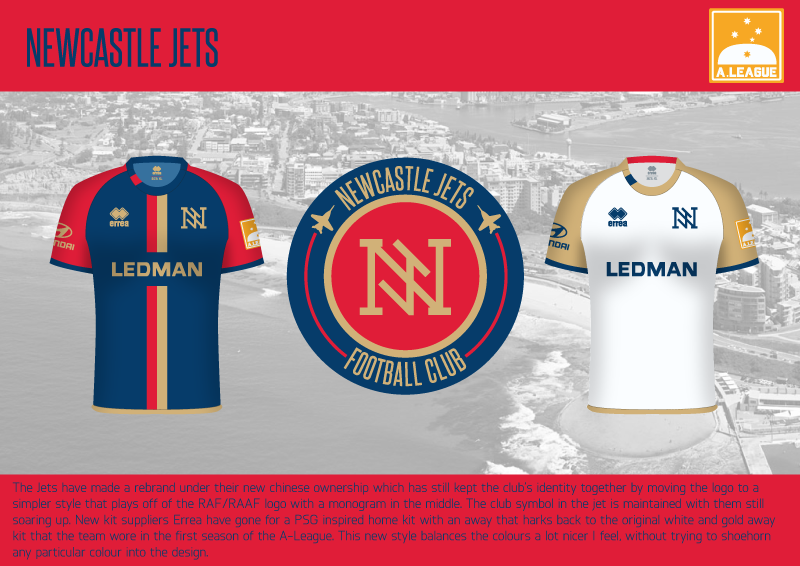
The logo was something I did a few months back with the template so and I was considering other options but in the end I just stuck with it and got the actual designs done. The concept is the southern cross obviously with Uluru behind it, I wanted to include another shape to help balance the orange and white and that was a simple shape that I could stylise to work on a modern logo. I could have done something like the opera house or the harbour bridge, but they are very much linked with Sydney while Uluru given that it is in the middle of the outback, is more general.
 
By request, here's the jets. happy to take suggestions and feedback as always.
Edit: enlarged the J on the monogram.
gsZ3kNd.png
Very nice. Not sure about the J in the logo. Love how you've used the planes though.
 
I'd love to see Collingwood play in another colour
Completely different, aye.
Melbourne Heart were around for like 2 seasons and left absolutely no imprint on the competition.

At some point, the club and supporters are going to have to move on. Better to move on now and forge a new legacy than to try and hold onto something that really wasn't important enough to hold onto in the first place.

Trying to compare that to over 100 years of Collingwood in black and white (and still the same club, something Heart/City is not) is a completely stupid argument. In a few years, not too many City supporters will even know what the Red and White is for, whereas Collingwood is almost completely branded around the black and white and have been for years.
 

Log in to remove this Banner Ad

Love the idea of the Victory having a secondary logo on their shirt. It's basically a design tautology to have the big V in the logo and then the logo sitting inside a big V. I get the idea, but on the shirts it'd be cool if there was just a big M or something.

I've long thought an Aussie team in any comp could get away with a really simple, identifiable animal or letter and capitalising on it. The Rabbitohs sort of do it but I've long thought the second (or third...) Melbourne A-League side should have the whale or ram as an ultra-simplistic logo. Wollongong Wolves are another good shout, though in my head I have a perfect logo where the 'W' and 'W sit at the top and bottom of a wolf – a little like a combination of the Vancouver Whitecaps and Wolverhampton Wolves logos.

BTW aren't Melbourne City located up at La Trobe uni in the north-east? Have they actually tried creeping into the inner south (what is the inner south? South Melbourne to St Kilda and then what else?)?
 
Heart played 5 seasons. You wait until City have been around for 5 seasons. Red and white will disappear.
Why any adult follows City is beyond me. City and Victory have the same target market (Melbourne), colors (blue, white) But Victory has been around longer. You must have been following or at the very least been aware of the A-League by 2009.
 
Love the idea of the Victory having a secondary logo on their shirt. It's basically a design tautology to have the big V in the logo and then the logo sitting inside a big V. I get the idea, but on the shirts it'd be cool if there was just a big M or something.
None of the designs are set in stone and I think the Victory shirt logo is something that might change, and the wordmark from my original logo worked a lot better in my opinion and I might make the V in the secondary logo the same colour as the subtle V's in the main logo to dull it down.
like this:
O2LUaEC.png


I've long thought an Aussie team in any comp could get away with a really simple, identifiable animal or letter and capitalising on it. The Rabbitohs sort of do it but I've long thought the second (or third...) Melbourne A-League side should have the whale or ram as an ultra-simplistic logo. Wollongong Wolves are another good shout, though in my head I have a perfect logo where the 'W' and 'W sit at the top and bottom of a wolf – a little like a combination of the Vancouver Whitecaps and Wolverhampton Wolves logos.
Funny you mention the ram or whale though I was considering using one of them on the City kit before I decided they held little relevance.

BTW aren't Melbourne City located up at La Trobe uni in the north-east? Have they actually tried creeping into the inner south (what is the inner south? South Melbourne to St Kilda and then what else?)?
It was always my belief that that City/Heart were for the south of the Yarra and Victory north (happy to be corrected on this), I'm south of the river and most of the people that I know that follow the league are City fans. I don't think they have set zones though and I don't really have enough of an understanding of it, so for the purposes of this portfolio the divide between the two is the sort of big money club vs. the established local side.
 
look forward no more flamingEMBERS
Perth Glory:
2NSip93.png

Imho the first one I'm not huge on. I think the old two-tone stripes could still work to great effect here, and orange is still under-utilised. The sponsor logo is quite off balance too, I don't think they've ever used that lockup before. All told I still appreciate the simplicity and I'm looking forward to the rest.
 
Heart played 5 seasons. You wait until City have been around for 5 seasons. Red and white will disappear.
Why any adult follows City is beyond me. City and Victory have the same target market (Melbourne), colors (blue, white) But Victory has been around longer. You must have been following or at the very least been aware of the A-League by 2009.
I chose City because I got sick and tired of the arrogant nature of the Victory club, from top to bottom. Plus, as an avowed fan of the underdog, I knew Heart were going to need all the supporters they could get. There should have been two Melbourne teams at the jump, but there weren't.
 
Imho the first one I'm not huge on. I think the old two-tone stripes could still work to great effect here, and orange is still under-utilised. The sponsor logo is quite off balance too, I don't think they've ever used that lockup before. All told I still appreciate the simplicity and I'm looking forward to the rest.
More stripes and more orange, coming up.
Not a fan, looks more like a Brisbane roar outfit. Did you change the purple? I feel like the logo needs more white or orange. The two toned purple is not working for me.
I did make the purple a little warmer but I don't think it looks maroon, anyway I've changed it now.
 

Remove this Banner Ad

It was always my belief that that City/Heart were for the south of the Yarra and Victory north (happy to be corrected on this), I'm south of the river and most of the people that I know that follow the league are City fans. I don't think they have set zones though and I don't really have enough of an understanding of it, so for the purposes of this portfolio the divide between the two is the sort of big money club vs. the established local side.

i share the same sort of idea too. I think it began because from the a-leagues inception, victory drew the majority of its loyal supporter base from the northern and western suburbs. City/heart were then seen as representative of the other suburbs following their creation in 09. Im from the north western suburbs and can say the majority of people i know follow victory so there probably is some truth to these unofficial zones both clubs seem to have
 
You only have to go to a Victory game to see how many Essendon wogs in burgundy and cuffed chinos there are. Definitely the northern and western team, for sure. Maaaayyte!


On iPhone using BigFooty.com mobile app
 
Adelaide United is no more, introducing RB Adelaide:
ljGzkc6.png

Love it- very, very clever. I'm sure most Adelaide United supporters would disagree but it's a clever idea and Adelaide would be the right choice for a Red Bull takeover. :)
 

🥰 Love BigFooty? Join now for free.

Can anyone actually think of a good name for an Adelaide soccer team? In all the mock-ups I've ever seen, the name never strays from the actual one. I can't think of any real identity the place has... Churches, Bells? Wines... Vintage Reds? That last one is a good idea... why don't Penfolds get on bored instead of Red Bull... better logo, cooler marketing possibilities... Asians also have a hard-on for Penfolds to so there's your relevance in the ACL.

United is pretty boring and unlike some other cities in the world, has absolutely no meaning – there is no divide of any sort of in that town, as far as I'm aware. It's one that irks me... 'South Australia United' is a dumb name but it makes more sense with the nickname. 'Hunter United' the same.
 
'Rebel...'
Hmm... I wonder ;)
Really like how this other team looks, think that I've captured the rebel vibe pretty well. They'd probably be a second division team though so I might do the rest of the A-league & expansion teams first before I reveal them.
 
why don't Penfolds get on bored instead of Red Bull... better logo, cooler marketing possibilities... Asians also have a hard-on for Penfolds to so there's your relevance in the ACL.
because penfolds don't have a history of buying football clubs, that's why I went with Red Bull.
 
because penfolds don't have a history of buying football clubs, that's why I went with Red Bull.
They sponsored St George for a while.
TYrO74U.png
 
Can anyone actually think of a good name for an Adelaide soccer team? In all the mock-ups I've ever seen, the name never strays from the actual one. I can't think of any real identity the place has... Churches, Bells? Wines... Vintage Reds? That last one is a good idea... why don't Penfolds get on bored instead of Red Bull... better logo, cooler marketing possibilities... Asians also have a hard-on for Penfolds to so there's your relevance in the ACL.

United is pretty boring and unlike some other cities in the world, has absolutely no meaning – there is no divide of any sort of in that town, as far as I'm aware. It's one that irks me... 'South Australia United' is a dumb name but it makes more sense with the nickname. 'Hunter United' the same.
Unification of West Adelaide & Adelaide City supporters under a neutral non-ethnic-based entity.
 

Remove this Banner Ad

Remove this Banner Ad

🥰 Love BigFooty? Join now for free.

Back
Top Bottom