


royboy2
Average Old Bastard
- Dec 7, 2007
- 13,184
- 15,396
- AFL Club
- Brisbane Lions
- Other Teams
- Rabbitohs, Villa, McLaren F1, ENG
Follow along with the video below to see how to install our site as a web app on your home screen.
Note: This feature may not be available in some browsers.
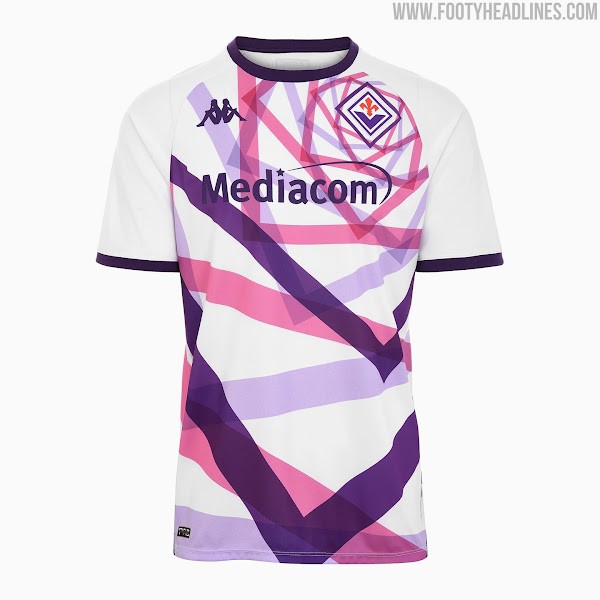
I tend to agree with you regarding the away jersey, but I like the fact that they aren't broken up by the sponsors logo, perhaps they needed to be a little narrower.great! except chevrons need to be higher on the chest. in this setting as is, the V will be pointing at south of the naval
Horrific

It's pure shitThe purple, fluro and black design - with a centred club crest - "celebrates individual personalities and energy, with eagle-eyed fans likely to spot nods to legendary players and moments from our history," a club statement says.
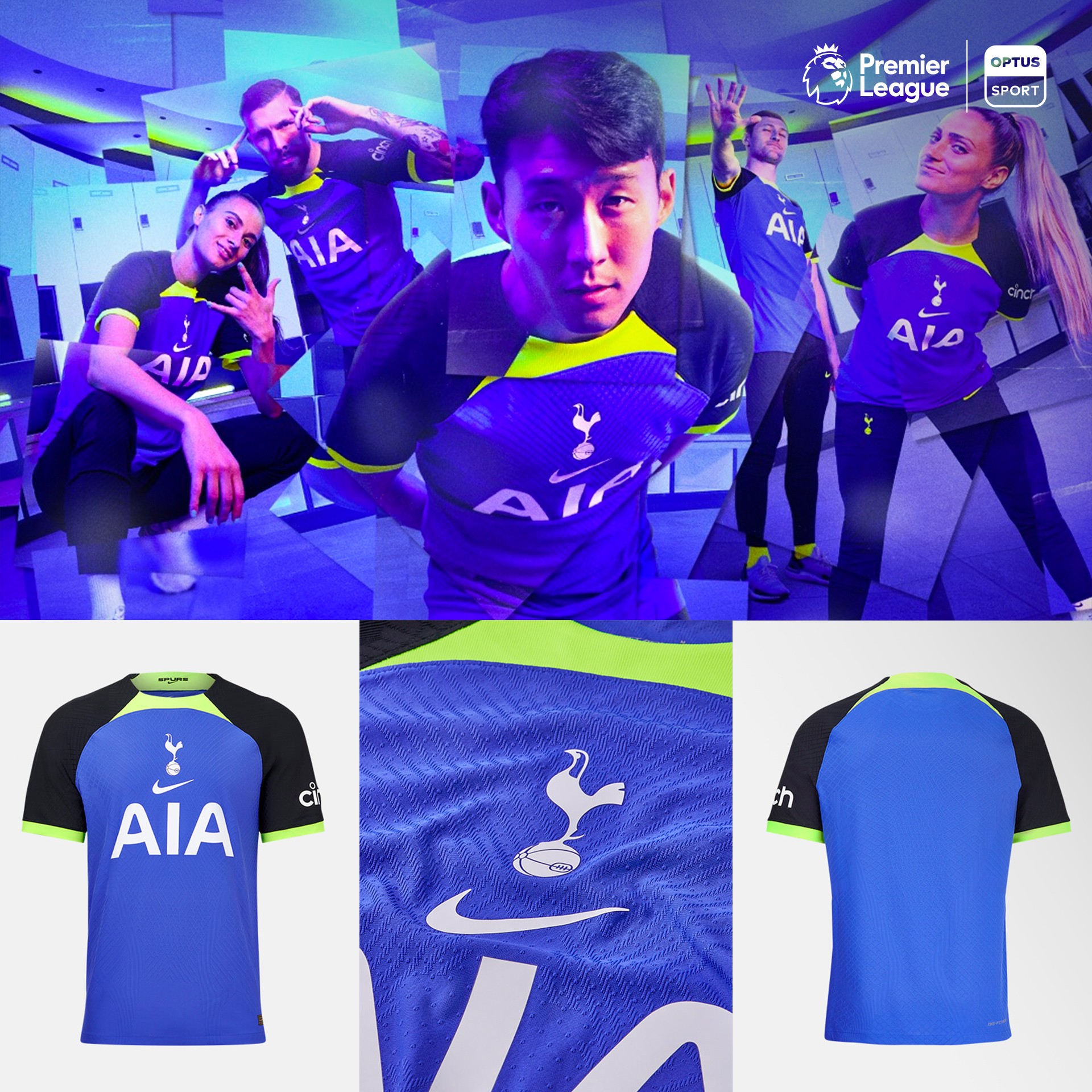
Spurs fans, care to elaborate? jd2010 The Cryptkeeper Art Vandelay_ hawkman
I am confused by the nods to legendary players bit?
Nice
First look I was like.. what..
Second look I dont mind.
First look I was like.. what..
Second look I dont mind.
View attachment 1451192
Our new (and apparently) best selling away Jersey ever.
No idea why we went with that colour, must be trying to blind the opposition.
View attachment 1451192
Our new (and apparently) best selling away Jersey ever.
No idea why we went with that colour, must be trying to blind the opposition.
If the picture was taken from the other side they would. Seems like there's a gradient on the shirt.that shirt is lovely, don't think the shorts match too well but nice
The negative nellies in our fanbase hate this but i love it. Feels really fresh, modern and original.
Something different anyway, I definitely going to get one.


