Navigation
Install the app
How to install the app on iOS
Follow along with the video below to see how to install our site as a web app on your home screen.
Note: This feature may not be available in some browsers.
More options


You are using an out of date browser. It may not display this or other websites correctly.
You should upgrade or use an alternative browser.
You should upgrade or use an alternative browser.
GC17 jumper
- Thread starter magic_johnson!
- Start date
- Tagged users None
- Thread starter
- #27
i sent a link of this thread to the GC17 website
hope they check it out and see what we have come up with
hope they check it out and see what we have come up with
roylandroos
Cancelled
- Banned
- #28
how do you post pics on this
- Thread starter
- #29
you mkae a photobucket acount on www.photobucket.comhow do you post pics on this
upload the pics onto that website
then copy and paste the img code into a reply
I'd be a millionaire if everyone who's asked me this gave me $1.how do you post pics on this
joduffy
Rookie
I simply love the interest everyone shows in the GC17 bid however what we now know about the bid committee is that they ignore suggestions and put their faith in the cafe latte marketing set that beleive their goal is to inovate while pushing aside the opinions of the potential fan base. We didn't get a nickname or a decent mascot, maybe they'll decide that Gold Coast FC will buck tradition and wear mesh singlets and bike shorts...who knows?
- Banned
- #34
I simply love the interest everyone shows in the GC17 bid however what we now know about the bid committee is that they ignore suggestions ?
Maybe they only took suggestions from GC supporters not people with vested interests.
Salad dodger
Team Captain
All too busy in my opinion, the best jumpers are two colours of basic design. as evidence I submit
Good
North
Pies
Cats
Dons
Tigs
Bad
Port too busy too many colours
Freo see above
the old Eagles jumper from a couple of years ago
the poos and wees when they have the mainly blue with diamond shaped yellow and brown just hidious
In other words two colours in a simple design is the right way to go, just because modern tech allows for more elabirate design doesn't mean you should adopt it. in this case less is more.
Yellow jumper CGFC (links as per the Carlton jumper) in Maroon with Maroon shorts. simple, queenland and instantly recognisible.
Yellow jumper CGFC (links as per the Carlton jumper) in Maroon with Maroon shorts. simple, queenland and instantly recognisible.
you dont think that might be a bit too much like brisbane bears? plus you have to remember this club is a new franchise trying to look "exciting" as they've said, carltons jumpers hardly exciting.
plus i think both west coasts jumpers look good at the moment
Azzballz Deluxe
All Australian
All too busy in my opinion, the best jumpers are two colours of basic design. as evidence I submit
Good
North
Pies
Cats
Dons
Tigs
Bad
Port too busy too many colours
Freo see above
the old Eagles jumper from a couple of years ago
the poos and wees when they have the mainly blue with diamond shaped yellow and brown just hidious
In other words two colours in a simple design is the right way to go, just because modern tech allows for more elabirate design doesn't mean you should adopt it. in this case less is more.
Yellow jumper CGFC (links as per the Carlton jumper) in Maroon with Maroon shorts. simple, queenland and instantly recognisible.
Not gonna happen matey
They've already said they are going to buck tradition and go for something "sexy"

But if they go for something like number 2, it should be alright.
Not trolling here, but the proposed colours are very simmilar to the dogs... wouldnt be surprised if they are shafted to the GC in a Fitzroy/Bears style
Father Jack
Brownlow Medallist
- Mar 23, 2006
- 22,936
- 25,122
- AFL Club
- West Coast
- Other Teams
- Tottenham Hotspur FC
12 and 13 look like they could be a goer, they may be a bit bulldogish, but Adelaide got away with something similar re Geelong. No 3 looks a bit like West Coast, oddly enough.
joduffy
Rookie
Maybe they only took suggestions from GC supporters not people with vested interests.
It's hard not to be cynical after hearing some in the bid committee had never seen an live AFL game. High flyers rise and fall on the Gold Coast like the tide. Rather than being hijacked by those who think they'll make a dollar or two, we need people with serious football cred or we will struggle. Engaging the supporters is vital but so far they've failed. Send us Sheedy to teach them something about the heart of the game. Please.
MarketingTosser
Draftee
Got to admit that I like the idea of a two colour design as well. As an ex-pat Queenslander, I'm missing the excitement of another team joining the AFL from my home state. But I also agree with some of the comments on the 'baggage' about trying to make a new team without all the reminders of the 'bad news' bears.
Further, if you go with a yellow jersey, there's always the opening for those magpie supporters to use the 'you're yellow' (a coward) chant at the point in the game that 'Joffa' indicates that the match is over...
Got to ask- why on earth are they planning to go with a mix of red, blue and yellow? They're already being used to death in this comp. Why not use ochre/gold (for sand/Gold coast), olive-green (for the fertility and symbolism of the hinterland), silver (for prosperity) and Sky-blue (The weather)?
If they want a radical design (that doesn't date), they just need to keep the design timeless. OK, so they don't want stripes and a yoke to the colours. So, have the complete back panel in Silver, and the front in olive green. On the left breast of the jersey print Gold (on top of) Coast in ochre on sky-blue, and do the same on the back for the numbers. If you really want to make the jersey more stylised, you could always have a tall sand dune crossing the front and back panels under the arms.
In any case, this sort of jersey would be simple and attractive, and instantly recognisable.
Sure, it's four colours, but then again, you could always take the Freo road and produce some killer 'tartan' tie designs as well.
Cheers!
A poll has now been added for this thread.
You can now choose your preferred GC Footy jumper
You can now choose your preferred GC Footy jumper
Ummm me. Well I did make it and I think it's good.geez, i wonder who voted number 9...
Ummm me. Well I did make it and I think it's good.
oh, i knew. you dont think its a bit... well it hurts your eyes
- Thread starter
- #47
13- would be very easy to make a clash jumper for
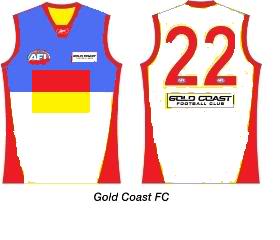
Used your designs as a base. was on the GC the last week and thought the guards flag is iconic.
Its the flag against a blue sky and white sandy beach
Used your designs as a base. was on the GC the last week and thought the guards flag is iconic.
i like the idea. it might need some experimenting with though (screwin around with colours)
peas_and_corn
Debutant
Voted four as it's my favourite that uses the announced colours, though my favourite is 8. Will be a bit of a lurker on this board, hope the club is successful
