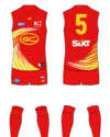
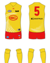
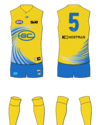
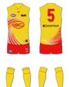
Resource Gold Coast Suns Rebrand

Best rebrand option


  • Total voters
    183

Remove this Banner Ad

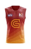
My 2cents. Stick with all red, but make it a slightly deeper/darker red. Whole kit solid red.
Then a simple monogram in gold, not yellow. because they should obviously be using gold. obviously


nothing revolutionary, but its a clean, classic look.

Anyway, I look forward to seeing what type of gradient they come up with :)
Mowse, did you play around with the eight points on the monogram being long and pointy (or just pointy) like sunrays?
 

Log in to remove this ad.

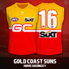
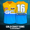
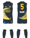
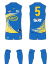
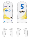
Had another crack at it, this time on the basis that the current logo is retained.

View attachment 1994620
View attachment 1994621

Great stuff, much better than the current. The only thing I'd change is the order, so red on top, yellow on the bottom. I mentioned previously, I think it looks better when a different colour runs into the shorts imo. Then you have, red, yellow, red.
 

(Log in to remove this ad.)

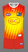
The bright red and yellow (and almost fluoro blue) are the problem. Shit colours for a footy jumper.

If you want to properly improve it then you need to change them.

All bright colours, like the three they have, don’t work.

You need at least one deeper/darker colour in the mix.

Some people here are making one or all of the red, yellow or blue darker, they are on the right track.
+1 vote for Charcoal, red and yellow.

Home kit is red base with yellow sun and charcoal accents, away is charcoal with yellow sun and red accents, third kit is yellow with red sun and charcoal accents, solved
 
+1 vote for Charcoal, red and yellow.

Home kit is red base with yellow sun and charcoal accents, away is charcoal with yellow sun and red accents, third kit is yellow with red sun and charcoal accents, solved

Charcoal as in black, is gonna become the new gold, which is usually just yellow. Sounds more fancy 😅.
 
The other issue is that they should've been told to steer clear from any colours that resemble the Brisbane Lions and also Adelaide.

Seriously, Red, Blue and Gold?
Same thing happened in Sydney

GWS orange clashes with Sydney Red
GC red clashes with Brisbane maroon (plus they both have elements of blue and gold/yellow)

Bizarre way to introduce new rivals to an area
 
Same thing happened in Sydney

GWS orange clashes with Sydney Red
GC red clashes with Brisbane maroon (plus they both have elements of blue and gold/yellow)

Bizarre way to introduce new rivals to an area
To be fair, going blue for GWS would've been controversial.
 
Back
Top