- Thread starter
- #526
Think that style looks better with yellow at the top.
Follow along with the video below to see how to install our site as a web app on your home screen.
Note: This feature may not be available in some browsers.
Think that style looks better with yellow at the top.
On to something. Looks surfy and retro. Is the S meant to be wave inspired. That's what I'm picking up
I literally just googled "oval shaped S logo" to try and illustrate what the description before might look like! So just nicked it to quickly knock up something, hopefully they dont steal it!On to something. Looks surfy and retro. Is the S meant to be wave inspired. That's what I'm picking up

Disagree. The fans in most cases don’t know s**t. Take the Eagles retro guernsey for example. The Ocha was the one they should’ve gone for. I appreciate the 94 looked fantastic but absolutely no one knew the old AFL logo and a retro HJs badge were part of the deal.They should just hold fan contests for a new guernsey design like Port did in the late 2000's and Hawthorn did in 2016 for their clash.
For years, I always saw that design in so many "worst guernsey designs" lists, it's in that same realm of Hawthorn's "Power Rangers" guernsey.Disagree. The fans in most cases don’t know s**t. Take the Eagles retro guernsey for example. The Ocha was the one they should’ve gone for.
It's because they want Port to wear their prison bar guernsey, but they consider that fan guernsey to be superior than their first AFL home guernsey.I see Port fans complaining about their current guernsey all the time and quite frankly I agree. It’s stale.
I mean if that’s on the worst guernsey design lists you’ve just proven my point that most times the fans don’t know s**t.For years, I always saw that design in so many "worst guernsey designs" lists, it's in that same realm of Hawthorn's "Power Rangers" guernsey.
It's because they want Port to wear their prison bar guernsey, but they consider that fan guernsey to be superior than their first AFL home guernsey.
This one with red instead of blue and sponsors logos I'd be interested to see.
 can't be fussed with sponsors I'm at the footy


Better Beer.All this talk of sunset gradients and S shapes just makes me think of Hilux Surf decals. Apologies for the awful, awful quality but you get the idea.
View attachment 1984185
View attachment 1984187View attachment 1984189
Emperor Hirohito approves of this guernseyView attachment 1984026can't be fussed with sponsors I'm at the footy

I prefer the blue and yellow partly for that reasonGee I don't know, very "Rising Sun" flag from WW2

same with freoDisagree. The fans in most cases don’t know s**t. Take the Eagles retro guernsey for example. The Ocha was the one they should’ve gone for. I appreciate the 94 looked fantastic but absolutely no one knew the old AFL logo and a retro HJs badge were part of the deal.
I see Port fans complaining about their current guernsey all the time and quite frankly I agree. It’s stale.


These are superb


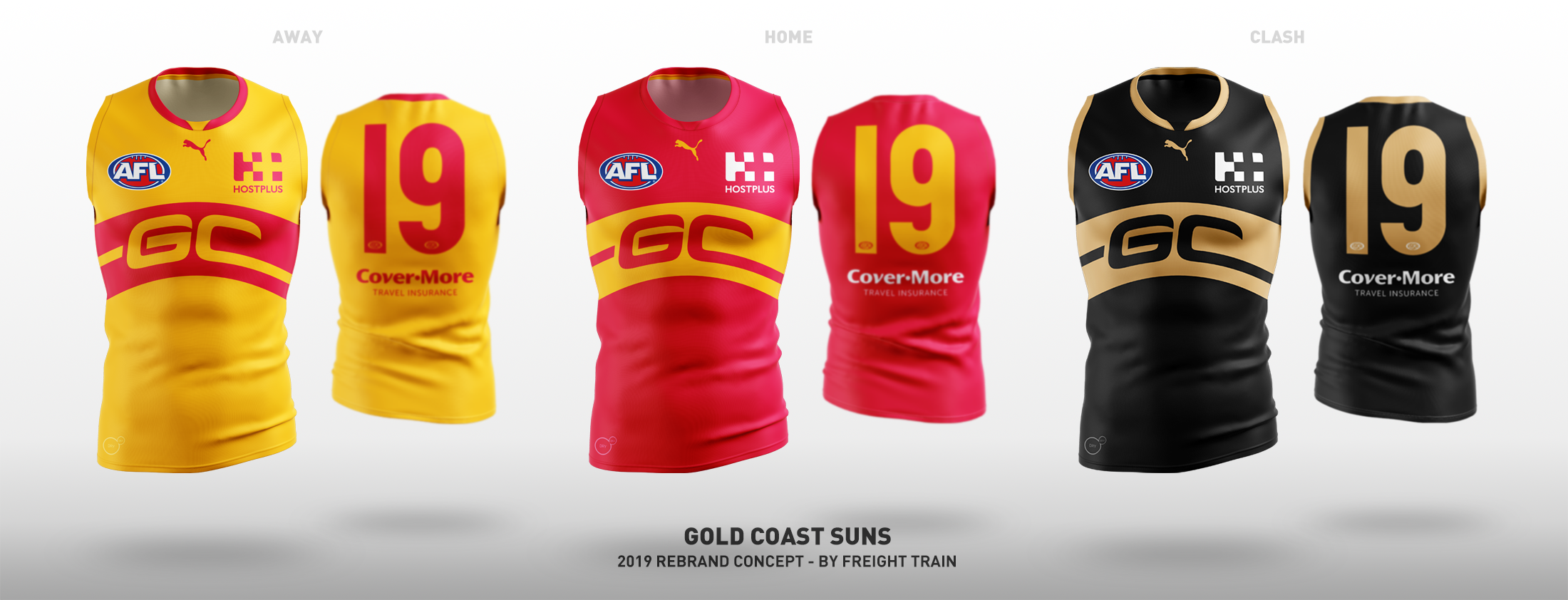
The fact Gold Coast haven't introduced some sort of rounded sun element on their guernseys is beyond me, and I felt this was the simplest "footy jumper" way to implement it, as well as keeping the monogram. Keep the mostly red home guernsey, which is a big part of their brand, and a simple inverse provides an adequate away guernsey. Then for a clash, a black and gold design is there for the taking and the Suns are the ideal team to use the colour set.

What would you do differently if you designed one now? no ochre allowed thoughjob was already done in 2018.