Remove this Banner Ad

Portfolio My Random Leagues Portfolio

🥰 Love BigFooty? Join now for free.

Joined
Apr 23, 2012
Posts
7,483
Reaction score
5,428
Location
The Riff
AFL Club
GWS
Other Teams
Sydney Swans, St Kilda Saints
Well... My time in highschool has finished but the memories (and designs) are still here. During the many long hours in Business Studies, some mates and I would come up with random leagues and we'd make the guernseys for the teams that would be in them. For example, we had the Big 4 Banks of Australia (NAB, ANZ, Commenwealth, Westpac) and so we had designs attributed to the logos for them. So here I am, sharing and looking for feedback.

To start off, we have the universities some of us were going to join after our HSC stints. Included with the designs are the actual logos to compare them

Notre Dame
Notre Dame.png Notre Dame L.png
The symbol above the numbers (Christian cross) is simply to represent the catholic nature of the Uni, not for the players spiritual orientation

Maquarie University
Macquarie.png
Macquarie L.png

University of New South Wales
UNSW.png
UNSW L.png

University of Sydney
USYD.png
USYD L.png

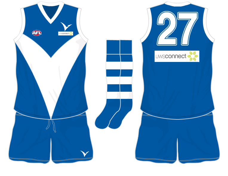
University of Western Sydney
UWS.png
UWS L.png
 

UWS's blue is slightly bluer, or as those of us who competed for them and wore the mostly blue tracksuit called smurf blue.

UWS1.png


Or in real life:

DSC00774.jpg
 
UPDATE: This is a huge bump, but I figured with the new influx of designers, some new advice is always welcome. I have finally updated the UWS colour scheme to match Craegus' tip.

Coming soon, An old league idea that I had created but have not posted before....
 

Log in to remove this Banner Ad

UPDATE: This is a huge bump, but I figured with the new influx of designers, some new advice is always welcome. I have finally updated the UWS colour scheme to match Craegus' tip.

Coming soon, An old league idea that I had created but have not posted before....

UNSW has TVS as a sponsor
 
If you lok at them, none have sponsors. If you noticed 99% of my dsigns, I don't use sponsors

I think you should it doesn't look bland if you put them on.
 
I think you should it doesn't look bland if you put them on.
I'm tired and coming off a caffeine-tablet induced rush so I'm assuming you're saying that I "should put logos on. It doesn't look bland when they are on".

If so, I dont like putting them on a)because its a bit tricker to make them look good in paint (especially when on dark colours, b) I cant be f***ed and c)its my personal preference. To me, a sponsor is something that goes on later and should fit in with the design, not the other way around. These jumpers were what would come around before sponsors were agreed on.

Another reason for this particular "league"is because my own university's sporting teams don't have sponsors. Money is raised from students to get equipment and uniforms. If I had a sponsor for one uni, but not another, it looks a bit unbalanced across the whole thing
 
UNSW with TVS as a sponsor? UWS owns/backs TVS, so why would a rival uni have it as a sponsor?
Damn I thought it was unsw


Sent from my iPhone using Tapatalk - now Free
 
Alright, so my next league isn't based on anything other than the rolling of a set of dice. Rules are below.
Team idea colours.png
The teams are:
Andsville Anchors
Craxon Cyborgs
Badlands Berserkers
Duskitin Falcons
Barrick Breakers
Far North Dragons
Centrals Theives
Granthern Gryphons
Lillin Jets
Northern Marauders
Plains Pride (OR Pride of the Plains)
Slidsin Strikers
Sandton Scholars
Therinth Rams
Torny Thunder
Trankon Snakes
Welwron Wolves
Vicitin Knights.


So here we go. Note, these are fantasy teams that exist only in my head. Im not trying to be overly creative and have to stick to the colours I rolled.. Those are my rules. Each team has a home, an away that is a whole change (either an invert or replacement of colours) and a white based clash

Andsville Anchors (Home, Away, Clash)
Home.png Away.png Clash.png
 
I'm down with this randomization idea! I'm looking forward to seeing how the color combinations all end up working, especially the unusual ones that are bound to arise, and how you deal with clashes if teams end up with similar rolls. If you're looking for feedback or constructive criticism, I like what you've put together for the Anchors, definitely not too out there and also easily identifiable, though I'm hoping you designate some of your fictional teams as more "classic" and others as more "modern," just for variety's sake. If I have any suggestions, it would be to make the hole at the top of the anchor white on the home and black on the away, to match the shape's outline; on the home especially, the navy blue hole next to the black anchor doesn't read well for me. I've also never understood that West Coast "T" on the back when there's nothing for it to connect to on the front, but maybe that's just personal bias. Other than that small, suggestion, though, looking good!
 
I'm down with this randomization idea! I'm looking forward to seeing how the color combinations all end up working, especially the unusual ones that are bound to arise, and how you deal with clashes if teams end up with similar rolls. If you're looking for feedback or constructive criticism, I like what you've put together for the Anchors, definitely not too out there and also easily identifiable, though I'm hoping you designate some of your fictional teams as more "classic" and others as more "modern," just for variety's sake. If I have any suggestions, it would be to make the hole at the top of the anchor white on the home and black on the away, to match the shape's outline; on the home especially, the navy blue hole next to the black anchor doesn't read well for me. I've also never understood that West Coast "T" on the back when there's nothing for it to connect to on the front, but maybe that's just personal bias. Other than that small, suggestion, though, looking good!
EDITs fixed. Id been tossing up between the colours for the hole in the anchor and mustve forgot to fix it. Thanks! With the T part, I don't know why WCE do it either, I nsimply included it to break up the colour a bit. Some teams have modernised tops, others more traditional. Some even have a combination. Glad to see someone likes the idea!
 

Remove this Banner Ad

I may not be from Boston, but I don't have any other word for that than "wicked"! A great design that's definitely aggressive and modern, but not busy or convoluted, and a crazy good color scheme too. I was wondering, did you create all of the team names before or after finding out what colors they'd have? Because the two so far have fit quite well.
 
I may not be from Boston, but I don't have any other word for that than "wicked"! A great design that's definitely aggressive and modern, but not busy or convoluted, and a crazy good color scheme too. I was wondering, did you create all of the team names before or after finding out what colors they'd have? Because the two so far have fit quite well.
I had an idea of what I wanted after all the colours were created. I just tried to have some range in all designs. Next will be Barrick Breakers, but not until I finish my essay:p
 
Ok, my personal favourite, even if the colours were a bit weird
Barrick Breakers
Another coastal city themed jumper, rather than having the anchor in the middle, it acts as a sash (similar to a Freo dockers prototype)
Home.png Away.png Clash.png

Also, this design actually was part of my portfolio when I went for a job as a designer,
Barrickk Breakers...Soul Sports.png
 

Remove this Banner Ad

Remove this Banner Ad

🥰 Love BigFooty? Join now for free.

Back
Top Bottom