Poll NAFL 2022 - League C, Round 2

Vote for your favourite in each matchup


  • Total voters
    26
  • Poll closed .

Remove this Banner Ad

nafl-2022-season-banner-jpg.1305805


LEAGUE C // ROUND 2


Poll will be open for 3 days.
Please vote in each of the games.
Home team listed first.
Do not vote for yourself.
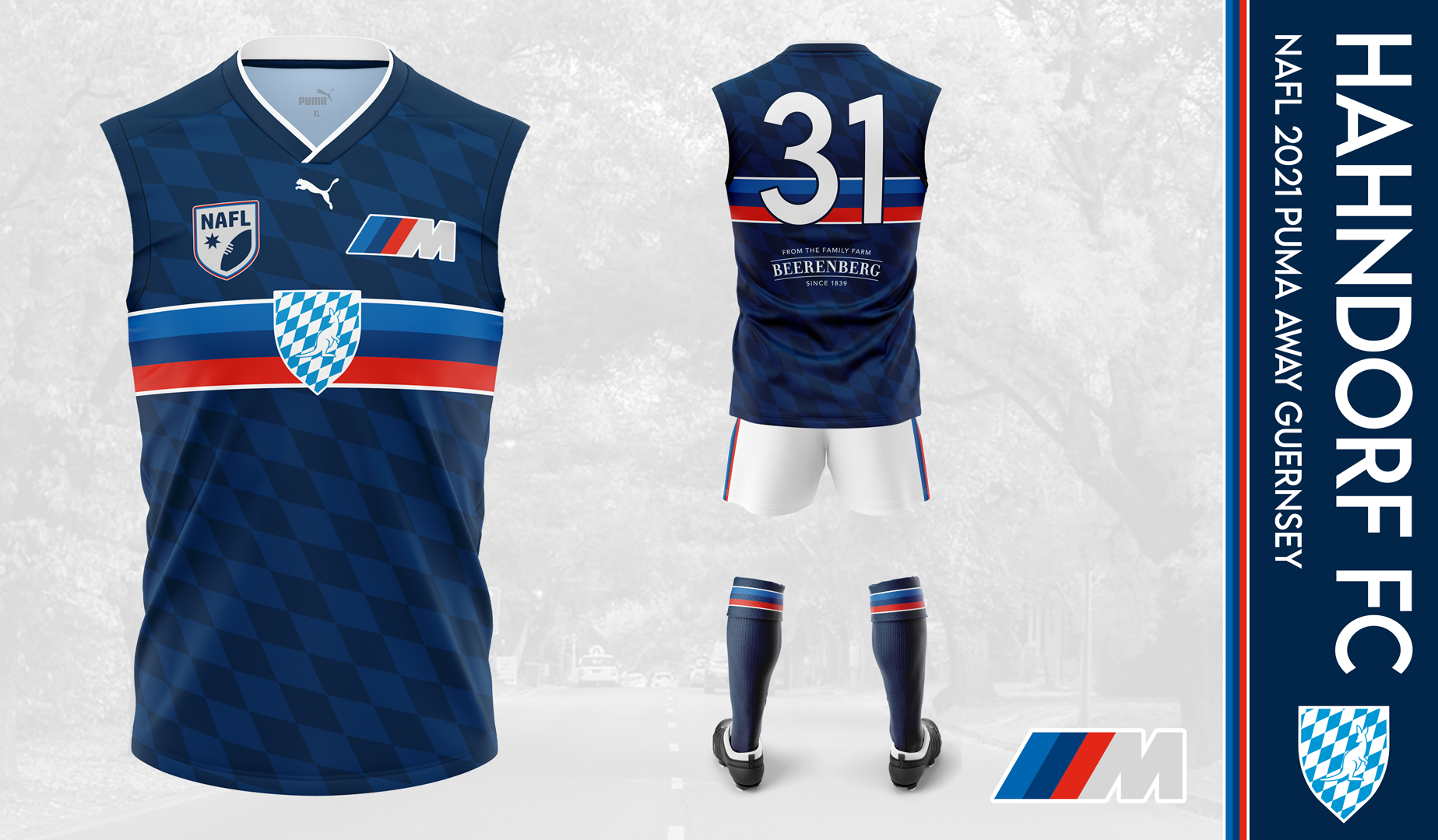

Albany vs. Hahndorf

51557351774_1f8fff0e61_b.jpg


WXlbN8m.png


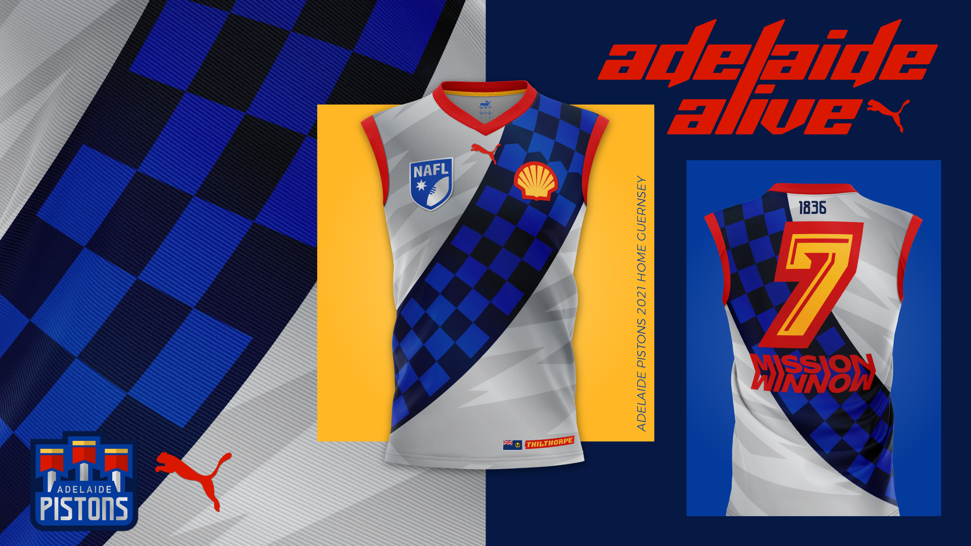
Adelaide vs. Toowoomba

Jlqji6A.png


u2SgW9G.jpg


Waikato vs. Port Lincoln

LbutQoJ.jpeg


8Uz9wTh.png


Wellington vs. Parkville

hm7WVnJ.png


6p32RE4.png


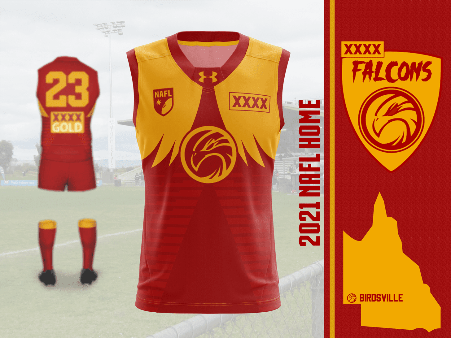
XXXX Falcons vs. Newcastle

sIRGh8q.png


I0pwtEi.png
 
I like Wellington's kit but I feel like the actual kit they play in will look very different.

Also love the Waikato grunge presentation look, always fun to try new stuff like that. Only suggestion is maybe to adjust the light around Buddy so it becomes more of your background colour or something (i.e. red) just so it blends more, but that's just my take :)
 

Log in to remove this ad.

Also love the Waikato grunge presentation look, always fun to try new stuff like that. Only suggestion is maybe to adjust the light around Buddy so it becomes more of your background colour or something (i.e. red) just so it blends more, but that's just my take :)

Thanks! It was definitely a balancing act trying to get the effect I wanted while also getting Buddy to pop adequately from the background.
 
Thoughts on the XXXX Falcons design and the idea to put the sponsorship in the name?

I like that you've tried to do something different for your club name, it's just a shame you picked an average beer for it! Personally I prefer your away design and I like your logo, though I think you could have picked a better typeface. Unfortunately though, this group has some designs that are top tier which are quite hard to stand out from.

I'd love feedback on the Sharks and Astros as well at some point, though I've noticed a few issues with the warping going on. Think I've done a better job with my FIRA entries on that front.
Thanks. I couldnt think of a time it had been done on the board before and LOL the beer is average (I only drink XXXX when its free) but the colours of the logo worked and it is a QLD beer. I dont mind the typeface on the logo but looking back now it doesnt fit in with the rest of the logo. There are definitely some top tier designs and overall presentations.

I like both the Sharks entries! The logo and the monogram on the home are great! I voted for you in round 1 and I intended to vote for you this week as well but have just realized I missed your match up completely :(

I love the idea behind the Mt Moon Astros! I like both designs although the home is a bit plain. The logo is great! I think if you decide to carry on with the Astros next season there is a lot of ways to incorporate Pokemon in to the designs as you have with the logo!

I love to see people on here improving and taking their designs to the next level, like you have painting the guernseys on to a real player! Ive tried to do it a couple of times but do not have the patience.
 
I'd love feedback on the Sharks and Astros as well at some point, though I've noticed a few issues with the warping going on. Think I've done a better job with my FIRA entries on that front.
Mount Moon is really cool. Nice colour combo, unique brand and clean design with a lot of potential for other stuff. Port Lincoln are maybe too similar to Cronulla irl, and wavy lines are hard to pull off without looking busy imo. Both your FIRA teams look good and have a lot of personality; Oslo are my gf's pick of the lot in FIRA.
 
Mount Moon is really cool. Nice colour combo, unique brand and clean design with a lot of potential for other stuff. Port Lincoln are maybe too similar to Cronulla irl, and wavy lines are hard to pull off without looking busy imo. Both your FIRA teams look good and have a lot of personality; Oslo are my gf's pick of the lot in FIRA.
Quit braggin ya have a woman ;)
 
Back
Top