Discussion NAFL Reserves 2018-19 hub thread

Remove this Banner Ad

While we're at it
#RoastMe
FanOMCB.png
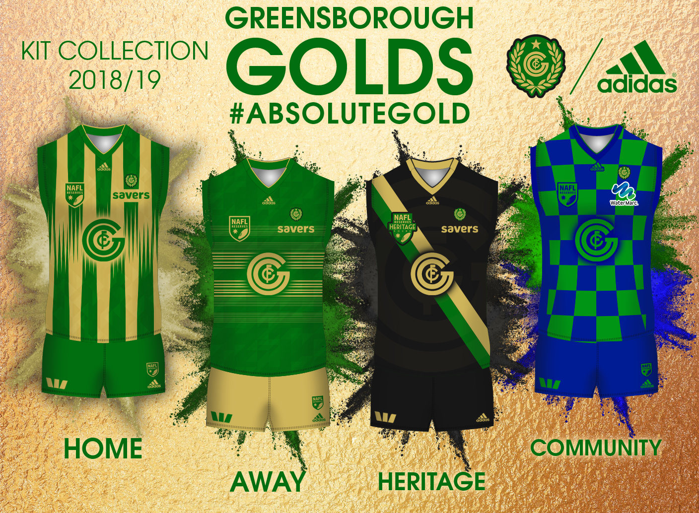
Home actually has a great idea behind it, though the shingled (not quite sure if that's the word) part in the middle seems a bit too busy and conflicting. However I understand that you're trying to make it unique. The watermark-patterns add a real good touch.

Away has a good concept (like the home), but once again I think the thin strips make it a bit too busy? To your credit, you've made the monogram work :)

Heritage is great. A simple and effective "football design" with the monogram standing out well amongst the other elements. Monogram watermark adds a good touch.

Community personally is a bit 50/50 to me. Great for representing the water slide which was instantly recognisable, though the shades of blue and green are a bit too deep I think.

Over all, a great set of kits that have a lot of potential to make a big impact on NAFL once more :)
 
Camberwell has a great colour scheme with a great "football design".
That blue on the heritage may need to be worked on?
Community is solid as a design, but perhaps the Swinburne logo could be emphasised better?
My only real pet peeve about Camberwell is the fact the negative space between the stripes don't seem to be equal :p
I'd also try fit in something that symbolises stallions or something of that kind?

Other than all that, Camberwell has a solid set of kits that have the potential to shake things up in NAFL next season.
 

Log in to remove this ad.

#ExploitingThatBrisbaneBearsVibe
Near flawless Home, away and clash. So effective, whichever way you arrange the palette and looks so suited for footy
Heritage looks neat but the cyan is too distracting, don't remember the Bulls blue being that light and going back to the hashtag, very Bears-esque
For the Community one, I reckon Swinburnes logo could've been placed under the Melb Bitter logo ala retro AS Monaco sponsor positioning. It gets lost between the black and white lines for me
 
Camberwell has a great colour scheme with a great "football design".
That blue on the heritage may need to be worked on?
Community is solid as a design, but perhaps the Swinburne logo could be emphasised better?
My only real pet peeve about Camberwell is the fact the negative space between the stripes don't seem to be equal :p
I'd also try fit in something that symbolises stallions or something of that kind?

Other than all that, Camberwell has a solid set of kits that have the potential to shake things up in NAFL next season.
#ExploitingThatBrisbaneBearsVibe
Near flawless Home, away and clash. So effective, whichever way you arrange the palette and looks so suited for footy
Heritage looks neat but the cyan is too distracting, don't remember the Bulls blue being that light and going back to the hashtag, very Bears-esque
For the Community one, I reckon Swinburnes logo could've been placed under the Melb Bitter logo ala retro AS Monaco sponsor positioning. It gets lost between the black and white lines for me
Cheers lads, when I get some time I'll sit down and give some feedback to both of you.
 
View attachment 608391

While we're at it - #RoastMe
(I know the community kit is pretty bad. With hindsight I think I should've just kept the vVv with the same mono-colour scheme)

Bonus points for feedback as to why my team fell to the Tsars and 'wells ;)
What does the home jumper look like without the NAFLR Badge and Sponsor? The red lines have been bugging me all season. It's like Schrodinger's Cat as to whether they meet or not.
 
What does the home jumper look like without the NAFLR Badge and Sponsor? The red lines have been bugging me all season. It's like Schrodinger's Cat as to whether they meet or not.
1548064086122.png
 
View attachment 608391

While we're at it - #RoastMe
(I know the community kit is pretty bad. With hindsight I think I should've just kept the vVv with the same mono-colour scheme)

Bonus points for feedback as to why my team fell to the Tsars and 'wells ;)

Home: 7.5/10 - Great jumper, excellent concept. Only problem is the lines of the 'Vees' getting lost behind the logos. I'd look to use a similar design, but don't hide anything with logos
Away: 7.5/10 - Ditto
Clash: 7/10 - Something about the mustard just didn't work, but in saying that, yellow bases rarely work on a jumper. I'm a fan of having a white clash jumper, possibly consider a red/yellow on white
Community: 6/10 - Idea is there, but the 'Vees' would have looked better. Love the logos all being in dark red
Heritage: 8/10 - Classy design, excellent colour choices

Why you lost: The Tsars have an excellent logo incorporated well into the design, which brought it above the Rockets where part of the main design element was hidden behind logos. Camberwell was a step above in this years comp, hard to make a comparison there.

Overall: An excellent concept, with some refinement on the 'Vees' and a new clash jumper, big things are in store for 2019


Home: 9.5/10 - Flawless. Only change I'd make is a slight stroke on the league logo to avoid it getting mixed and lost within the design
Away: 9.5/10 - Ditto
Clash: 9.5/10 - Ditto
Heritage: 9.5/10 - Love the subtly of the stripes, and the cyan works excellent with the maroon
Community: 8.5/10 - Love how the Swinburne colours are incorporated, but the positioning and colours of the logo lets it down. I'd consider a tertiary colour or incorporating the logo another way (perhaps a landscape version replacing Optus on the back)

Overall: Perfect. This set could go deep into the NAFL Seniors as it is now. With further refinement and improvements, it will be a huge challenger for the title next season.

View attachment 608426

Ah what the heck, gimme your worst (or your best)

Home: 8/10 - Love the positioning of the logo and how well it is incorporated on the jumper. Only thing is the logo itself maybe a bit too simplistic. Further detail wouldn't go astray
Away: 7.5/10 - Compared to the Rockets, this shade of yellow (along with being used with black) works quite well. Yellow or white shorts maybe a possibility though, as it is the attention is drawn towards the dark shorts rather than the jumper itself
Heritage: 7.5/10 - Not a whole lot to say, a slightly darker green might help it improve though
Community: 8.5/10 - I'm not sure what it is about the Hawaiian flowers, but they just work. Love the yellow-on-white jumper too (clash jumper for 2019?). My favourite of the Tsars designs

Overall: A very nice design set, with a classy home jumper and a solid set of accompanying jumpers. With some further detail, it too will be fantastic in the NAFL Seniors in 2019
 
All of your designs suck because you don't use paint.
If those designs suck since it's not MS Paint, then what does that make me, the paint user with the worse designs?

P.S. I understand joke, I'm just askin'
 
Keen for some feedback too #roastme
View attachment 608396

Welcome to Div 1!

Your identity and general design is really good. I love the striping pattern. Your design sense is certainly at a level where you'll fit in in the top division, although given what you've gone with you want to tread lightly around being too close to the Broncos in terms of identity.

My only real problem is that you haven't warped the design to fit with your 3/4 angle template very well, so the perspective is a bit off.

There are a few ways to do it, I did a tutorial on the Template Feedback Thread on how I do it here:
https://www.bigfooty.com/forum/threads/template-feedback-thread.1085918/page-51#post-58901206

You'll need to kick that execution up another gear next year in Div 1, but if you can continue to develop that identity and keep progressing in terms of execution you'll fit right in.
Cheers mate, div 1 next season I plan on using a new template that I will create sometime this year that will certainly a warp a lot better, my current one is already over a year old. As you said gotta strive a step higher for next season as the bar is raised even higher which I am keen for the challenge.
 

(Log in to remove this ad.)


This identity just needs a bit of a refresh, certainly a new logo and maybe a colour adjustment.

Unfortunately that template doesn't display shading highlights, so big blocks of gold come out quite dull on it. The 3yo template plus the same colours and identity from the last few seasons are counting against you at this point. It just feels a bit like i've seen it all before.

You definitely want to push for something bright, bold and new next season.

While we're at it
#RoastMe
FanOMCB.png

You do some cool designs on what are unfortunately really dull colours that hold you back. This would look amazing in real life, but on a computer screen those shades of green and gold don't have enough contrast to really pop, and I think that probably costs you votes.

Your ability to put together a cool kit design is certainly unquestionable though. Just need to make it pop off of the screen a bit.

Given you base all designs around the monogram, i'd have another go at that before next season as well.

View attachment 608391

While we're at it - #RoastMe
(I know the community kit is pretty bad. With hindsight I think I should've just kept the vVv with the same mono-colour scheme)

Bonus points for feedback as to why my team fell to the Tsars and 'wells ;)

Your hero design element is fantastic! We always talk about a unique take on traditional design, so something looks like a footy guernsey but is also new and interesting, and you've nailed it here. Love it. Keep that philosophy front and centre when designing and you'll always make cool stuff. Your home kit is my favourite kit in the Ressies and would certainly fit in in Div 1.

Moving forward to really take the next step you'll need to move forward a bit with template and execution, but you're well on your way.
 
If those designs suck since it's not MS Paint, then what does that make me, the paint user with the worse designs?

P.S. I understand joke, I'm just askin'
Makes you one of my favourite designers on the board :hearteyes:
 
I promised I'd do it and I have delivered.
While we're at it
#RoastMe
FanOMCB.png
Home: 7/10 - I rate this, although I feel it is lacking finish but at the same time it is quite busy for my liking. Maybe subtle stripes could work as well along with the pattern just in the stripes??
Away: 8/10 - Love this one, my fav kit of yours, its simple and works really well.
Heritage: 8/10 - This works well although I feel the subtle logo is just one massive watermark. Maybe that's just me. Love the colours here, that black with green and gold is perfection.
Community:5/10 - The colours and design really don't work well for a footy guernsey, looks like the sort of thing I would see when high or at amaze n things Phillip Island.

Overall Cannavo I think this year was a solid season for you but you're still designing the same sort of designs for the past 3 seasons or so, maybe for next year you should consider a change up of template and maybe even focussing more on gold for next season or even in fact run with the black as the primary colour.
View attachment 608391

While we're at it - #RoastMe
(I know the community kit is pretty bad. With hindsight I think I should've just kept the vVv with the same mono-colour scheme)

Bonus points for feedback as to why my team fell to the Tsars and 'wells ;)
Home: 8/10 - massive rate for this kit, looks really nice and works well, its modern and old school at the same time.
Away: ^^
Clash: 8/10 - ^^
Community: 5/10 - Not a fan of this, colours don't work and the design is really odd and not really the sort of design for a footy jumper imo, it also took me a minute or two to initially work out what community it actually was.
Heritage: 6.5/10 - Obviously hard in your first season but I feel you could of done more with it than what you did imo, maybe play around with old designs and get them to work, good idea on the collar too.

Overall a decent season for first year, plenty of improvement to come out of you next year which can only enhance my excitement to see what you can create and come up with next season.
View attachment 608426

Ah what the heck, gimme your worst (or your best)
Home: 9/10 - A solid design that was robbed of a potential premiership ;) , It sort of looks like Werribee but it doesn't. I think it's a fantastic well executed design done well.
Away: 9/10 - same as home
Clash: N/A
Heritage: 6/10 - Kind of boring in my opinion and maybe an idea could be to enlarge that logo in the middle into some form of design with a cool pattern and ditch the green. Obviously same as your brother, it's hard in your first season.
Community: 4/10 - I have no idea what this is, but I don't really rate the yellow and white together nor the pattern used. I'm assuming it's daffodil day?? Idk maybe play around with a yellow base and 1 large daffodil.

Overall to sum it all up, fantastic first year by you and it will be good to see how you go next year with me in div 1. After the grand final I think its fair to say we have established a new rivalry now. Best of luck next season.
 

Remove this Banner Ad

Back
Top