Resource Official Request Thread

Remove this Banner Ad

Yeah. Any ideas for integrating?


Looking good...

It's gonna be our new club logo, of course.

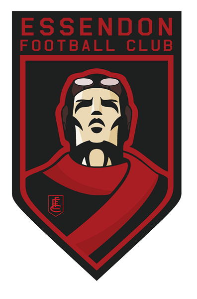
If you want a new Essendon club logo, no one can top ScottFreo's Essendon logo.
BomberHead5Copy_zpsca91ff4b.png
 
If you want a new Essendon club logo, no one can top ScottFreo's Essendon logo.

BomberHead5Copy_zpsca91ff4b.png

Not really my thing.

I like the title though - maybe that's the way it should be on mine - red and black and integrated.

I think basically if you replaced the graphic section with the shield above by TheFreightTrain it'd be sweet.
 
Last edited:
If you want a new Essendon club logo, no one can top ScottFreo's Essendon logo.

BomberHead5Copy_zpsca91ff4b.png
I think it is too busy for mine. I'm not really a fan of the man, but like the shape of the shield, the writing on top and the logo on the man's chest. I also like the jumper with the sash.

Maybe if the man is removed, the logo on the chest is expanded to cover most of the shield and the sash is kept on the bottom right side of the shield. That would be simple and won't be outdated in 20 years time. I think the shape of the shield is on point.
 

Log in to remove this ad.

Anyone with photoshop skills know how to enlarge the logo on the man's chest above? The EFC monogram with the shield. And then put it in place of the man while maintaining the Essendon Football Club on top, the red margins and adding est 1871 at the bottom. And maybe a separate one with the enlarged monogram that maintains the red sash at the bottom right side of the shield. Of course running it's length instead of wrapping around.

Thanks in advance.
 
I think it is too busy for mine. I'm not really a fan of the man, but like the shape of the shield, the writing on top and the logo on the man's chest. I also like the jumper with the sash.

Maybe if the man is removed, the logo on the chest is expanded to cover most of the shield and the sash is kept on the bottom right side of the shield. That would be simple and won't be outdated in 20 years time. I think the shape of the shield is on point.

Agree. The shape of that shield is great. Personally thinkt he sash has to be front and centre though like TheFreightTrain did.

Some hella talented people on here.
 
Agree. The shape of that shield is great. Personally thinkt he sash has to be front and centre though like TheFreightTrain did.

Some hella talented people on here.
Yes. I can't even design using basic paint.

I don't mind either, but I'd like the monogram bigger and the centre of the logo, with the sash added for a sense of history.

We can both agree that we don't want no cartoon looking plane with Bombers written in bubbly cartoon looking font.

Bombers cannot be written in the logo at all.
 
Anyone with photoshop skills know how to enlarge the logo on the man's chest above? The EFC monogram with the shield. And then put it in place of the man while maintaining the Essendon Football Club on top, the red margins and adding est 1871 at the bottom. And maybe a separate one with the enlarged monogram that maintains the red sash at the bottom right side of the shield. Of course running it's length instead of wrapping around.

Thanks in advance.

Without a vector version of the logo- it's not really possible without re-drawing it, and plus, I'd feel pretty uncomfortable f**king around with ScottFreo's design- it's his intellectual property and he's a fellow member of the board.
 
Bunk Moreland are you familiar with Geelong's logo set up?

LOGO8.gif


They have 2 logos. 1 for kids and 1 for adults, basically. I think Essendon could definitely do something along those lines and do it well.

I mean, 1 logo is fine too but it's an idea worth exploring.
 
Bunk Moreland are you familiar with Geelong's logo set up?

LOGO8.gif


They have 2 logos. 1 for kids and 1 for adults, basically. I think Essendon could definitely do something along those lines and do it well.

I mean, 1 logo is fine too but it's an idea worth exploring.

Yep seen them. Whilst not a logo as such, we do have Skeeta, our mascot, which I think is a pretty good one for the kids, and it's front and centre on a lot of junior merchandise.

I'm probably biased, I've just never liked our current logo, ever since the late 90s when it was introduced. I'm a fan of something much simpler and more traditional - I think the red sash should be at the heart as it's the one enduring symbol of the club.
 
The SF logo is so genius because it replaces the plane with an old school pilot, a character that evokes stories of dogfights and survival. Stronger imagery than either an old plane or the one they're using now, because they have a tendancy to date or represent something a bit more sinister.

There's a couple of brilliant nuances too, from the integration of the sash - easily the most iconic Essendon imagery, to the upward tilt of the pilot's head, symbolising the arrogance and pride the footy club and its supporters carry (do not mean this is a bad way at all).
 
The current Essendon logo is so soulless, and doing a simple shield with a stripe is really boring.

ScottFreo absolutely nailed it. Concept and execution. It's just phenomenal.
 

(Log in to remove this ad.)

The current Essendon logo is so soulless, and doing a simple shield with a stripe is really boring.

ScottFreo absolutely nailed it. Concept and execution. It's just phenomenal.

For me I just want something thats
simple, classy and implements a few important factors.

The red sash is the single enduring symbol of the club and should be foremost IMO.

The club is nearly 150 years old, there should be something that nods to that, like the simple "1871".

Some more use of the club motto. Whilst perhaps not appropriate for all applications, so perhaps just an add on, but as the club rebuilds itself it's something that should be seen more for some historical context.

Finally, for mine we'd want to have a pretty good reason for having anything on there thats not red or black. They're the best colours in the league (biased? haha) and particularly with that *in grey jumper appearing, I think we want to limit lighter colours as much as possible. The current logo has a lot of *in grey.

The ScottFreo version is a work of art, no doubt. I guess the only thing is it is just a bit cartoonish, IMO only. Perhaps we're just overly sensitive about that as we seek a change from the current abomination.
 
Bunk Moreland are you familiar with Geelong's logo set up?

LOGO8.gif


They have 2 logos. 1 for kids and 1 for adults, basically. I think Essendon could definitely do something along those lines and do it well.

I mean, 1 logo is fine too but it's an idea worth exploring.
I don't know if anyone could do it but it would look cool with the two cats logos merged.
Use the kid logo, take away the CATS underneath and replace it with the est, fc banner from the adult logo.
Never have liked that adult logo cat, doesn't look right.
 
I don't know if anyone could do it but it would look cool with the two cats logos merged.
Use the kid logo, take away the CATS underneath and replace it with the est, fc banner from the adult logo.
Never have liked that adult logo cat, doesn't look right.
Like this? (sorry about the blurriness, it was a very quick edit)
z.png
 
Can someone please make me a Jack Ziebell computer background?
 
How do you make the colour tint over the top?
Im not 100% sure what alzy11 does, but id say its probably a gradient acrosss the image that has been overlayed. That is, he makes a gradient, and down where the layers are shown, it has been selected as 'Overlay" instead of "Normal"
 

Remove this Banner Ad

Back
Top