Discussion Random Chat Megathread Mk II

And an even sneakier peak...

2AXxjcB.png


I tell you what - recreating monograms in vector format is an absolute pain in the ass, as is trying to find BBL club logos in vector - but, we got there in the end.

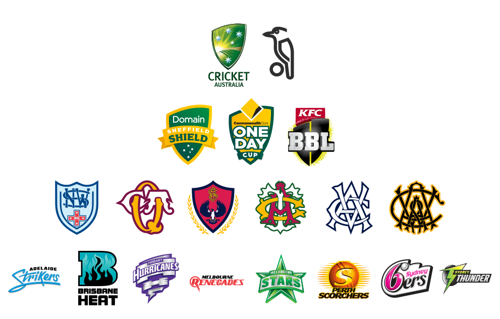
Essentially, going to be working on a full Australian Cricket portfolio covering the national team as well as the three domestic competitions. Probably won't have anything up for a while, especially with NAFL dropping soon, but I'm excited to get this all underway.

Just with an update on this - just finished the last jersey design for this, so expect to see the folio start up in the coming week or so.
 
Gibbsy & Red Crow - was thinking perhaps we could have a stickied thread for portfolios in a similar sort of thing to what the CCSL forum has for it's hall of fame threads where all completed portfolios can be easily accessed, which is useful for new members, lurkers etc. who want to go back and see these folios. A lot of great stuff from many designers on this board that have disappeared with time, so if it's something that people would want, and you guys feel is worthwhile, I'm happy to help collate the portfolios.
 
I'd much prefer the subboard.
Who is going to keep updating the megathread, and what qualified as a "past portfolios"? Finished portfolios, or largest one, or regular posters.
Also starting to get confused with so many different threads discussing variations, ideas and the actual Port Adelaide logo.

I’ll update it.

What will qualify will be completed portfolios, which will then be sorted by user and by date. I already have a lot of this already over the past few years with the POTY nominations.

If someone’s folio hasn’t been put on, they’d be welcome to send me a message to have it added.

This won’t include workshops, and I’m not sure how this thread would be confusing, it would be a stickied thread that acts as a hub to find all completed portfolios. If anything a sub board would be more confusing due to the high number of unfinished folios on the board.
 
This won’t include workshops, and I’m not sure how this thread would be confusing, it would be a stickied thread that acts as a hub to find all completed portfolios. If anything a sub board would be more confusing due to the high number of unfinished folios on the board.
What I am getting at, is that there are three threads all at once that discuss the Port logo, moving portfolios and/or workshops to a subboard helps distinguish between user content and official AFL news. I know we have tags, when everything is in one massive list, it's harder to figure out.
 
So... the EFL just rebranded to the EFNL and adopted a new logo that although looks slick and modern, I honestly reckon could've been whipped up in 15 minutes and I'm sure there's a few on this board alone who could've done a better job:

EFNL_Brandmark_OnWhite_Full_RGB-1-880x530.jpg
FOOTYEFL.png


For clarification, the EFL Organisation operates a footy league (the Eastern Football League) and a netball league (EFL Netball).
So they've decided to merge these identities into one for both leagues. Honestly feel pretty bummed about this, not only does the league not have a simple name like before (EFL), but the logo itself looks like it would be for an oil company. It doesn't look like a footy or a netball - it looks like a beachball.

Really should've rebranded the organisation itself to "Eastern Sporting Inc." or something like that, who operate two separate leagues - the EFL and the ENL.
That way they haven't locked themselves to just Footy and Netball for the future and both sporting leagues can be respected as separate entities with consistent branding, rather than being "frankensteined" together for corporate brownie points.

Also not to mention the costs for all 40 teams to get 40+ new jumpers made up with the new logo when the old one would've been amazing if it'd been touched up a bit.
 
Last edited:
1571126070722.png
1571126080426.png


This is what I would envision as the logos of the new teams (if we had to stick with this design).
I'd design the netball league's "ball" to look like a netball, with the footy leagues "ball" on the left to be shaped more closer to a footy.
They could branch this theme out for other sports they could potentially expand to in the future, like cricket, basketball, softball, etc.
 
The logo is nice. Incorporates the netball and then the football in the dead space.

No issue with naming it the EFNL. We already have the Southern Football Netball League, Northern Football Netball League, and the South East Netball Football League And with the National Netball League already going about linking footy and netball, it’s gonna get more and more popular. Most of the country leagues would bit this bill as well.
 

Gibbsy

Cakewalk
Oct 12, 2009
23,613
27,536
Geetroit
AFL Club
Collingwood
So... the EFL just rebranded to the EFNL and adopted a new logo that although looks slick and modern, I honestly reckon could've been whipped up in 15 minutes and I'm sure there's a few on this board alone who could've done a better job:

EFNL_Brandmark_OnWhite_Full_RGB-1-880x530.jpg
FOOTYEFL.png


For clarification, the EFL Organisation operates a footy league (the Eastern Football League) and a netball league (EFL Netball).
So they've decided to merge these identities into one for both leagues. Honestly feel pretty bummed about this, not only does the league not have a simple name like before (EFL), but the logo itself looks like it would be for an oil company. It doesn't look like a footy or a netball - it looks like a beachball.

Really should've rebranded the organisation itself to "Eastern Sporting Inc." or something like that, who operate two separate leagues - the EFL and the ENL.
That way they haven't locked themselves to just Footy and Netball for the future and both sporting leagues can be respected as separate entities with consistent branding, rather than being "frankensteined" together for corporate brownie points.

Also not to mention the costs for all 40 teams to get 40+ new jumpers made up with the new logo when the old one would've been amazing if it'd been touched up a bit.

The old one sucked. "footyEFL" is a ridiculous name and I'm sure no one said it. I like the new one - it looks '80s' and 'now' at the same time. No problem with having Netball in the title too. The two sports have coexisted in the Geelong region for over 10 years; it's happening everywhere. One can't survive without the other at a local level.
 
"footyEFL"
We just call it "EFL", but that was just the tag line they were going with, no one really cared because Footy was what was important. I agree old logo was dated, but laid the foundation for a design agency to make something real good.

The logo is nice. Incorporates the netball and then the football in the dead space.
No issue with naming it the EFNL. We already have the Southern Football Netball League, Northern Football Netball League, and the South East Netball Football League
Actually thanks! Didn't see the footy there in the negative space so that helps quite a bit. Also have to mention that the font is far better (still can't unsee the beachball :p).

But in regard to the naming/branding (being my main point of contention), that's the exact issue. Everything that made the biggest semi-professional suburban league in Victoria unqiue (such as white umpiring uniforms as well) is being phased out until we look no different to the Northern, Southern, South East, etc, etc Football Netball League.

Also demeans fans of both leagues as the netball league is made to look like they can't support themselves without being attached to the footy (which isn't completely false, but that's another issue entirely), while also pssing the fans of the footy league because they're being amalgamated with a competition that the majority don't know or even care about.

Might just be me as a passionate Blackburn supporter and follower of this league for my whole life that gets me. I see this as a completely unnecessary change, though could've been perfect if executed ever so slightly differently.
 
Oct 27, 2016
5,931
10,591
AFL Club
Collingwood
Other Teams
Packers, Raptors, Renegades
Aesthetically, I think it could've been better. I like the negative space of the footy I guess but it just looks like a beach ball the more I look at it.

EFL has never been known for Netball so that's my main issue with the rebrand. Netball holds 0.1% of the leagues interest and money. If they wanted to, they could've had two logos, one for the EFL, Eastern Football League, and one for the Netball league.

As one of the biggest suburban leagues in Australia it would be cool to have a point of difference but I guess we're just following what all the other leagues are doing.

One thing I will say is that the old logo was due for an update, but only minor such as thickening the line. Our logo now looks like a corporations logo rather than a league logo. Just mocked up a few alterations here.

NEW EFL LOGO 3.png
NEW EFL LOGO.png
 
Sep 16, 2016
1,888
3,291
I have no idea
AFL Club
Western Bulldogs
Other Teams
Quite a few
Gibbsy & Red Crow - was thinking perhaps we could have a stickied thread for portfolios in a similar sort of thing to what the CCSL forum has for it's hall of fame threads where all completed portfolios can be easily accessed, which is useful for new members, lurkers etc. who want to go back and see these folios. A lot of great stuff from many designers on this board that have disappeared with time, so if it's something that people would want, and you guys feel is worthwhile, I'm happy to help collate the portfolios.
I'd much prefer the subboard.
Who is going to keep updating the megathread, and what qualified as a "past portfolios"? Finished portfolios, or largest one, or regular posters.
Also starting to get confused with so many different threads discussing variations, ideas and the actual Port Adelaide logo.
Sort of on this topic Gibbsy Red Crow what if we did a sort of board AGM? Basically decide what we want to do regarding stuff like this
 
Back