fancyscum
Radical Crommunist
you may not like it but this is what the ideal male body looks like:It was back when Jars was skinnier and a half decent looking bloke.

Follow along with the video below to see how to install our site as a web app on your home screen.
Note: This feature may not be available in some browsers.
you may not like it but this is what the ideal male body looks like:It was back when Jars was skinnier and a half decent looking bloke.

I'm a male and I may or may not resemble this photo...you may not like it but this is what the ideal male body looks like:


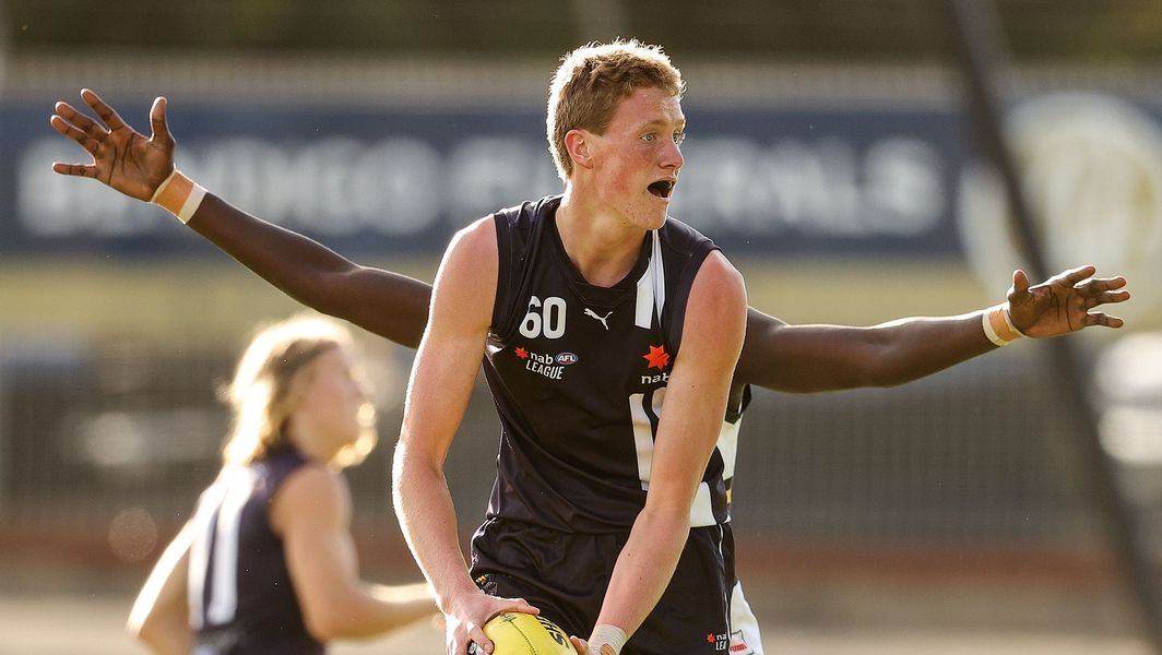
Toby Conway is one of the leading ruck prospects in this year's draft and could become the first player with 4 arms to play AFL.


Always interesting to see what jumpers overseas footy teams are wearing.
The USAFL Power team got their hands on Port's 2013 NAB Cup guernseys, which completely lack sponsors.
View attachment 1195810
View attachment 1195816
This jumper is a little interesting to me. Port lightning jumper with silver instead of teal, has the teal just faded so much to become silver or was it a training jumper? Or even a prototype?
View attachment 1195802
Heaps of those teams in the USAFL have mint PI/MW gear from AFL clubs. It’s heartbreaking for jumper collectors here in Aus.


Just go play for them, rack the jumper than return to aus with the goods.Yep, best Crows clash guernsey of all time lies in the hands of the Austin Crows. Don't think I've ever seen a PI of this for sale in my five years of shopping for jumpers, if I did I would have tried to buy it.
View attachment 1196247
View attachment 1196246
Thing is they haven't worn these guernseys in many years as they wear newer stuff now, I really hope they didn't throw them out...
Just go play for them, rack the jumper than return to aus with the goods.

Hiyall! Scott here
Favoured Collingwood (or Port) back then by the looks!

Blue Eagle on Yellow uniform.View attachment 1212538
Blue Eagle on Yellow uniform.View attachment 1212538
It's funny it's an error, because I've wanted them to make The Eagle blue on the yellow uniform because it looks better.Everything that is old is new again, it has a 1987 feel to it
You think it looks better? I think it looks like a mistake.It's funny it's an error, because I've wanted them to make The Eagle blue on the yellow uniform because it looks better.
You think it looks better? I think it looks like a mistake.
It doesn't make sense to invert the colours of your logo because the shadow needs to be in the darker colour (the blue).

What he's trying to say is with the current Weagles logo, the inverse looks horrid, and it does. Because the logo relies on a darker colour (blue) to be the shadow, it doesn't work when you inverse it because it goes against a lighter colour.Literally West Coast's first guernsey, which that clash guernsey is seemingly based off had the blue Eagle on yellow. It looks better because it adds a contrast between the two. The Eagle being yellow on a yellow uniform doesn't stand out at all.
View attachment 1212988


It needs a black eye, but it’s still better (shadow notwithstanding).What he's trying to say is with the current Weagles logo, the inverse looks horrid, and it does. Because the logo relies on a darker colour (blue) to be the shadow, it doesn't work when you inverse it because it goes against a lighter colour.
View attachment 1213057View attachment 1213058
The difference is night and day.