Remove this Banner Ad

Media TiFmedia Presents... Random Sweet FA stuff I like - Ep 1: Kits

🥰 Love BigFooty? Join now for free.

XqPr3wX.png


Random Sweet FA stuff I like... with TheInjuryFactory
Episode 1: Kits


Ladies and Gentlemen,

In the interests of celebrating Season 40
(which seems weirdly taboo for some reason) and the upcoming Heritage Round in Rd 14, I was recently inspired by a piece of my own media straight out of TheMediaFactory™ in fact.

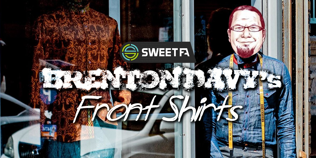
It was a laydown misère of a media concept proposed for old mate Brenton Davy, called 'Brenton Davy's Frontshirts'. Cos you know, he liked to talk about shirtfronting ALOT.
p8nx138.png


Brenton Davy’s Front ShirtsBrenton Davy does a complete 180 and shows us another side to his gruff, caveman-like persona by proving himself to be quite the discerning fashionista, as he carefully and methodically reviews both current and historical Sweet FA club kits to declare his personal favourite for each club.


p8nx138.png


Brenton Davy’s Front ShirtsBrenton Davy does a complete 180 and shows us another side to his gruff, caveman-like persona by proving himself to be quite the discerning fashionista, as he carefully and methodically reviews both current and historical Sweet FA club kits to declare his personal favourite for each club.

The concept was as beautiful as it was simple, but obviously not simple enough for old mate Brenton Davy. Because he didn't even reward the incredibly generous offer of free of charge, bespoke, flat-packed for easy assembly media dynamite from one of the renaissance masters of Sweet FA media with a token react.

So now I'm taking it back, you ungrateful sod. It's a bloody terrific idea for a thread, and it's mine now and you can't have it back.

Which brings me back to this here thread, as I look to kick off what might even become a series, based on random Sweet FA stuff I like. This first edition is an homage to Heritage Round you see. As a hobby curator of the odd piece of Sweet FA history and memorabilia here and there, I've dug into my own extensive library of club kits sourced and saved down over the journey to select my all-time favourite kit for each of the current Sweet FA clubs. Yes, even the Old Boys.

Now this is the first historical thread for a while where I haven't utilised Sweet FA+ and so don't need to credit Hate for his incredible work, but as arguably the league's greatest historian and an inspiration to those of us who dabble, I am going to anyway.

I was going to hold off on this one until next week, but I figured there's no time like the present to get clubs thinking about their history prior to Heritage Round.

So that's it. Happy S40 everyone. Here's a bit of club nostalgia for your face, courtesy of me.

I might do logos next, or media threads, or exhibition matches, I don't know. We'll see.

Get around it. :thumbsu:
 
Last edited:
Baghdad Bombers - S19 Away Kit New
OT3aDoo.png

Baghdad Bombers
Season 19 Away Kit (Then known as Baghdad Bandits)

Designed by TBC

hjvRIQi.png


TiF's two cents...

This is a spectacular kit. It's a pretty big departure from the majority of Baghdad's kits both before it and since, I love the Bandits logo and definitely rated the aesthetics of the whole Bandits rebrand era. That said, for the most part, the Bombers branding has been bold and sharp, whilst still finding room to depart somewhat from their real world counterparts.

For those who might not know, and to be honest I'm hardly an expert on the topic myself, the Bombers rebranded to the Bandits from S18 - S21 under the leadership of Gee Dub and his successor Shermy who assumed the reigns and retained the Bandits moniker. In fact surprisingly it was our old mate beez who returned Baghdad to their Bombers roots in S22, so I guess we probably have him to blame for everything since.

I just really like this one. I like the predominantly white look with the away kit, I like the bold Baghdad red and Bandit era gold broad stripes with the smart little black pinstripes, I love the gold cuffs and collar and this was just a really nice one to get to recreate. Jabba73 and co, feel free to consider slapping this one on next weekend to celebrate Heritage Round in style.
 
Last edited:
Coney Island Warriors - S34 Commemorative Kit New
dpYjTf9.png

Coney Island Warriors
Season 34 Whore Tree Commemorative Kit

Designed by TheInjuryFactory

vHxYfRj.png

TiF's two cents...

It was tough doing my own club, especially since every kit that's not our OG kit since S26 has been one of my designs. And even that one I modernised when I arrived at the club and got myself a snazzy template. This is possibly my favourite of the lot, although you're not supposed to have favourites, I just really like the tree homage and the departure from the 'W' dominant original kit. It's a very different look and feel to the typical Warriors kit, but it's still 110% Wazza and I love that.

The Whore Tree has been such a consistent mascot for the club ever since the concept was coined all those years ago now. While it already features subtly on the standard kit, the S34 celebration of the Whore Tree's anniversary demanded centre stage for our beloved tree to be worshipped by all you dendrophiles out there.

The S34 commemorative kit then inspired our S35 Heritage Round 'stealth' kit, which was a close runner up in the fave stakes. I love the striking all black base leaving the persimmon Whore Tree motif to feature one out, with the off-centre wrap around allowing for a 50/50 split of the tree in all her glory on both the front and back sides of the kit. With our original kit being such a timeless, statement look and almost untouchable from a rebrand/reimaging perspective, we do try to get creative with our Heritage Kits/commemorative kits each season and this was a fun one to put together.

Interested to know your favourite, bossman? :think:
 
Last edited:
Dragons FFC - Season 30 Heritage Kit New
M7zI8qq.png

Dragons FFC
Season 30 Heritage Kit

Designed by TBC

U4sEwWv.png


TiF's two cents...

This is another really smart looking kit. While the Dragons have quite the extensive back catalogue of kits owing to the fact that they've not only actively updated their look at regular intervals over their tenure, but also to the fact that they are the result of a merger that occurred back in Season 7 between the Southern Sharks and Dragons FC to create the Southern Dragons, who went on to become the Dragons FFC we see before use nowadays.

This particular kit is an homage to their history and elements of both of their feeder club's original kits as a bit of a riff on the OG Southern Dragons kit, however with an added nod to the Southern Sharks with a striking blue feature retained from the Sharks' blue, white and grey colour palette. The modern day Dragons rolled this one out as part of the S30 league celebrations in Heritage Round, and this was another enjoyable one to recreate.

The kit features the bold white cross base from the S8-S9 Southern Dragons Kit, with the Southern Sharks blue featured on one side of the chest, and the Dragons FC/Southern Dragons red featuring on the other side of the chest. The bold green Dragon motif while a tad simple and cartoonish just somehow works. I have to say, the S17-S22ish era of the Dragons kits were very stiff in selecting my fav, with the S22 away longy in particular another big personal favourite and just a really beautiful kit that only just missed the cut.
 
Last edited:

Log in to remove this Banner Ad

Do you wanna know something really freaking random, TheInjuryFactory?

In the last 48 hours I've watched two French movies: one where fluorescent pink paint was used on a motorbike and the other with a really sweet song about seashells.
 
As a fellow fashionista I approve of this thread. Nice to see a fresh new thread for the spring season.

However, I do hope we see the return of buttons on guernseys in the near future.

Who doesn't love a nice button?
 
East Side Hawks - Season 27 Home Kit New
kTtxmTs.png

East Side Hawks
Season 27 Home Kit

Designed by Barrybran

zTYjtSl.png


TiF's two cents...

The first of the Barrybran kits... there's ALOT more to come. (Sorry for the dodgy knock off of your logo brother!)

This is an early days Barrybran special this one, as Agent93 engaged Baz for a zoosh of the Hawks kits in S27 after some of his stellar guernsey work at the Bears in his rookie season all the way back in S26. I just like the boldness of this design. The Hawks logo at the time was a straight rip of the Atlanta Hawks, but it was still a really smart, sexy logo that lends itself superbly to featuring on the kit.

Much like the Bombers, the Hawks historically haven't departed very far from their trademark rich dark green and canary yellow aesthetic over their extensive history, but this was just the smartest, cleanest look with the boldest colours I think they've managed and I really loved them at the time, and really loved getting to recreate them. In fact this kit persisted for some time as the Hawks main kit between S27 and S31, before those dastardly Phoenix dirtbags almost blew up the club.

Like I say, I think the bold colours, the striking contrast with the Hawk lifted from the logo, the brewery no one's ever heard of before or since as a sponsor, Barrybran flexing his kit expertise on a league that wasn't ready, and a bold skipper in Agent93 at the command of an equally bold squad at the time that filled these bad boys out. Another ripper.
 
Last edited:
Do you wanna know something really freaking random, TheInjuryFactory?

In the last 48 hours I've watched two French movies: one where fluorescent pink paint was used on a motorbike and the other with a really sweet song about seashells.
Dammit beez now I have to revise my list.

maps :crossmark:
French movies :whitecheck:
 
Fighting Furies - Season 25 Away Kit New
yNk6xM1.png

Fighting Furies
Season 25 Away Kit

Designed by Cody_

kyXzhQQ.png


TiF's two cents...
I might be one out here with this one, but I just really liked this one for some unknown reason I can't put my finger on. Maybe because it's the kit the NaturalDisaster led Furies got belted in the granny in? Nah, it's probably not that. This one featured as the away kit for the S25-S26 seasons with the reverse featuring that grape colour as the base for the home kit. As another club with the majority of their kits featuring a consistent colour palette being black and gold for the Furies, these ones were quite unique against the rest.

There's probably a touch of nostalgia there for me, as this was the Furies kit during my initial foray into the league, and so it holds a bit of personal significance there. This was the last kit before the Tigerturbulance led push into the zany world of nuclear fluro pink which progressed to the licorice all sorts we see before us today, and yet was retained as a heritage kit by Barrybran when he rebranded the Furies kit and logo for S27 so I guess Baz must have liked it to, as yet another club enlisted his services at the time after his flair shown with the Bears kits.

It's probably just me, but I just really like this one. It was a fun kit to recreate, I love the contrast of the colour palette with the pink and grape contrasting nicely against the banana-like yellow, it's kinda stayed with me over the seasons as a personal fav and I think it just strikes a chord with a time before the Furies kinda went off the rails abit and shifted away from what was a really strong club & brand identity.
 
Last edited:
Gold City Royals - Season 24 Away Kit New
4XuYlGX.png

Gold City Royals
Season 24 Away Kit

Designed by fancyscum

ChBRMlT.png


TiF's two cents...

The Royals have a huge amount of variety in their kits for an expansion club, and I've even had the pleasure of commissioning one of their kits back in Season 30 actually. But in terms of my favourite, I landed on this one. It marked a pretty big shift away from a fairly established colour palette of a kind of strawish gold, dark magenta and grape purple to a bolder, brighter look of a regal purple and gold with a complete overhaul of the club's entire branding led by skipper Blacky in S24, which included a logo change that has heavily influenced the kits from that point forward.

It was an era of change for the Royals at the time, and with Blacky, then fumbler then The Filth Wizard at the reigns, this era was a notable one for the club that set them on the path to their maiden premiership in S30 so I guess all the turmoil was worth it, and they looked bloody sensational while they were doing it. I'm guilty of a bit of prime mid S20s romance with this one, but it really is a striking look.

I think they nailed it with this one at the time, with a simple crown motif taking centre stage. It was easily reversible for the home kit and is reminiscent of equally bold two tone kits across other well known leagues we won't name. I love the strong colours, It was tricky to recreate but was fun to make, and I just love the simplicity of it and how it tied in so well with the logo at the time as a fresh look for the club after what had previously been some pretty chaotic kit aesthetics.
 
Last edited:
Gumbies FFC - Season 30 Away Kit New
T0olNmN.png

Gumbies FFC
Season 30 Away Kit

Designed by Barrybran

8MWJcEG.png


TiF's two cents...

Look at this magnificent piece of work. Another Barrybran special, let's face it you'd be hard pressed to find a Gumbies kit from the Baz era that doesn't slap. While reminiscent of earlier Gumbies kits, the Season 30 away kit just hits the perfect balance of a predominantly white away kit while highlighting the Gumbies hallmark blues.

In fact this kit captures probably the zenith of the Barrybran era at the Gumbies, when the long time skipper was at the peak of his powers and was grafting away to lure high profile recruits and build credibility for the club, and it all started with the aesthetics and professional branding that set the tone. Besides the Baz era kits which were hard to separate, I have to say I have quite a soft spot for the Wolves era kits circa S19-S23.

There's not much Baz does that I don't like, but I just really liked this one. I just loved the clean crispness of the white kit with the smart navy and cobalt stripes. It's just a really sharp, simple look but done to perfection. It was a campaigner of a kit to recreate and maintain the scaling, but the end result is a semi decent homage to Barrybran's work. Just don't look to closely at the stripes.
 
Last edited:
yNk6xM1.png

Fighting Furies
Season 25 Away Kit


kyXzhQQ.png


TiF's two cents...
I might be one out here with this one, but I just really liked this one for some unknown reason I can't put my finger on. Maybe because it's the kit the NaturalDisaster led Furies got belted in the granny in? Nah, it's probably not that. This one featured as the away kit for the S25-S26 seasons with the reverse featuring that grape colour as the base for the home kit. As another club with the majority of their kits featuring a consistent colour palette being black and gold for the Furies, these ones were quite unique against the rest.

There's probably a touch of nostalgia there for me, as this was the Furies kit during my initial foray into the league, and so it holds a bit of personal significance there. This was the last kit before the Tigerturbulance led push into the zany world of nuclear fluro pink which progressed to the licorice all sorts we see before us today, and yet was retained as a heritage kit by Barrybran when he rebranded the Furies kit and logo for S27 so I guess Baz must have liked it to, as yet another club enlisted his services at the time after his flair shown with the Bears kits.

It's probably just me, but I just really like this one. It was a fun kit to recreate, I love the contrast of the colour palette with the pink and grape contrasting nicely against the banana-like yellow, it's kinda stayed with me over the seasons as a personal fav and I think it just strikes a chord with a time before the Furies kinda went off the rails abit and shifted away from what was a really strong club & brand identity.
If James Colorado wanted to, and maybe if we went down the path of those NHL Reverse Retro jerseys, he could have these redone in the Furies current colours.
 

Remove this Banner Ad

dpYjTf9.png

Coney Island Warriors
Season 34 Whore Tree Commemorative Kit


vHxYfRj.png

TiF's two cents...

It was tough doing my own club, especially since every kit that's not our OG kit since S26 has been one of my designs. And even that one I modernised when I arrived at the club and got myself a snazzy template. This is possibly my favourite of the lot, although you're not supposed to have favourites, I just really like the tree homage and the departure from the 'W' dominant original kit. It's a very different look and feel to the typical Warriors kit, but it's still 110% Wazza and I love that.

The Whore Tree has been such a consistent mascot for the club ever since the concept was coined all those years ago now. While it already features subtly on the standard kit, the S34 celebration of the Whore Tree's anniversary demanded centre stage for our beloved tree to be worshipped by all you dendrophiles out there.

The S34 commemorative kit then inspired our S35 Heritage Round 'stealth' kit, which was a close runner up in the fave stakes. I love the striking all black base leaving the persimmon Whore Tree motif to feature one out, with the off-centre wrap around allowing for a 50/50 split of the tree in all her glory on both the front and back sides of the kit. With our original kit being such a timeless, statement look and almost untouchable from a rebrand/reimaging perspective, we do try to get creative with our Heritage Kits/commemorative kits each season and this was a fun one to put together.

Interested to know your favourite, bossman? :think:
Tough one brother. I probably lean towards the s35 Whore Tree Stealth kit marginally over the s34 persimmon Whore Tree one, but as you rightly point out there's so many to choose from. The classic W kit is elite, perhaps the greatest and at least the most recognisable of the regular kits going around. I'm also partial to the ones that rock the ye olde CIW monogram (the black and white s33 Heritage kit is a great point of difference to the others).

Great trip down memory lane, and thanks for putting up something to commemorate the 40th trip around the sim.
 
OT3aDoo.png

Baghdad Bombers
Season 19 Away Kit (Then known as Baghdad Bandits)


hjvRIQi.png


TiF's two cents...

This is a spectacular kit. It's a pretty big departure from the majority of Baghdad's kits both before it and since, I love the Bandits logo and definitely rated the aesthetics of the whole Bandits rebrand era. That said, for the most part, the Bombers branding has been bold and sharp, whilst still finding room to depart somewhat from their real world counterparts.

For those who might not know, and to be honest I'm hardly an expert on the topic myself, the Bombers rebranded to the Bandits from S18 - S21 under the leadership of Gee Dub and his successor Shermy who assumed the reigns and retained the Bandits moniker. In fact surprisingly it was our old mate beez who returned Baghdad to their Bombers roots in S22, so I guess we probably have him to blame for everything since.

I just really like this one. I like the predominantly white look with the away kit, I like the bold Baghdad red and Bandit era gold broad stripes with the smart little black pinstripes, I love the gold cuffs and collar and this was just a really nice one to get to recreate. Jabba73 and co, feel free to consider slapping this one on next weekend to celebrate Heritage Round in style.
1761702202263.png
 
So now I'm taking it back, you ungrateful sod. It's a bloody terrific idea for a thread, and it's mine now and you can't have it back
You think Ive got time for a bullshit media piece like this? That would be marginally more fun than getting a hand job from Edward Scissorhands!
 
You think Ive got time for a bullshit media piece like this? That would be marginally more fun than getting a hand job from Edward Scissorhands!
Can't just go around yucking someone's yum like that, BD.
 

🥰 Love BigFooty? Join now for free.

Las Vegas Bears - Season 18 Clash Kit New
oEiwpbp.png

Las Vegas Bears
Season 18 Clash Kit

Designed by lmach

PsDO9Ip.png


TiF's two cents...

I have no real clue about the actual backstory to this one, but this is one of the more random official Sweet FA kits in league history and I'm here for it. The Bears set the stylistic tone for what was to come out of Vegas in their return to the league in Season 18 after a 10 season hiatus having gone into Sweet FA hibernation after Season 7. Whilst sticking pretty closely to their stock and trade branding since S18, one thing the Bears have done exceptionally well over the journey has been their clash/special kits.

This particular kit was the clash kit for the successful return of the Bears franchise in the same expansion intake as the Warriors. Skippers pantskyle and DemonJim led the newly re-formed Bears with a set of striking kits to match with a quality crop of recruits including a raft of hall of famers - brahj, Dingster and both skippers, decorated veterans like The Half Back & Quivorir, and club legends kane249 & Matera92 just to name a few.

The regular kits paid homage to the OG Bears in retaining the 'V' chested design, but made a shift away from their navy and orange look to their traditional orange, maroon and black palette we know them by today. This kit, while retaining the maroon and orange colours, features the large baby bear motif secured by a baby sling, which I can only assume was a nod to their return to the league representing the squad of baby Bears they'd assembled. It's got a collar which is rare, it's got a weird baby body with the Bear from their logo on top, and it's bright orange. What more can I say?

The Bears S29 Finals Kit was very, very stiff here but I just couldn't walk past this bad boy and already had it up my sleeve from a previous Heritage Round so it was a no brainer.
 
Last edited:
Mt Buller Demons - Season 28 Clash Kit New
9PnaWIK.png

Mt Buller Demons
Season 28 Clash Kit

Designed by Barrybran

kpuRXvK.png


TiF's two cents...

This is another really smart kit I like. The Demons are yet another club who has heavily leveraged Barrybran's talents for their aesthetic, and Baz took the reigns for the foundation club to pay homage with a thoughtful nod to the S16-S23 era kit but with a sleek modern approach.

The kits were commissioned by then newly minted skipper manangatang, and while the Dees retained their timeless S24 logo, their kits were brought to life having lagged behind many clubs in this space in the preceding era. This was a time when the Dees were riding high with an unrivalled era of dominance the league has rarely seen, with Mr 74% himself Yakker handing over the reigns at the peak of his powers to a barnstorming mang emerging into his own era of excellence as he took the club from strength to strength over an impressive 10 season stint at the helm.

I think we've established I'm an unashamed Barrybran fan, and I'm fond of a dominant white away kit, but this is another I just love for it's crispness and it's simplicity. It's faithful to the club's red and blue palette first implemented way back in S3 at the rebrand from Team Pump to Mt Buller, with the silhouette of the club's mountain range motif and the strong white kit is a clever nod to the Snow Dome itself. This was a really nice one to recreate, simple yet sharp.
 
Last edited:
Ophidian Old Boys - Season 34 Clash Kit New
i81VsLa.png

Ophidian Old Boys
Season 34 Clash Kit

Designed by TBC

XjaAfiD.png


TiF's two cents...

I really quite like this one. The Old Boys only have the one set of official kits to my knowledge, although who knows with the literal thousands of different variations sported in match threads and media threads in their plethora of AI images, most coming from the club's players/leaders themselves. In fact there's been so many variations of their club kits/colours over the past 6 and a bit seasons, that I was almost taken aback when I actually reviewed their kits because I don't think I've actually seen the OG set since S34.

The Old Boys as we know are the league upstarts and most recent expansion club, having successfully earned a license and path into the league during the S33 season. Tigerturbulance, Mobbs and a handful of well known and very mercenary vets and their wives/girlfriends/brothers in law joined the league officially in S34, with a unique and very sharp set of club branding which included this beauty we see before us. The club's official colour palette included a soft purple with orange and white rounding out the look which they retain to this day, and the OG kits incorporated these into a very smart set of a home, away and clash.

In recreating the clash kit here, I couldn't quite source the same snake motif as the original, so it's not quite a replica but more of an homage. I do appreciate a bit of a high transparency overlay to give a kit some additional depth where clubs can incorporate a mascot/iconography of the club into a basic kit design, and I think it works with the two bold mid section bands. I think the purple dominant kit is a more striking contrast personally, and I'd probably have preferred to see it as the home kit over the white, with the orange version as the clash. But that's just my two cents.
 
Last edited:
Roys FFC - Season 19 Home Kit New
EcbCk03.png

Roys FFC
Season 19 Home Kit

Designed by Klim

0SibpMZ.png


TiF's two cents...

I LOVE this kit. The Roys were founded all the way back in Season 3, led out by club legend Roylion with league creator & Roys club icon Mobbs alongside them. After a 2 season hiatus from the league in S9-10, the Roys have never looked back and they are without a doubt one of the most beloved clubs in the Sweet FA. Aesthetics wise, they've employed the iconic 'Roys monogram and their trademark maroon and blue colours have been in place in some form or another since their debut in S3.

This particular kit was commissioned in S19 by then skipper fitzroybowiedog in his first season as skipper, and with it's predominantly white away counterpart represented the duration of fitzy's 9 season tenure at the helm. It's the kit they won their second flag in back in S25, it's the Broken return kit, it's the Mooch winning the Fred every other season kit, and in fact it lasted another two seasons into TedDougChris' reign after ascending to the captaincy, where it was replaced after 11 seasons and sadly the timeless monogram has not been seen since.

I've actually recreated the white version of this kit previously back in S35 for Heritage Round, and while I'm certainly partial to a white kit, I couldn't go past the OG blue and maroon version here as my favourite Roys kit of all time. The monogram is the hero here, but the maroon dominant kit allows it to shine. I already had the template to knock this one up pretty quickly, but I enjoyed bringing this one back to life again for this piece.
 
Last edited:

Remove this Banner Ad

Media TiFmedia Presents... Random Sweet FA stuff I like - Ep 1: Kits

🥰 Love BigFooty? Join now for free.

Back
Top