The NFL network one on that is wrong I think. Since we saw an updated version on ESPN & 7 during the first game

Follow along with the video below to see how to install our site as a web app on your home screen.
Note: This feature may not be available in some browsers.

Thats the world feed. They use it for all games. It's not based on any of the US packages and used on most games other the ESPNsThe NFL network one on that is wrong I think. Since we saw an updated version on ESPN & 7 during the first game
View attachment 2419959
Log in to remove this Banner Ad
Yes I know but what I’m saying is that the world feed scorebug was same as the NFL network last season (was it not?). So since world feed changes, NFL network might also changeThats the world feed. They use it for all games. It's not based on any of the US packages and used on most games other the ESPNs
It’s a little bit like the 7AFL scorebug but I think executed much better. You can see similarities when 7’s is not extendedLove the new CBS graphics. Simple and to the point. Appropriate amount of colour, strong fonts, but nothing overly flashy or garish like gradients, textures or metallic effects.


they even do the +6 annomation like 7It’s a little bit like the 7AFL scorebug but I think executed much better. You can see similarities when 7’s is not extended
View attachment 2420092View attachment 2420093
But CBS is much cleaner than 7’s end result
View attachment 2420094
they even do the +6 annomation like 7
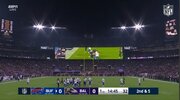
It's odd to have new graphics outside a Superbowl.CBS NFL graphics update View attachment 2419918
I assume it will become the norm more often now that the superbowl is on a 4 year rotation instead of 3?It's odd to have new graphics outside a Superbowl.

It's like Stan Sport doing the EPL with Premier League Productions not Sky Sports UK/TNT Sports providing the world feed for EPL fans worldwide.Thats the world feed. They use it for all games. It's not based on any of the US packages and used on most games other the ESPNs


It's just the same gradient of the lines in between the goal behind and total sections. And the grey looks like the same shading on the Hawks side - white just shows it more.It’s been like this all season but I’m still confused why 7 uses a silver colour background for Geelong instead of white like they have for many teams wearing clash. White is the Cats primary colour so it should be white.
View attachment 2430772
Also don’t understand why 7 hasn’t been able to fix the score & time separation. At least 1 team always has a curve. The finals gold has made it better but it’s still got a bit weird non straight line.
I’m talking about this, having a curve next to the time box for some teamsIt's just the same gradient of the lines in between the goal behind and total sections. And the grey looks like the same shading on the Hawks side - white just shows it more.


Yeah that's strange with the St Kilda V Geelong differences, but St Kilda still has the same effect - just lighter. Maybe it's because it's Geelong's 'home' colours that they added more of a gradient.I’m talking about this, having a curve next to the time box for some teamsView attachment 2431556
The white of teams like the saints looks more white while cats look silver/grey. View attachment 2431560View attachment 2431561
Yeah if you zoom in enough, you can see a gradient border on every teams score box right where it merges with the time/qtr box. It just doesnt blend too well depending on the team. We're probably the only people in the country that notices it though hahaYeah that's strange with the St Kilda V Geelong differences, but St Kilda still has the same effect - just lighter. Maybe it's because it's Geelong's 'home' colours that they added more of a gradient.
With Essendon, it looks like a curve but it's only because of the gradient that doesn't blend as well. They do have to fix that though, haha.
No Fox has a similar thing to 7 and it’s kinda noticeable. But the Cats thing just confuses me. Like why are their gradient so different to all other teams that have white?Yeah if you zoom in enough, you can see a gradient border on every teams score box right where it merges with the time/qtr box. It just doesnt blend too well depending on the team. We're probably the only people in the country that notices it though haha


Some different fonts too? I think the ‘round’ font is differentLooks like not much change to the Brownlow graphics apart from moving it to the centre of the screen?