Hey Mero, the sash on the 2017 Richmond clash is very faded:


Follow along with the video below to see how to install our site as a web app on your home screen.
Note: This feature may not be available in some browsers.
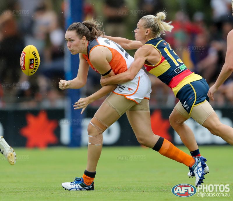
I'm treating women's AFL like the WAFL.
Home jumpers only.

ISC logo is way too high there Mero.The first major change in uniform template since the printed jumpers in 1996-97
May I ask what the "major change" is? Is it the socks?The first major change in uniform template since the printed jumpers in 1996-97
No, it's actually in exactly the right place.ISC logo is way too high there Mero.
I don't like the collar


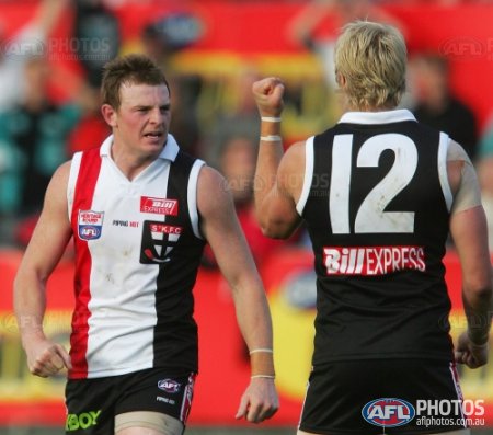
Yeah, most players will wear official AFL short socks.
I probably shouldn't have said way too high haha.No, it's actually in exactly the right place.
The hoops may be too high, but that's a problem of the template, where the cuffs have to finish there, so the hoops start just below them.
Shouldn't the border around GWS have white, similar to St Kilda's one?Uniforms page will look like this:
http://bomberblitz.com/mero/2017.htm
Even though a major part of their jumper is white?Nah, I think they've said their colours are Orange and Charcoal.
White seems like an afterthought.
http://shop.portadelaidefc.com.au/port-adelaide-power-2017-mens-home-guernsey-158323.phtmlUniforms page will look like this:
http://bomberblitz.com/mero/2017.htm
Now fixed.http://shop.portadelaidefc.com.au/port-adelaide-power-2017-mens-home-guernsey-158323.phtml
Ports home sponsor is Oak Plus
Uniforms page will look like this:
http://bomberblitz.com/mero/2017.htm
I just get fixated on my own teams sexy Home kit. Can't believe we're entering S2 with the wings at home. Beautiful.The North kit looks pretty great in that line-up.
My exact thoughts earlier!The North kit looks pretty great in that line-up.
The North kit looks pretty great in that line-up.

Also, that patch around the St Kilda logo should be a curved square.Numbers on a lot of St Kilda jumpers need correction.
2009-2015 the curve end of the 2 digit has always finished horizontally (as you've got for 2016 and a couple of 14-15 promos). Also most heritage/promos from the 00s have generic numbers instead of ones matching the regular strips of the day.
E.g. 2006 Heritage: