News New Jumpers for 2015

Remove this Banner Ad

Status
Not open for further replies.

Log in to remove this ad.

Port's doesn't get enough criticism IMO.

It's a giant fist holding a lighting bolt. Considering their strategy of wanting to be called the PAFC and moving away from the Power moniker, it seems quite outdated.

I agree that the premise is a bit puzzling, but it's well executed, and despite several threads a year calling for a new Port logo, i've never seen one that is as good as the existing one.

I thought we might get a new one after OneClub but it hasn't happened yet, and I doubt we'd see it so soon after the move to Adelaide Oval.
 
Port's doesn't get enough criticism IMO.

It's a giant fist holding a lighting bolt. Considering their strategy of wanting to be called the PAFC and moving away from the Power moniker, it seems quite outdated.

It's not great, but the other two are worse. Obviously the crow looks terrible, but Essendon's - for a traditional club - is shocking.
 
Port's doesn't get enough criticism IMO.

It's a giant fist holding a lighting bolt. Considering their strategy of wanting to be called the PAFC and moving away from the Power moniker, it seems quite outdated.
It's like that fat chick in your computer programming class. She's smart, nice, you can tell who she is from a mile away (because she's fat, you see) but she's not good to look at. But because you're not getting any action you decide to go for it anyway, at least until a better alternative pops up. Wait... we're talking about logos.

Port's logo encompasses elements of both Power and Magpies. That's a good thing. It has a very '90s vibe. That's a bad thing. But all the alternatives I've seen are pretty s**t and I'd rather wait til we see a logo that's awesome rather than changing for the sake of change, and winding up with something fairly s**t like North or Adelaide. So, yeah, it's s**t, but we'll still use it until something better comes along.
So, Port's is a practice logo?
 
New WCE gear is here.
_JC_5342HomeGuernsey.jpg
my eyes
my eyes!
hideous like it always has been
 

(Log in to remove this ad.)

Source? If it's new, I have a gut feeling it may be a return to the stripes as a clash
i tweeted the Club when they released the home and away guernseys for 2015. i asked where the clash one was, they said a new one was getting released in March.

Unlikely to be a stripe i think, as we already have that for home and away.
 
i tweeted the Club when they released the home and away guernseys for 2015. i asked where the clash one was, they said a new one was getting released in March.

Unlikely to be a stripe i think, as we already have that for home and away.
March seems a bit late. When does the season start?

Stripes would be perfect, creates a continuity across all three. But it'd most likely be white based.
 
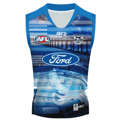
I know this is posted but here is some more info on it.

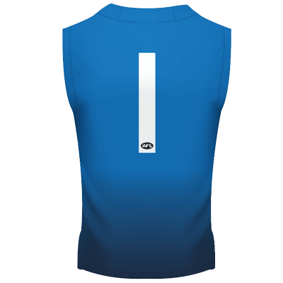
This Geelong Themed Technical Guernsey contains images from the Geelong region which includes: Simonds Stadium, The Geelong Pier, Classic Ford Falcon and Geelong Cats Theme song. This is the ideal item for the Geelong Cats Supporter wanting something a little different which highlights our history in the region.
A8CDEA55-C31E-D99C-5F3EDA24212C98C72015adulttrainingguernseynavyfront.png
A8CEC5C4-0F4C-6290-B5C923FAEEF142262015adulttrainingguernseynavyback.png
Copy and paste description klim? :p
 
Status
Not open for further replies.

Remove this Banner Ad

Back
Top