News New Jumpers for 2016

Remove this Banner Ad

Status
Not open for further replies.
A question for those more in the know.

In the last 3 years Reno have had 3 different logo set ups without actually changing their logo, I thought there were rules about that?
 

Log in to remove this ad.

A question for those more in the know.

In the last 3 years Reno have had 3 different logo set ups without actually changing their logo, I thought there were rules about that?
When was there ever rules?

Let's not pretend there are any jumper rules or anything in the AFL. It's all made up and reactionary.
 
A question for those more in the know.

In the last 3 years Reno have had 3 different logo set ups without actually changing their logo, I thought there were rules about that?
Renault have demoted yellow to a tertiary colour as seen on their advertising. I saw this change coming, I just thought it would happen last year
 
Beautiful colour combo.
So, so poorly done though. All the elements in it are pretty cool - the royal and orange colour combo, and the pattern is pretty neat imo. But the template is hideous and everything looks so out of place, especially the sleeve pattern.
 
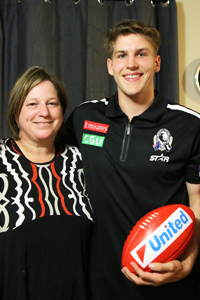
Media polos aren't rocket science. Just pick a club colour for it, have a logo/sponsors/apparel logo and then have a secondary colour (or colours) on either the shoulders or piping around the collar and sleeves.
Done.
 
Media polos aren't rocket science. Just pick a club colour for it, have a logo/sponsors/apparel logo and then have a secondary colour (or colours) on either the shoulders or piping around the collar and sleeves.
Done.
Or even solid colour with logo and sponsors a la Carlton.
 

(Log in to remove this ad.)

151125_sier300_2.jpg

I like the polo but whhhhhhhhy the zip.
 
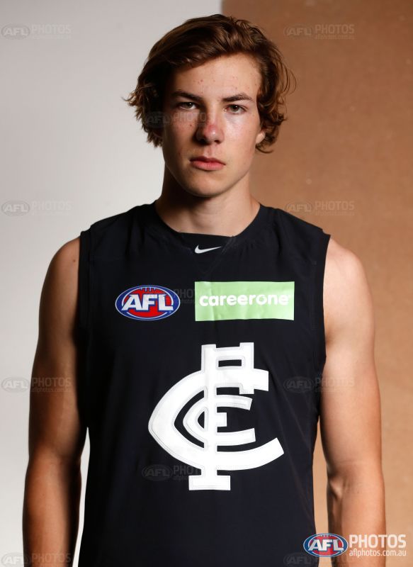
It's not just the colour that doesn't work (although I usually like lime green and navy), it's the fact that the box goes over the vertical halfway line of the guernsey and how they have the text in white with the lime background when the logo would be seen easier with a dark background, like, I don't know... NAVY. It's not hard to allow your logo to be recoloured!!!@@@÷^!€@^#&

Idiots. s**t logo, s**t integration, s**t.
I hope the money is worth it.
I wonder what it would look like with lime text and no background.
 
Status
Not open for further replies.

Remove this Banner Ad

Back
Top