


I'm a big fan of the navy blue used in the heritage round Fitzroy guernsey from the year before last. I'll take the paddlepop gone regardless.
Navigation
Install the app
How to install the app on iOS
Follow along with the video below to see how to install our site as a web app on your home screen.
Note: This feature may not be available in some browsers.
More options
You are using an out of date browser. It may not display this or other websites correctly.
You should upgrade or use an alternative browser.
You should upgrade or use an alternative browser.
Changing the Original Lions Guernsey/Clash Jumper Discussion
- Thread starter Hysteria25
- Start date
- Tagged users None
Danny3
Team Captain
- Oct 6, 2011
- 382
- 456
- AFL Club
- Brisbane Lions
- Other Teams
- Moreton Bay Lions
Perhaps any colour that actually represents our Club - maroon, blue and GOLD.... I think the song goes
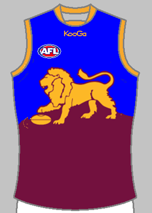
It has been posted many times before (I can't be bothered finding it), but there have been great mock-ups done of a Lions clash jumper using the Brisbane Bears jumper we wore this year as a template (with the traditional lion instead of the BB logo).
However, apparently the AFL can force some clubs (like us) to have white clash jumpers, while others get to do whatever they want (Essendon, Richmond,...?).
Ta-da.

The often suggested problem is that the above clash jumper doesn't work against Gold Coast. I don't agree with that though - GC's home jumper with red shorts vs. the above jumpers with white shorts = no clash IMHO.


Worst guernsey in the AFL. It honestly hurts your eyes looking at it.
I'm a big fan of the Giants logo, jumper and overall colour scheme - its very unique and they've executed it very well.
However Gold Coast have royally ****ed it. They should have been the 'Sharks' from day dot and adopted a light blue as their primary colour. They're logo is underwhelming at best, although still satisfactory in my eyes, but their jumper is just putrid, unimaginative and lazy. Get a real jumper, a real nickname and some proper colours - the red and yellow just scream 'franchise club' with the scheme so easily reminding us of McDonalds.
horrible.
iBeng
Intentionally left blank
- Apr 3, 2012
- 58,148
- 66,409
- AFL Club
- Brisbane Lions
The often suggested problem is that the above clash jumper doesn't work against Gold Coast. I don't agree with that though - GC's home jumper with red shorts vs. the above jumpers with white shorts = no clash IMHO.
That is just offensive to everything the AFL ever was.
- Moderator
- #58
Makes a great clash jumper. I'd prefer to see no white in any of the Lions jumpers.
Maroon jumper for home games and non clash interstate games. Red jumper for Victorian games and this for designated clash games.
However Gold Coast have royally ****** it. They should have been the 'Sharks' from day dot and adopted a light blue as their primary colour. They're logo is underwhelming at best, although still satisfactory in my eyes, but their jumper is just putrid, unimaginative and lazy. Get a real jumper, a real nickname and some proper colours - the red and yellow just scream 'franchise club' with the scheme so easily reminding us of McDonalds.
Totally.
The AFL had the opportunity to create an US against THEM genuine rivalry with the Brisbane Lions and the Gold Coast. Think the red side and blue side of Merseyside. Even think about the new A League franchise in Western Sydney (red black hoops) and how it contrasts with the blues of the existing. Think the Maroon Vs the Blues of state of origin. It starts with the basics - colors, and in relation to the AFL, the mascots (Lions, Suns). The opportunity was there to create something whereby both teams could wear their 'traditional' colors for EVERY game they played against each other - recognise the clash, recognise the colors, recognise the significance of the rivalry - make Queenslanders make a decision as to whether you were on one side or the other. Create the US against THEM, THEM against US mentality. Create interest in the sport. Convert new fans to the contest.
And what did the AFL do/allow the new franchise to do?
Use colors similar to the existing.
Pick a mascot that doesn't mean anything much.
It was just shortsighted stupidity.
Imagine "Lions Vs Sharks". Or "Lions Vs Cheetahs". Or "Lions Vs anything else but the Suns really".
Imagine Maroon, Blue, Gold versus Green/Light Blue. Or Maroon, Blue, Gold versus anything else but Red, Gold and a hint of Blue.
It was the opportunity to create a color scheme that differentiated the teams, but also the fans - one end of the ground at a Q clash in Maroon, Blue, Gold and the other in some other combo other than what looks like Reddish and Gold and a hint of Blue.
Right royally stoopid.
Don't think the Sharks was viable. Southport would have been up in arms much like how Gold Coast Titans were going to be the Gold Coast Dolphins but the Redcliffe Dolphins took them to court and won. Also have the Cronulla Sharks in the NRL. I absolutely hate the jumper and it is a disgrace.
GC Squids?
The GC Abletts?
*Waits for someone to crop Gazza's head onto a Sun's jumper*
As for the rivalry point raised, you're absolutely right - the current colour scheme says alot about the AFL's stance on interleague relationships - they clearly want the Suns to piggy back off the maroon, blue and gold we've developed rather than develop their own identity and visual contrast in order to establish that rivalry. It could be argued we've adopted the maroon based on the Broncos and they've pinched it from the Bulls.
Clearly they want it to be QLD v the rest. The AFL see us as a collective team in fighting the good fight in growing the code in the northern states. I think the best way for this to happen was to give the Suns a different identity that could have 'fueled' our rivalry.
Squibs.GC Squids?
MSB ROYS
Brownlow Medallist
Is McStay's run in the GF sprint the last time we will see the paddlepop jumper in an official capacity?
(Unless it is deemed to be a heritage jumper in the distant future!)
(Unless it is deemed to be a heritage jumper in the distant future!)
Doubt it would be used as a heritage jumper due to the bad blood it caused.Is McStay's run in the GF sprint the last time we will see the paddlepop jumper in an official capacity?
(Unless it is deemed to be a heritage jumper in the distant future!)
- Dec 2, 2013
- 2,475
- 4,838
- AFL Club
- Brisbane Lions
It's being unveiled in the next week isn't it?Whilst I'm breaking news, and I'm not sure if this is common knowledge, the Premiership Lion is going to be a little larger than it was last was.
HowYouDoin
Club Legend
- Banned
- #70
Whilst I'm breaking news, and I'm not sure if this is common knowledge, the Premiership Lion is going to be a little larger than it was last was.
It's a good looking lion. Why wouldn't they want to make it bigger
Fitz Roy
Debutant
- May 20, 2014
- 130
- 173
- AFL Club
- Brisbane Lions
It's being unveiled in the next week isn't it?
I'm not actually sure. Hope so!
- Dec 2, 2013
- 2,475
- 4,838
- AFL Club
- Brisbane Lions
I just read back a few pages, it's late october apparently.I'm not actually sure. Hope so!
- Aug 11, 2012
- 7,011
- 10,797
- AFL Club
- Brisbane Lions
Late October I thought.It's being unveiled in the next week isn't it?
whatboutbob
Serial Avatar Troll
I just read back a few pages, it's late october apparently.
hitthepost
Norm Smith Medallist
Not this I hope:Whilst I'm breaking news, and I'm not sure if this is common knowledge, the Premiership Lion is going to be a little larger than it was last was.
Premiership Lion on the Paddlepop design :/
Similar threads
- Replies
- 56
- Views
- 1K
- Replies
- 272
- Views
- 9K
- Locked
- Replies
- 358
- Views
- 11K
- Locked
- Replies
- 421
- Views
- 17K
