Navigation
Install the app
How to install the app on iOS
Follow along with the video below to see how to install our site as a web app on your home screen.
Note: This feature may not be available in some browsers.
More options
You are using an out of date browser. It may not display this or other websites correctly.
You should upgrade or use an alternative browser.
You should upgrade or use an alternative browser.
News New Jumpers for 2024
- Thread starter RedmanWasHere
- Start date
- Tagged users None
Fizzler
BBTB
- Dec 26, 2013
- 12,781
- 16,367
- AFL Club
- Port Adelaide
- Other Teams
- OKC, Coburg, Werribee, Storm, QPR
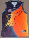
Seems like a win-win then. I would’ve loved to see the ochre this year but they’ve done a great job with the navy wings and the old AFL logo takes it up another level. Would be sick to see them do the prototype 2000 AFL logo on the Ochre next year even if it wasn’t worn like that in game.Game day guernseys will feature old AFL logo. Expect to see the losing entry in 2025
- Feb 5, 2018
- 14,119
- 34,054
- AFL Club
- Hawthorn
- Other Teams
- Chicago Blackhawks Melb Renegades
Apologies if it's common knowledge and been posted about, but Rebel stores are being sent the premiership patches and will be heat-pressing them onto Collingwood guernseys in-store.
On ya Nike.
On ya Nike.
Bjo187
Premiership Player
- Apr 30, 2020
- 3,192
- 4,204
- AFL Club
- Essendon
They've got the wrong time with the radio on the shoulder, that was late 80s early 90s I reckon.
They've got the wrong time with the radio on the shoulder, that was late 80s early 90s I reckon.
Should have been Discmans
That jacket. No club logo on the front. One sponsor. I love it.
Freight Train
Once hit the sign at the Mercantile Mutual Cup
- Moderator
- #1,558
Should have had an Eagles logo under the NB logo like here
View attachment 1936408
View attachment 1936411
Nah, it’s actually pretty era-authentic as is.
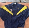
Main change is that this jacket didn’t have an Eagles logo on it at all, just a giant HJs logo on the back that they’ve swapped out.
pattymalone00
All Australian
Feel like some white on the chevrons would look great but looks good
Feel like some white on the chevrons would look great but looks good
Should look better on camera than last years version, I bought my partner the stealth one from last year and she was pretty disappointed when she saw it in person
Bjo187
Premiership Player
- Apr 30, 2020
- 3,192
- 4,204
- AFL Club
- Essendon
What did people think of the new giants away jumper. I liked the back with the white numbers, looked clean. Have always thought they should have white numbers on their traditional home, it balances it out better because then from both front and back you can see all 3 colours, orange, black and white.
jumperfan
Debutant
- Nov 17, 2023
- 70
- 89
- AFL Club
- St Kilda
Feel like some white on the chevrons would look great but looks good
If they're going to do this they should go back to the lighter shade of purple used during the anchor era. This looks like it'll be an improvement on last year but I think it'll still be too dark.
Bjo187
Premiership Player
- Apr 30, 2020
- 3,192
- 4,204
- AFL Club
- Essendon
If they're going to do this they should go back to the lighter shade of purple used during the anchor era. This looks like it'll be an improvement on last year but I think it'll still be too dark.
Watching the Dockers the other day, it almost looks navy blue now. Makes a boring jumper even more boring. I like their logo, I dunno why that couldn't be incorporated into the middle of the bottom arrow or something, to add some character.
Fizzler
BBTB
- Dec 26, 2013
- 12,781
- 16,367
- AFL Club
- Port Adelaide
- Other Teams
- OKC, Coburg, Werribee, Storm, QPR
Feel like some white on the chevrons would look great but looks good
Interesting, looks to be an improvement on last year, but will remain to be seen how good it looks in the flesh. This’ll mean Carlton will be in the clash unless they’ve got a white based gather round jumper planned which is unlikely.
I think it’s kinda the point that it’s hard to see, hence the name Stealth.If they're going to do this they should go back to the lighter shade of purple used during the anchor era. This looks like it'll be an improvement on last year but I think it'll still be too dark.
jumperfan
Debutant
- Nov 17, 2023
- 70
- 89
- AFL Club
- St Kilda
I always thought they were going for a neon light-inspired design with the purple outlines on the chevrons and this would work a lot better if the purple stood out from the black more.Interesting, looks to be an improvement on last year, but will remain to be seen how good it looks in the flesh. This’ll mean Carlton will be in the clash unless they’ve got a white based gather round jumper planned which is unlikely.
I think it’s kinda the point that it’s hard to see, hence the name Stealth.
Fizzler
BBTB
- Dec 26, 2013
- 12,781
- 16,367
- AFL Club
- Port Adelaide
- Other Teams
- OKC, Coburg, Werribee, Storm, QPR
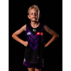
I thought that too, but it turned out the photos last year were a bit deceptive and there wasn't that glow effect on the real thing. This year's photos could possibly have the same effect too. I've had a look at the club shop and the kids jumper seems to be just matte colour. Normal purple chevrons and a seemingly blue outline.I always thought they were going for a neon light-inspired design with the purple outlines on the chevrons and this would work a lot better if the purple stood out from the black more.
- Oct 27, 2016
- 5,949
- 10,676
- AFL Club
- Collingwood

- Other Teams
- Packers, Raptors, Renegades
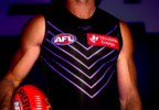
How hard is it for them to just use a brighter purple? Or better yet, add white into the mix with a gradient like from what it looked like in the promotional pictures from last years one. I think I like this outline look better if I'm honest. They've fumbled this a bit but hey credit where it's due at least they are doing something outside of the box.

Mero
Norm Smith Medallist
- Jun 3, 2015
- 743
- 761
- AFL Club
- Port Adelaide
No word on a new norf jumper for Friday yet?
pattymalone00
All Australian
I’m surprised all the marketing has them in there home guernsey so have they just completely shelved it or somethingNo word on a new norf jumper for Friday yet?
Fizzler
BBTB
- Dec 26, 2013
- 12,781
- 16,367
- AFL Club
- Port Adelaide
- Other Teams
- OKC, Coburg, Werribee, Storm, QPR
I had a look and last year they unveiled the design on the Tuesday before the game. If that’s the plan this year then we could be getting something today. Very surprised at how late they’re cutting it though, I’d think if the plan is to auction off the jumpers after the game then you’d be a little better off giving fans some time to anticipate getting that specific jumper in their hands.No word on a new norf jumper for Friday yet?
caloschwaby
Whisper
- Jan 3, 2017
- 4,858
- 6,484
- AFL Club
- Collingwood

- Other Teams
- Celtics, Renegades, Packers
How hard is it for them to just use a brighter purple? Or better yet, add white into the mix with a gradient like from what it looked like in the promotional pictures from last years one. I think I like this outline look better if I'm honest. They've fumbled this a bit but hey credit where it's due at least they are doing something outside of the box.
View attachment 1939329

Discussion - Jumpers That Never Were
I've often had the thought process of "what if?", and obviously, that's barely limited to football and its jumpers. Not only that, but I've often seen proposed jumpers being discussed. Images posted and queries pondered. Yet all these occur in a bevy of different threads. So this is almost an...
 www.bigfooty.com
Chezzel
Draftee
- Oct 15, 2023
- 4
- 1
- AFL Club
- Adelaide
What did people think of the new giants away jumper. I liked the back with the white numbers, looked clean. Have always thought they should have white numbers on their traditional home, it balances it out better because then from both front and back you can see all 3 colours, orange, black and white.
Wasn’t a fan of it when the photos came out online, I thought it was basic and the white didn’t really work. But after seeing it in action I’ve done a full 180, it looks clean and crisp. I would go as far to say it’s their best away jumper yet.
Sent from my iPhone using BigFooty.com
Orange Paradox
Debutant
- Oct 7, 2020
- 67
- 244
- AFL Club
- North Melbourne
- Other Teams
- Glenelg, Cardinals (NFL), Kings (NBA)
Similar threads
- Replies
- 726
- Views
- 78K


