


- Moderator
- #1,951
Classic Sportswear, they have been long time manufacturers of Rugby League jerseys (including the NSW State of Origin)
I'm glad they're still around
Follow along with the video below to see how to install our site as a web app on your home screen.
Note: This feature may not be available in some browsers.
Classic Sportswear, they have been long time manufacturers of Rugby League jerseys (including the NSW State of Origin)
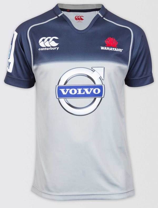
Is this confirmed (sauce plsThis is the new Waratahs away jersey for 2015.

) but in either case it looks more like a training shirthttp://www.canterburynz.com.au/product/672/10136/mens/waratahs-away-jersey--2015/Is this confirmed (sauce pls


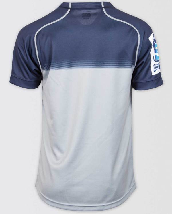
Tramp stamp.And this is their Charity jersey:
*Source - Canterbury and NSW Waratahs online stores.
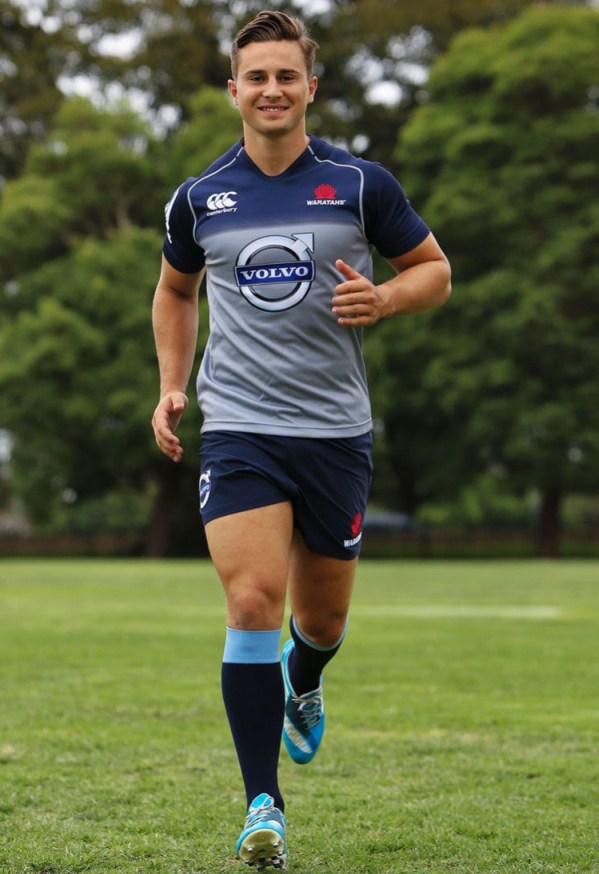
Looks nice, but yeah, way too much like a training top. Especially in that photo.This is the new Waratahs away jersey for 2015.
And the charity is...?And this is their Charity jersey:
*Source - Canterbury and NSW Waratahs online stores.


Apart from the sugar daddy* being hidden by numbers that is one of the best jerseys I've ever seen.2015 Warriors Heritage jersey
Forget gradients and cartoons, this is an amazing way to make a jersey using dye sublimation.I'm impressed. That is amazing.
bingo, the 95 style yokeIt's interesting to note the bottom half of the front and back sides. The front has the current logo in a current jersey, whereas the back has (I assume) the original jersey with the original logo.
...right?
Dead right.It's interesting to note the bottom half of the front and back sides. The front has the current logo in a current jersey, whereas the back has (I assume) the original jersey with the original logo.
...right?
That's a tongue? I always thought it was teeth, which messed with my head when I saw the original logo.The curved tongue to the left was considered a sign of femininity by Maori tradition thus cursing the earlier teams.
A few 20's comps and I think a minor premiership (or two) but no ARL/SL/NRL premiership...That's a tongue? I always thought it was teeth, which messed with my head when I saw the original logo.
Warriors still haven't won anything though, have they..
I always thought it was teeth, which messed with my head when I saw the original logo.
Yeah, and the rest of the mouth didn't have anyTeeth like Bugs Bunny teeth you mean?
Better like this perhaps. Can do it any way...just without the green. By making the logo bigger, they would have to compress the text to fit on the jersey like I had to do here. I guess Suncorp didn't want to alter the logo in the slightest. The way to get around that is to have the graphics larger and the text smaller like the third picture.


Source?
So they did changed it....much better!!


