Discussion State of our jumper

Remove this Banner Ad

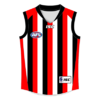
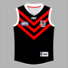
Soon we will have our own vfl team. I like the idea of the saints top running found in the vfl. But I also like the idea of a similer but different design. Even playing round with the colours maybe. Anyone got their own opinions on the matter?

Definitely needs to be a little bit different for mine, even if only modestly.
 
Soon we will have our own vfl team. I like the idea of the saints top running found in the vfl. But I also like the idea of a similer but different design. Even playing round with the colours maybe. Anyone got their own opinions on the matter?

This has always been one of my favourite designs so I would love to see it return in the VFL.

StKilda-Clash-2013.gif


Wear the white one for away games and wear the same for home games (with a black back and a thinner white cross). :thumbsu:
 

Log in to remove this ad.

ok technically your correct . At first It was the PURA MILK jumper which was yellow black n white. And just used for sponsorship.
But this is the 2nd incarnation of that jumper.
We were now sponsored by Mortage House and we had added the red outlines on the jumper.
So it was just a clash top now.
Yes it was a bit garish LOL but it stood out, was bold and certainly didnt clash with anybody else:D
and it did contain red black and yellow which were our official colors for a period.
Not everbodys cup of tea but i didnt mind it.
its a bit of a hobby of mine to collect diff Saints jumpers.Ive pretty much got every jumper weve released.
Except for the 140th one and that yellow red white and black one were talking about.
Im always checking ebay incase somebody is selling that one pictured above.
I've got their green one they used in the preseason a few years ago, now that's an unusual Saints colour scheme!
 
I reckon my two favoured designs have been the candy stripe that was resurrected last year, and the stickman we used in the preseason last year.

I think the benefit we have is that red, white and black is classic. But when you try to do funky designs with it, it gets messy. Our indigenous designs are often some of the worst as a result, and designers of our clash over the years seem to have an infatuation with making the colour scheme look distinctly different.
 
This has always been one of my favourite designs so I would love to see it return in the VFL.

StKilda-Clash-2013.gif


Wear the white one for away games and wear the same for home games (with a black back and a thinner white cross). :thumbsu:

Would much prefer that guernsey if it didn't have the cross. Keep it a solid tri-panel with white back.

I would like us to wear the black shorts in the home games with it. Be very different to anything we've worn at AFL level in recent years but it would still have a genuine St Kilda feel to it.
 
Home needs more white collars and cuffs ;)

Also im actually finding myself a bigger fan of the clash we have now than the 2005 candy stripe, but I'd love the hot cross bun for games against Collingwood or maybe Geelong/Norf

This is the alternate I had before going with more stripes (and doubling the white thickness), this is pretty much the 2005 design on the modern jumper template.
stkilda_isc_light.png
 

(Log in to remove this ad.)

I really think a 140th-style clash (red and black horizontal stripes) would look great and sell well.

Ongoing revisions to the width of the vertical stripes for the clash jumper can only go on for so long...
 
I actual
Something like this?

View attachment 192424

LOL
ly don't mind that but I was thinking more along the lines of totally jet black with maybe very thin red and white piping down the centre seams plus all the logos. We'd look boss.
 

Remove this Banner Ad

Back
Top