Resource Gold Coast Suns Rebrand

Best rebrand option


  • Total voters
    183

Remove this Banner Ad

so we have this line in our club song
We are one in the red, gold and blue

i am all for dropping the blue and just trying to find a design which works with red and gold, or red and yellow

so maybe instead of
We are one in the red, gold and blue

it can be
We are one in gold and red stripes for you

and we do the classic coll/north/hawks stripes in gold and red
Change blue to white.
 

Log in to remove this ad.

so we have this line in our club song
We are one in the red, gold and blue

i am all for dropping the blue and just trying to find a design which works with red and gold, or red and yellow

so maybe instead of
We are one in the red, gold and blue

it can be
We are one in gold and red stripes for you

and we do the classic coll/north/hawks stripes in gold and red

Yeah I think that line needs to change too. Tbh I like the azure blue as a subtle tertiary colour and as the main colour in a clash/alternate guernsey, but to have it mentioned in the song is just pointless and makes it sound like their colours are equal parts red gold and blue which they aren’t, and shouldn’t be.

Your state rivals are in maroon, blue and gold. Not to mention the colours being red gold and blue in a frequently used away guernsey AND the colours mentioned in their club song.
The Crows also wear navy blue, red and gold

Three teams with virtually the same three primary colours albeit varying shades, is one too many. The Suns should be equal parts red and gold and that should be their identity. If not, take the mentioning of colours out of the song altogether.


Sent from my iPhone using BigFooty.com
 
View attachment 1827090

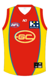
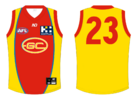
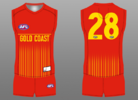
Billy ray Something like this?

Would work well as a home kit with red back + yellow/white numbers, or yellow back + red numbers

Or just as well being inversed with the same GC logo
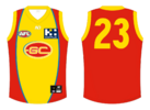
i reckon if the gold and red were switched, such that the sides are not side panels but red flowing into an all red back (with yellow numbers) it would be great
 
i reckon if the gold and red were switched, such that the sides are not side panels but red flowing into an all red back (with yellow numbers) it would be great
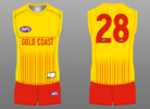
Gold Coast Snus Yellow.png

A very interchangeable design, I think I still prefer the first one even with a yellow back + red numbers (more in line with the lifesaver look)
 
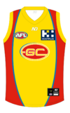
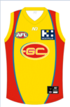
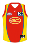
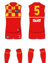
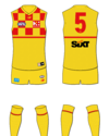
ive totally farked this as i am no graphic designer and literally using paint, but, i wanted to see what the two surfboard fronts with their corresponding backs would look like


yellow surfboard would have a red back
1696983140959.png 1696983159349.png

and red surfboard would have a yellow back (my skillz! someone hire me)

1696983061895.png 1696983106373.png
 
I'm getting a weird bug on my screen when i look at these, they look like they have some sort of horrible logo still on the front. Is anyone else getting this?
We have to take baby steps with the GC kit... at least getting them to the point where they're utilising all their club colours + helping the logo look like it belongs rather than just slapped on as a training kit.

I can't believe of the 2010's expansion clubs, GC is the one still rocking virtually identical kits vs GWS who actually had a great thing going was the one who downgraded hard.

For the record there's a time and space where I enjoy the current GC kit, but it has just gone on for too long, ~13 years with a placeholder-looking kit that doesn't really say anything other than "hey look, we're a new expansion side!"
 

(Log in to remove this ad.)

I really think yellow background with red details and minimum white highlights is the way to go, and I really like the checkerboard "taxi" stripes on the sides, they should extend them to the front like Croatia's national football team.

Really dynamic, unique and attractive, plus the gives the team a motor racing kind of aesthetic that is exciting and a positive quality for a sporting team.
 
Watching Gold Coast v Hawthorn and realised Hawthorn's away strip could work well as a Gold Coast home jumper. GC logo could be placed like the St.Kilda logo on their chest or below V. I'd keep the yellow side panels as a knod to their original design.
View attachment 1721900
Looks better without their logo, sorta reminds me of The Bears 90's guernsey.
 
you want somthing that represents the sun or that is related to it like life guards or surfing like the gold coast, racing isn't their identity
my intended reference was nothing to do with racing, more the surf life saving caps
britains-prince-charles-talks-to-surf-lifesavers-on-broadbeach-in-gold-coast-on-april-5-the.jpg
 
Back
Top