Groupie_
time to return the traditional Richmond yellow
feel worried for you if its true , might be eye check timeNever noticed it
Follow along with the video below to see how to install our site as a web app on your home screen.
Note: This feature may not be available in some browsers.

feel worried for you if its true , might be eye check timeNever noticed it
its a direct rip offYeah and Puma do their kits. It's like Puma can't be arsed using our traditional yellow and just went with the s**t they have with Borrusia Dortmund.

Log in to remove this Banner Ad
This rate they will have to change our song as well lol.We’re expanding the photoshop budget as it slowly transitions to lime green
Oh we're from Tiger (nib-green and black), oh we're from TigerlandThis rate they will have to change our song as well lol.

Same could be said re the umpires then. They continue or deliberately miss it. lol. Gotta find away to make the colours stand out.it's probably functional - fluro yellow easier to pick out teammates on the ground / in the contest
should we link some of Groupie_ 's comments to them?
this is trash , we , blooze and bummers have won multiple flags wearing dark colours before fluro came init's probably functional - fluro yellow easier to pick out teammates on the ground / in the contest
reckon this

ah yes, the blues and bombers, well known for their recent successthis is trash , we , blooze and bummers have won multiple flags wearing dark colours before fluro came in
We're lemon going on lemon lime
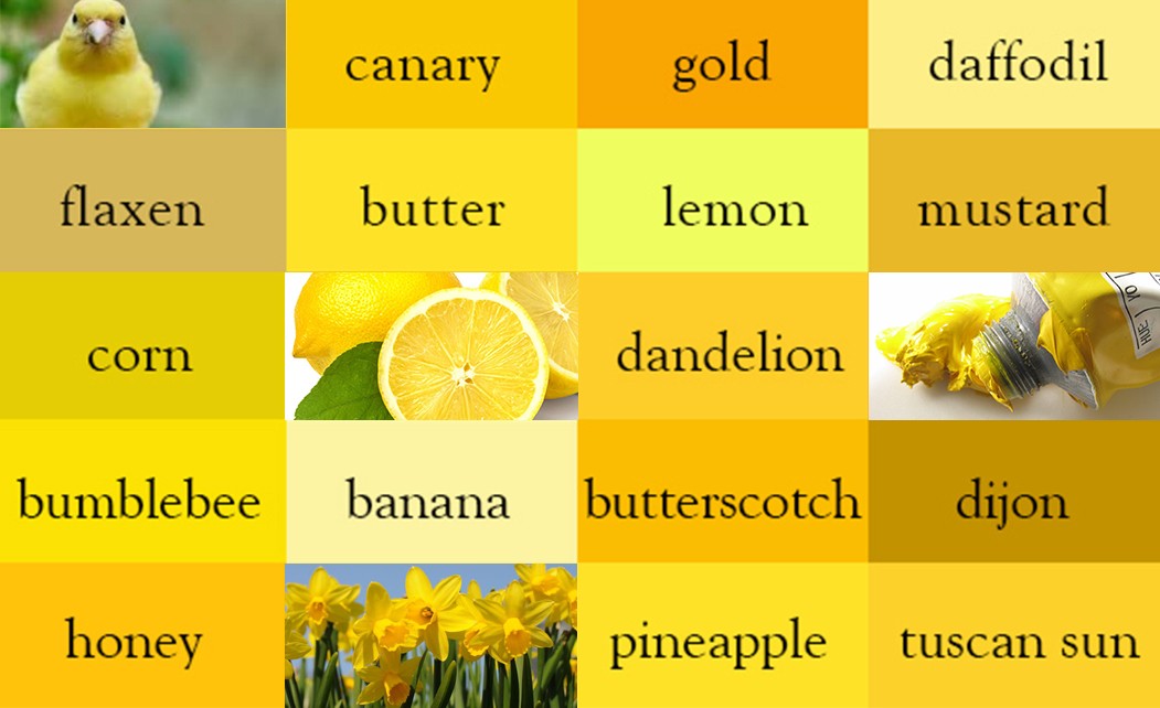
Dijon looks like our new colour #NIB lol
I don't mind daffodil or banana. Whose with me?
Maybe we should make it glow in the dark fluro, that would look alright lol.tim lane on 3aw just said that Richmond should wear the traditional yellow not the fluro
see, even carltoon duds can see it


The only thing wrong with that pic is the nib. Green on green