SJ
Premium Platinum
Personally, I hate it.Man I wish this was used more.
Have it upgraded from secondary to primary before the rebrand heading into 2008.
Follow along with the video below to see how to install our site as a web app on your home screen.
Note: This feature may not be available in some browsers.

Personally, I hate it.Man I wish this was used more.
Have it upgraded from secondary to primary before the rebrand heading into 2008.
I've always seen these with AFL logos on the breast of the players - sometimes in the colour of the guernsey (early 90s), other times in blue/red white (mid-late 90s).Working on dates for these 80s/90s logos.
View attachment 2415964
I don't think I've ever seen a Freo version, so 1995 for most. But then, they were associated with some clubs later. The Bulldogs have a version with the robo-dog logo which was from 1997. And North were using theirs right up until the 1999 premiership.


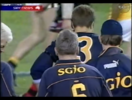
Recently been binging every 'That Was The Season That Was' videos, spotted this anomaly in the 2001 version. Another instance of 2 different number fonts used.
Round 7, 2001 - West Coast vs. Port Adelaide. Left: Jakovich, Right: Collica
View attachment 2448378
@32:05
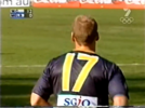
Checked out other 2001 WCE games, and it seems the number fonts change depending if the jumper is a longy or not
Collica vs. Sydney - Round 2, 2001
View attachment 2448381
@7:13
Had to see if the Ochre's did the same, and they did!
Not just Collica's longy had the original numbers, Embley's too
Round 10, 2001 - Carlton vs. West Coast
View attachment 2448384
@1:37:09
View attachment 2448385
@17:13
Gaspar's short sleeve jumper up close with the different font
View attachment 2448386
@1:14:34
Collica's short sleeve Ochre jumper with the different font
Round 5, 2001 - West Coast vs. Richmond
View attachment 2448387
@1:35:12
Log in to remove this Banner Ad


 11-7 screenshot.png")
 3-26 screenshot.png")
 11-9 screenshot.png")
 0-54 screenshot.png")

According to the same thread there was a time where these animated characters went across the screen after a win (1988?): https://www.bigfooty.com/forum/threads/request-90s-style-mascots.678771/#post-17065364. I cannot find an example on Youtube now though.


Thoughts on the new boots
These are the 1970 to 1999 version
View attachment 2463787View attachment 2463788
Do they look a bit too real?
I see what you mean, but I think we'll get used to them pretty quickly. The darker boots look better to my eyes (less jarring), but obviously lighter boots are a reality that's good to document. Definitely an improvement from the old boots (although there's nothing wrong with them) - love the addition of the studs!


FixedView attachment 2472531
Adidas logo missing under collar
Where are these from?Old jumper has new logo. Also no -(insert year) at the end of the timeline
Possibly the Port Magpies page?Where are these from?
All jumpers on the website have logos on them now.
Try Refreshing the page.
These are the SANFL ones. The 2019 needs the old Port Magpies logoWhere are these from?
All jumpers on the website have logos on them now.
Try Refreshing the page.


The middle row has them all, 2nd and 3rd from the left, 2nd and 3rd from the right.Hey Mero, I'm curious what the source is for this North VFA uniform with the stripes running up and down the sleeves:
View attachment 2482886
Obviously the designs here are all over the place, as they were back then, but the only guys wearing sleeves in this picture appear to be wearing hoop sleeves like the ones North typically wear to this day:
View attachment 2482885
Oh you're right, I didn't notice those ones.The middle row has them all, 2nd and 3rd from the left, 2nd and 3rd from the right.
There are more 'hooped' sleeves than striped sleeves though, thanks to the back row.
 www.hiddenfootyhistories.org