Navigation
Install the app
How to install the app on iOS
Follow along with the video below to see how to install our site as a web app on your home screen.
Note: This feature may not be available in some browsers.
More options
You are using an out of date browser. It may not display this or other websites correctly.
You should upgrade or use an alternative browser.
You should upgrade or use an alternative browser.
News New Jumpers for 2026
- Thread starter Mozzie_Squad
- Start date
- Tagged users None
🥰 Love BigFooty? Join now for free.
- Jun 23, 2021
- 2,808
- 3,145
- AFL Club
- Melbourne
- Other Teams
- LA dodgers LA Kings Melbourne Aces
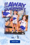
Adelaide would like a wordMight be nothing but the new Bombers membership drive sloan has dropped with the Dutton logo. So this years non clash away. Likley next seasons home. Readability of the slogan another issue in itself....View attachment 2470900
- Apr 21, 2019
- 1,512
- 2,920
- AFL Club
- Fremantle
Fly To TherMight be nothing but the new Bombers membership drive sloan has dropped with the Dutton logo. So this years non clash away. Likley next seasons home. Readability of the slogan another issue in itself....View attachment 2470900
Mr Eagle
Bird-brain
Fly Todfther, clearly.Fly To Ther
Log in to remove this Banner Ad
- Mar 30, 2014
- 3,028
- 5,189
- AFL Club
- Brisbane Lions

- Other Teams
- Dolphins, Seattle Kraken
Fly TobetherMight be nothing but the new Bombers membership drive sloan has dropped with the Dutton logo. So this years non clash away. Likley next seasons home. Readability of the slogan another issue in itself....View attachment 2470900
But also, maybe they're channeling the the Mighty Ducks?
BOMBERS FLY TOGETHER!
Liam Boy
Brownlow Medallist
DAT8
Senior List
View attachment 2470997
Don't actually mind this one too much after seeing it on a player. Obviously should've been a white Roo on Blue (I reckon we'll see that if we have to play in Geelong next year) but it's not in our top 10 worst jumpers imo
The kangaroo is too low.
Doesn't have the same impact that the 00s version had.
- Dec 13, 2016
- 1,218
- 2,644
- AFL Club
- Brisbane Lions

- Other Teams
- Arsenal, Melb City, Storm, Stars
- Thread starter
- #408
View attachment 2470997
Don't actually mind this one too much after seeing it on a player. Obviously should've been a white Roo on Blue (I reckon we'll see that if we have to play in Geelong next year) but it's not in our top 10 worst jumpers imo
The kangaroo is too low.
Doesn't have the same impact that the 00s version had.
Looks like the low positioning of the roo is to avoid overlapping with back sponsor...

Damn that’s a bad jumper.View attachment 2470997
Don't actually mind this one too much after seeing it on a player. Obviously should've been a white Roo on Blue (I reckon we'll see that if we have to play in Geelong next year) but it's not in our top 10 worst jumpers imo
Looks cheapDamn that’s a bad jumper.
Matele
Ooh Ahh Tom McCarth..y
There’s just nothing to it? No substance.View attachment 2470997
Don't actually mind this one too much after seeing it on a player. Obviously should've been a white Roo on Blue (I reckon we'll see that if we have to play in Geelong next year) but it's not in our top 10 worst jumpers imo
I guess you can’t really add any stripes to the front because then everyone realises it’s another butchered version of the white base home jumper, and really what’s the point in that?
Mop
Bucket not included
Yep, but the normal thing to do would be either to blank out the logo or just not take a photo with the footwear in the image.Sheezel would have his own commercial brand arrangement with Nike.
It is quite jarring and definitely unusual.
The Kangaroos Away jumper is so bland and close to pointless. Its only saving grace is that it should be effective away against Collingwood, & might work v Geelong (a blue Clash jumper would be better though).
Oh give me a world where North have the blue jumper with white V as Home, stripes as Away, and use the blue jumper against Collingwood & Geelong away.
Oh give me a world where North have the blue jumper with white V as Home, stripes as Away, and use the blue jumper against Collingwood & Geelong away.
Rubber Arm
Prestige 10 - Rank 70
- Oct 10, 2018
- 1,996
- 4,519
- AFL Club
- Geelong
- Other Teams
- Borussia VfL 1900 e.V. Mönchengladbach
Green and white?Looks like Tassie about to announce their Jumper maybe just VFL. Too be fair that's probably all they will ever be anyway.
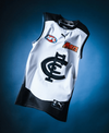
Blues back to a raised monogram in 2026

 www.carltonfc.com.au

It’s back: Raised monogram returns in 2026
The raised monogram returns in 2026.
memes_about_carlton
Flaggers 2025
That jock tag cutting into the white, is making my eye twitch.Getting me a bit nostalgic. Mars sponsorship = prime Marc Murphy, Andrew Walker, Bryce Gibbs <3
View attachment 2471453
DAT8
Senior List
Raised monogram elevates this a lot.Getting me a bit nostalgic. Mars sponsorship = prime Marc Murphy, Andrew Walker, Bryce Gibbs <3
View attachment 2471453
Need more teams to jump on adding depth to their designs.
Raised eagle head? lol
🥰 Love BigFooty? Join now for free.
Paddle Pop lion that you can lick and it tastes like chocolate.Raised monogram elevates this a lot.
Need more teams to jump on adding depth to their designs.
Raised eagle head? lol
RedmanWasHere
Rarely in kitchens at parties.
- Aug 23, 2010
- 30,624
- 37,925
- AFL Club
- Essendon
- Other Teams
- Exers, Gryffindor, Rich+Ess AFLW, Tassie
Looks like Tassie about to announce their Jumper maybe just VFL. Too be fair that's probably all they will ever be anyway.
Welcome to Tassie Devils apparel New Balance.
____
.
- Sep 1, 2009
- 7,757
- 9,409
- AFL Club
- Brisbane Lions

- Other Teams
- Everton, Brisbane Bullets, Thai Port FC
Wait, when has Carlton gone back to Mars?
pattymalone00
Club Legend
Time to start the new jumpers for 2028* thread?

memes_about_carlton
Flaggers 2025
No that's just a mockup I made.Wait, when has Carlton gone back to Mars?


