Remove this Banner Ad

News New Jumpers for 2026

🥰 Love BigFooty? Join now for free.

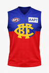
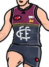
Can’t understand why Brisbane away jumper is not the Fitzroy jumper with the FFC is replaced by BFC in the same style.

Can someone make this to see how it looks?

Also should be blue or red shorts depending on the opponent.
I think most old Fitzroy fans will definitely prefer the lion over a bastardised version of the FFC monogram.
 

Log in to remove this Banner Ad

I think most old Fitzroy fans will definitely prefer the lion over a bastardised version of the FFC monogram.

Absolutely. As long as it is the Fitzroy lion as opposed to some other sort of lion such as the 'paddlepop lion'.
 
I firmly remain in belief that the paddlepop lion was responsible for everything that went wrong with our club in the mid 2010's. Once we remove that lion from our official logo, nothing would be standing in our way for a 7 peat.


Aw man I remember I lived in brisbane between 2010-13...and I had good mates who were members and used to drag me along most weeks. **** it was hard going back then (except when the eagles were in town and I turn savage against them) but I love the lions, used to go watch them at their absolute worst many times and see their purest fans still there supporting them despite the shitness. So glad they're good again, a little too good though :p

*If you've seen another post of mine on here, my brother and I actually ran into them in 2013 on their mad monday celebrations and they bought us beers and were just real nice drunk campaigners to us
 
We should be wearing our regular home jumper against GWS away.

As for our clash jumper NB almost had it perfect. Just need to replace the BB monogram with the Lion.
 
I firmly remain in belief that the paddlepop lion was responsible for everything that went wrong with our club in the mid 2010's. Once we remove that lion from our official logo, nothing would be standing in our way for a 7 peat.
I blame this jumper for making the Eagles wear a clash v Lions away. It’s long gone and yet Eagles still have to wear a clash.
 
Are all these sponsors offering up more dollars in the middle of their contracts to fill that spot?

Some insight into the economics would be interesting, especially for the clubs that are adding the same sponsors in that spot as the ones already on the back.
Spoke to an oneils rep

Said the club could sell that space for 750k so approached oneils who recognised they couldn’t pay that so instead renegotiated the supply aspect if the contract
 

Remove this Banner Ad

Really like this old logo and have always been a fan of the GFC days. Is it true they ditched it due to the global financial crisis? Also like the simple G. Never been a fan of the cat head used since 2008. even if it’s for the kids. Is there a way a GFC could be done like a Carlton or Fitzroy style? The old cats mascot head used on merchandise in the 90s is nostalgic. What’s old is new, bring it back.
Official insta announcement for Lions, no real change other than materials, and keeping Bears clash.


Bears colours are elite. Very QLD too
 
Really like this old logo and have always been a fan of the GFC days. Is it true they ditched it due to the global financial crisis? Also like the simple G. Never been a fan of the cat head used since 2008. even if it’s for the kids. Is there a way a GFC could be done like a Carlton or Fitzroy style? The old cats mascot head used on merchandise in the 90s is nostalgic. What’s old is new, bring it back.

Bears colours are elite. Very QLD too
I don't know why the club doesn't inverse the colours. Maroon on top, blue down the bottom would look good. As would maroon down bottom and yellow on top. Inversing the fitzroy colours would look good as well.
 
Really like this old logo and have always been a fan of the GFC days. Is it true they ditched it due to the global financial crisis? Also like the simple G. Never been a fan of the cat head used since 2008. even if it’s for the kids. Is there a way a GFC could be done like a Carlton or Fitzroy style? The old cats mascot head used on merchandise in the 90s is nostalgic. What’s old is new, bring it back.

Bears colours are elite. Very QLD too
That GFC logo was replaced in the late 1980s. A similar one was used internally in the 1990s and officially in the 2000s.

The claim about the rebrand in 2008 being due to the Global Financial Crisis is a myth.
 
beats the hell out of wearing the same thing year in, year out.
I have done a sketch concept in the past below which I was quite fond of (the gold stripes represent premierships - shows how long ago). But, footy supporters are traditional, fickle, tribal beasts.

Screenshot_20251229_105140_Outlook.jpg
 

🥰 Love BigFooty? Join now for free.

Remove this Banner Ad

News New Jumpers for 2026

🥰 Love BigFooty? Join now for free.

Back
Top