memes_about_carlton
Rookie

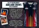
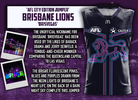
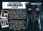
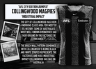
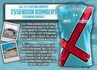
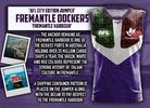
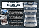
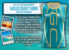
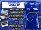
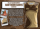
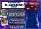
AFL CITY EDITION JUMPERS
Within this portfolio, all 18 AFL teams must incorporate a third jumper for a designated round each season, referred to as the 'City Edition Jumper'.
Drawing inspiration from the NBA, City Edition jumpers are distinguished by unique designs, colour schemes and patterns meticulously crafted to reflect or pay tribute to the unique attributes of the city, suburb or region each AFL team represents. These specialised jumpers serve as a platform for teams to not only display local pride, but also commemorate community history and culture, establishing a deeper connection with fans on a more personal level.
The freedom in designing these jumpers allows for the inclusion of unconventional designs and wacky colour schemes or patterns, deviating from the typical home jumper associated with AFL teams.
However, even amid the creative freedom, elements of each AFL team's identity will remain.
*(Note; I have conceptualised these jumpers for over 4 years, you can have a look at some old designs I posted back in 2019 on CentralSportEdits on reddit)


