Portfolio AFL x Adidas - Reverse Retro

Remove this Banner Ad

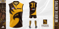
Hawthorn: 1997-98 Away & Preseason
Hawthorn-PresentationRevised.png
Not only a reversal but also a nod to many other Hawks guernseys, this Reverse Retro outfit revives a forgotten classic! The Hawks' late nineties foray into alternate guernseys is celebrated today with a mostly gold front, but with added pinstripes to harken back to the original striped jumpers. Diamonds truly aren't forever and rather, this guernsey possibly inspired future Hawthorn alternates and thus, gains its deserved place in the Reverse Retro collection!​
 
Last edited:

Log in to remove this ad.

Hey Zoops!

I work for Channel 7 covering the 7AFL social media pages. These are amazing! Could we please share these awesome designs with credit to your account? Let me know if you have a Twitter, Instagram or a TikTok page you want featured. Cheers!
Kudos for asking and not just taking!
 
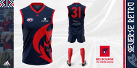
Melbourne: 2003-04 Away & Preseason
Melbourne-Red-Presentation.png
The Flaming Demon is back again! Melbourne's Reverse Retro guernsey revives a fan-favourite logo once again and whilst the Demons' alternate guernseys have a history of being maligned, this one is most certainly not! The team of the red and the blue's Reverse Retro guernsey celebrates the Daniher era of the Demons by combining the nineties logo and guernsey combo with the main inspiration, the early 2000s preseason guernsey! This is a guernsey with nostalgic character and charm, fit for a grand old flag!​
 
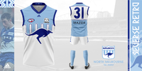
North Melbourne: 1996-99 Away
North-Melbourne-Presentation.png
This fan favourite gets its time in the sun again and is inspired by the original logo of the '80s. Light blue stripes have divided North Melbourne fans for a long time, however, the Reverse Retro guernsey takes its inspiration from the retro logo by keeping the Kangaroo royal blue and emphasising its importance as a brief nod to the 'Kangaroos' of the '90s. A simple inverse is overlooked in favour of something unique whilst still keeping its importance as a North Melbourne guernsey with the blue Kangaroo across the front!​
 
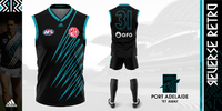
Port Adelaide: 1997-2002 Away
Port-Adelaide-Presentation-A.png
For Port Adelaide, there was only ever one choice! With inspiration from the recent 'stealth' movement and an obvious fan favourite design from a fantastic era, Port Adelaide's Reverse Retro guernsey screams Power and the Passion! A celebration of the teal and early era of Port Adelaide in the AFL, the Reverse Retro guernsey brings the teal outline onto the number and retro 'Port Power' logo. If ever a guernsey encapsulated the Reverse Retro concept... It would be Port Adelaide!​
 
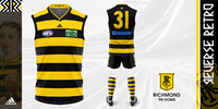
Richmond: 1895-1907 Home
Richmond-Presentation.png
Richmond's Reverse Retro guernsey celebrates unique eras, separated by almost a hundred years! The main design is similar to the original, however with thicker hoops and darker. However, the further reversal is on the back of the guernsey. A significantly darker back celebrates the Tigers of 1995. With no sash on the back, it harks back to the likes of Maxfield, Knights, Campbell, Bond and Daffy! The '90s Tiger finds its place on the throwback badge and above the number. Richmond's Reverse Retro guernsey is truly unique and celebrates two distinct overlooked eras of success at Tigerland!​
 
Melbourne: 2003-04 Away & Preseason
View attachment 1534096
The Flaming Demon is back again! Melbourne's Reverse Retro guernsey revives a fan-favourite logo once again and whilst the Demons' alternate guernseys have a history of being maligned, this one is most certainly not! The team of the red and the blue's Reverse Retro guernsey celebrates the Daniher era of the Demons by combining the nineties logo and guernsey combo with the main inspiration, the early 2000s preseason guernsey! This is a guernsey with nostalgic character and charm, fit for a grand old flag!​
Ooft. Instant classic.

Ripper portfolio.
 
Port Adelaide: 1997-2002 Away
View attachment 1535950
For Port Adelaide, there was only ever one choice! With inspiration from the recent 'stealth' movement and an obvious fan favourite design from a fantastic era, Port Adelaide's Reverse Retro guernsey screams Power and the Passion! A celebration of the teal and early era of Port Adelaide in the AFL, the Reverse Retro guernsey brings the teal outline onto the number and retro 'Port Power' logo. If ever a guernsey encapsulated the Reverse Retro concept... It would be Port Adelaide!​
I really like that one.
 

(Log in to remove this ad.)

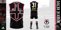
St Kilda: 1997-2001 Home
St-Kilda-PresentationRev.png
St Kilda's most iconic guernsey besides their main is relived once again. The Saints' Reverse Retro guernsey takes on more black rather than the original red, emphasising the importance of the cross design with a thick double outline of red and white. Any Saints fan would love to be in this number and it celebrates its stars, Lowe, Jones and Harvey! The '90s were truly the decade that delivered fresh guernseys and as a result, gift St Kilda a distinct Reverse Retro number... The 'Midnight Crusader'!

Massive thanks to SFgiant for permission to use the fantastic redesigned logo.​
 
Last edited:
St Kilda: 1997-2001 Home
View attachment 1536806
St Kilda's most iconic guernsey besides their main is relived once again. The Saints' Reverse Retro guernsey takes on more black rather than the original red, emphasising the importance of the cross design with a thick double outline of red and white. Any Saints fan would love to be in this number and it celebrates its stars, Lowe, Jones and Harvey! The '90s were truly the decade that delivered fresh guernseys and as a result, gift St Kilda a distinct Reverse Retro number!

Massive thanks to SFgiant for permission to use the fantastic redesigned logo.​
takemymoney.jpg
 
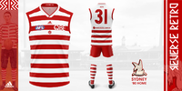
Sydney: 1880-1904 Home
Sydney-Presentation.png
Less of a reverse at first glance and most certainly a retro, but it is a reverse nonetheless. Sydney's Reverse Retro guernsey celebrates the early history of the club, way back to when they first adopted the red and white colour scheme. The original hoops made it a white guernsey but here on the front is majorly red. Across the chest is the original South Melbourne monogram, worn on the guernseys between 1920 and 1922. This guernsey acts as a nod to that brief era too and is why the majority of the back is in white and accompanied by red shorts. The Swans' Reverse Retro guernsey rehashes the hoops once more, but in this instance with just that little bit more!​
 
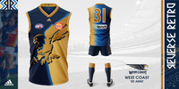
West Coast: 2000-02 Away
West-Coast-Presentation.png

The ochre but with no ochre..? Let me explain. There was only ever one West Coast guernsey that would get the Reverse Retro treatment and on this occasion, it tries to stick to the Eagles' colour scheme. An almost bronze gold takes the place of the ochre in an effort to modernise a design so at home in the early 2000s. The royal blue keeps West Coast's modern colours intact, however, the darker navy and gold harken back to the mid-'90s and 2000s era of Eagles guernseys. Here's to hoping that another generation looks at this guernsey and allows it to become fascinated with football guernseys!​
 
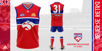
Western Bulldogs: 1997-2011 Home
Western-Bulldogs-Presentation.png
I see red, I see red, I see red! The Robodog is back again for the Western Bulldogs Reverse Retro guernsey! Such an overlooked colour in the Bulldogs' history of alternate guernseys and every dog truly has its day! A celebration of bright colours and distinct branding, the Bulldogs' Reverse Retro getup sports blue shorts as a nod to the blue guernsey, red shorts combo of the seventies and most importantly, bestowed the fan favourite Robodog a new lease on life. Here's one fit for the 'Scray!​
 
Fin.
Fin.jpg
First ever portfolio I've completed and my first with the Adobe suite was easily some of the most fun I've had designing in a long time. Recolouring the guernseys and club logos and seeing how they came out was a great experience. My personal favourites would probably be Adelaide, Brisbane, Gold Coast, Hawthorn, Melbourne, Port Adelaide, St Kilda and West Coast. Surprised myself with how I managed to recreate these designs, West Coast's especially. I would love to hear what everyone thought of this folio. To finish I ought to quote Freight Train!​
I really do love that we live on a board where the Ochre has become such a part of it, it’s not a true AFL based folio unless the Eagles get the Ochre treatment.
 
Last edited:
Fin.
View attachment 1537988
First ever portfolio I've completed and my first with the Adobe suite was easily some of the most fun I've had designing in a long time. Recolouring the guernseys and club logos and seeing how they came out was a great experience. My personal favourites would probably be Adelaide, Brisbane, Gold Coast, Hawthorn, Melbourne, Port Adelaide, St Kilda and West Coast. Surprised myself with how I managed to recreate these designs, West Coast's especially. I would love to hear what everyone thought of this folio. To finish I ought to quote Freight Train!​

You’re a credit to this board, and an incredibly talented designer. I’ve always valued concept development ahead of anything else with apparel design, and you’re streets ahead in that regard.

Incredible work. 🙌
 

Remove this Banner Ad

Back
Top