Navigation
Install the app
How to install the app on iOS
Follow along with the video below to see how to install our site as a web app on your home screen.
Note: This feature may not be available in some browsers.
More options
-
Mobile App Discontinued
Due to a number of factors, support for the current BigFooty mobile app has been discontinued. Your BigFooty login will no longer work on the Tapatalk or the BigFooty App - which is based on Tapatalk.
Apologies for any inconvenience. We will try to find a replacement.
You are using an out of date browser. It may not display this or other websites correctly.
You should upgrade or use an alternative browser.
You should upgrade or use an alternative browser.
Discussion Bad Graphic Design
- Thread starter Stromageddon
- Start date
- Tagged users None
🥰 Love BigFooty? Join now for free.
0-1So what was the score?
0-0 or 1-1?
Cory
Brownlow Medallist
- Aug 17, 2006
- 24,472
- 23,886
- AFL Club
- Geelong
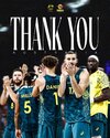
Has anyone mentioned the Australian Olympic basketball uniforms? I feel like the player names on recent editions have often made the font on the player names way too big, but this was compounded in the Olympics, by the 'Australia' on the front being microscopic.
The plain shorts without a continuation of the side panel from the singlets also drew a fair bit of negative feedback: like a team in a mid-week social comp telling you they've gone all out on custom singlets, but as for the shorts, just pick up a plain green mesh pair at Rebel.
The plain shorts without a continuation of the side panel from the singlets also drew a fair bit of negative feedback: like a team in a mid-week social comp telling you they've gone all out on custom singlets, but as for the shorts, just pick up a plain green mesh pair at Rebel.
Attachments
Log in to remove this Banner Ad
- Mar 30, 2014
- 3,024
- 5,176
- AFL Club
- Brisbane Lions

- Other Teams
- Dolphins, Seattle Kraken
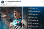
This also makes me sad that they chose McStay, cos he never got the premiership but gets to wear the jumper. Bloke deserved to win oneSurely it could’ve been proof checked to include Brisbane’s logo. However slapping the players onto a generic MCG photo looks bad
View attachment 2078783
- Jan 3, 2017
- 5,294
- 7,406
- AFL Club
- Collingwood
- Other Teams
- Celtics, Packers
Still 3 years to go on that contractThis also makes me sad that they chose McStay, cos he never got the premiership but gets to wear the jumper. Bloke deserved to win one
- Mar 30, 2014
- 3,024
- 5,176
- AFL Club
- Brisbane Lions

- Other Teams
- Dolphins, Seattle Kraken
Hey now, stop thatStill 3 years to go on that contract
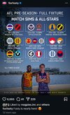
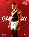
That 3-team game will be one to watchSomeone forgot to tell admin it is an AFL All Stars not NRL!
View attachment 2217055
Supercheapgiants
I'm Blue
Just not a fan of this at all
- Jan 3, 2017
- 5,294
- 7,406
- AFL Club
- Collingwood
- Other Teams
- Celtics, Packers
Just not a fan of this at all
Please, just a 1 pt stroke at least...
Swooping_Magpie
it's swooping season
what’s going on here
- Mar 30, 2014
- 3,024
- 5,176
- AFL Club
- Brisbane Lions

- Other Teams
- Dolphins, Seattle Kraken
what’s going on here
No idea why they desaturated the logos, three teams logos are changed, the others are unaffected (which is a weird decision)
Supercheapgiants
I'm Blue
Kayo having a small howler here
Freight Train
Maccas footy aficionado
Kayo having a small howler here
How so? Makes sense enough to me…
Supercheapgiants
I'm Blue
Just seemed a little unnecessary/messy including the middle graphic, throws everything a little off balance. Would've thought just including the commentators tips would sufficeHow so? Makes sense enough to me…
Cory
Brownlow Medallist
Why have a photo of a commentator looking sideways when all the rest are looking forward
🥰 Love BigFooty? Join now for free.
Gibbsy
Moderator
- Moderator
- #1,395
I'm being a little harsh here, but I could tell straight away that something was up with the Hyundai sponsor on Cripps' guernsey for the AFL 26 packshot. The rotation and positioning of the sponsor are completely wrong (it should be skewing to the right, not the left) and it's also quite obviously a lower res and the wrong colour compared to the rest of the white elements in the photo.
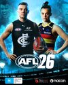
I figured it was probably a rudimentary replacement of a pic where he was wearing a Great Southern Bank guernsey.
Lo and behold...
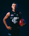

I figured it was probably a rudimentary replacement of a pic where he was wearing a Great Southern Bank guernsey.
Lo and behold...

- Oct 27, 2016
- 6,128
- 11,283
- AFL Club
- Collingwood
- Other Teams
- Packers, Raptors, Renegades
That's one of the lamest sport video game covers I've ever seen. I've seen people look more thrilled doing their taxes.I'm being a little harsh here, but I could tell straight away that something was up with the Hyundai sponsor on Cripps' guernsey for the AFL 26 packshot. The rotation and positioning of the sponsor are completely wrong (it should be skewing to the right, not the left) and it's also quite obviously a lower res and the wrong colour compared to the rest of the white elements in the photo.
View attachment 2300324
I figured it was probably a rudimentary replacement of a pic where he was wearing a Great Southern Bank guernsey.
Lo and behold...
View attachment 2300327
- May 3, 2004
- 805
- 1,616
- AFL Club
- Geelong
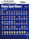
Interesting that the first logo actually used at the time was GWS' 2012.
Every other logo for the years prior is incorrect.


