


Welcome to Week 3 of the 2021 Can-Am season.
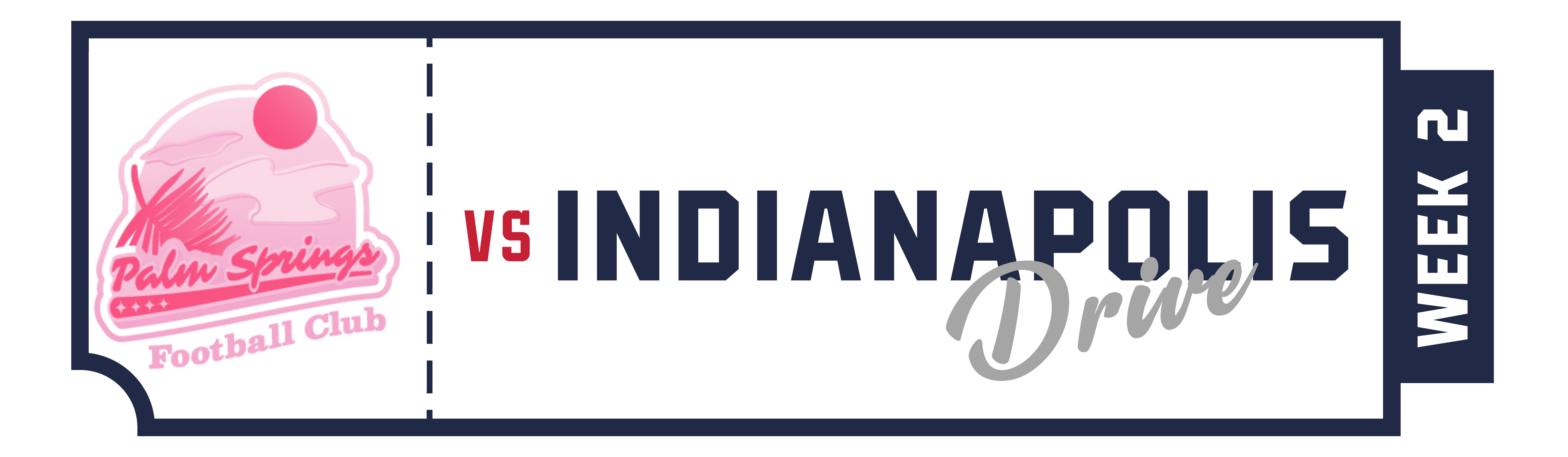
This weeks Big Ticket game sees the Can-Am 2 take precedence with the titanic matchup of the INDIANAPOLIS DRIVE vs the PALM SPRINGS FOOTBALL CLUB.
Eastern Conference
Toronto FC

@ DC Jurassic

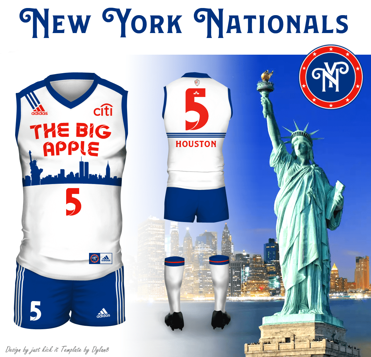
Philadelphia Surge
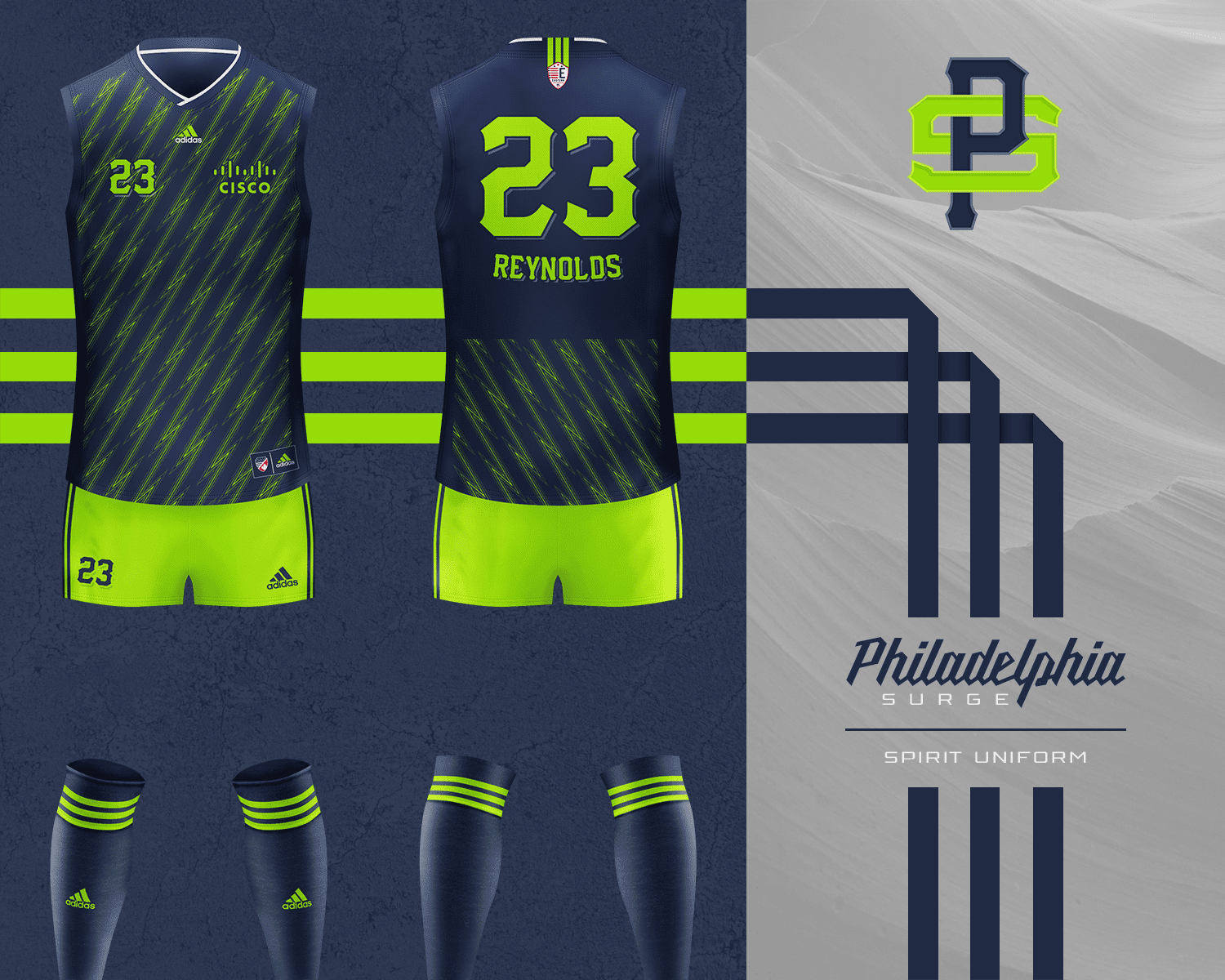
@ New York Nationals
Norfolk Pilots

@ Winnepeg Silverbacks

Western Conference
SoCal Sharks

@ The Valley Football Team

Vancouver Stags

@ Sacramento Rush

San Jose Bytes
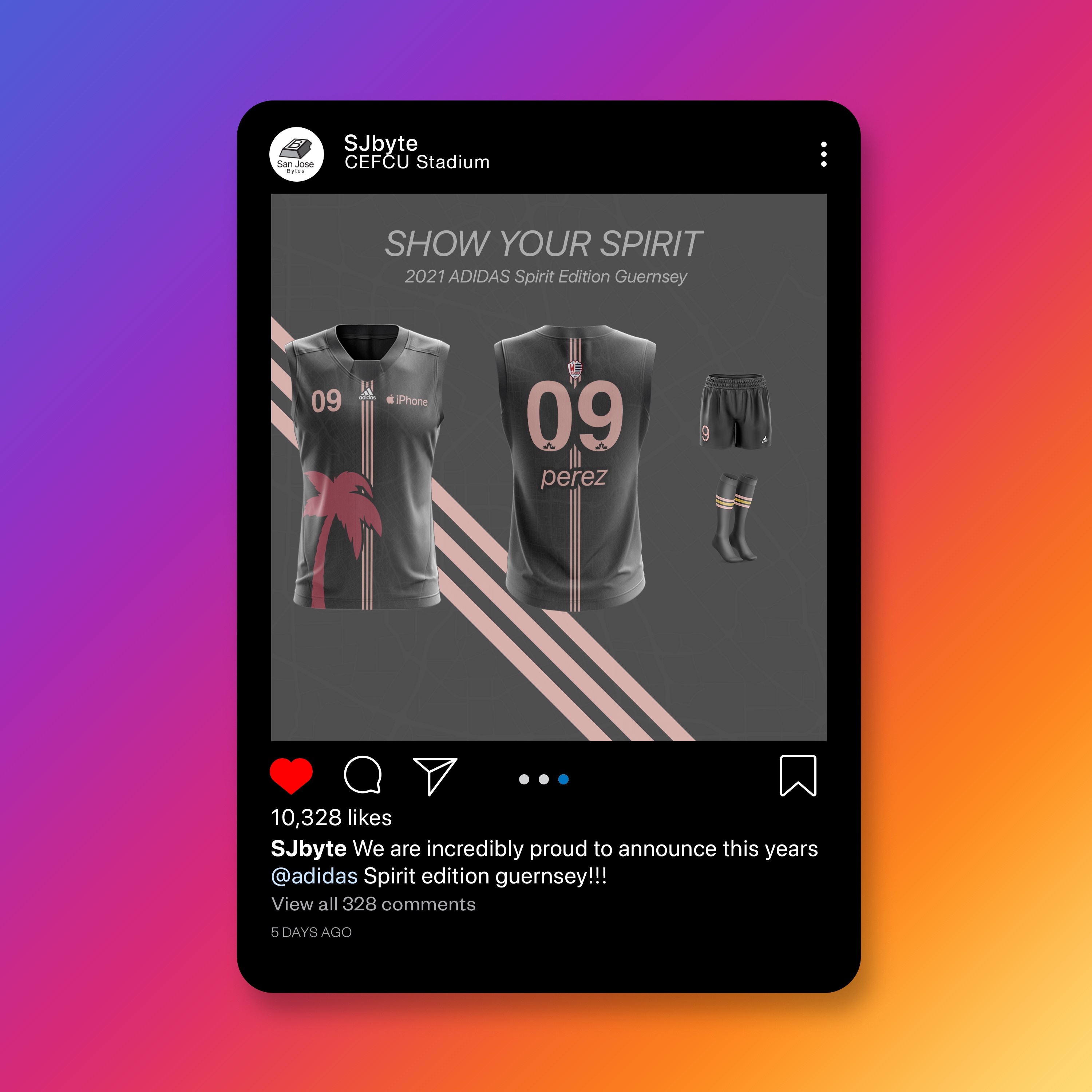
@ Colorado Bighorns

Can-Am 2
Indianapolis Drive (Indiana Bluebirds)

vs Palm Springs Football Club (Los Angeles Bears)


")

