Remove this Banner Ad

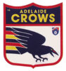
Opinion Crows Logo - the ultimate poll

  • Thread starter Thread starter feenix67
  • Start date Start date
  • Tagged users Tagged users None

Regarding the Crows Logo, do you:


  • Total voters
    86
  • Poll closed .

🥰 Love BigFooty? Join now for free.

I'd like it changed, BUT I'm not sure how confident I am in actually getting a better alternative.

the best ideas I've seen thrown out there are only marginally better and ultimately underwhelming, or in other words not worth the hassle.

the perfect logo feels like a bit of a unicorn to me at this point.
 

Log in to remove this Banner Ad

Think it needs an update not an overhaul. Keep the shape, get rid of the gradients and shadings, make it 3 solid colours and switch to a more professional font.

If it is going through an overhaul (which is a bad idea from a branding point of view), scrap the crow completely and make an AFC or ADL logo.
 
I love it!
disgusted-clint-eastwood.gif
 

Remove this Banner Ad

I'm hoping for some widespread fan consultation when we do change it. I absolutely hate how this one was forced on us.

And I think I remember Trigg saying it would grow on us.:huh:
Like a boil.

I too would be interested to see some concepts. To be fair I do think it's a hard brief. There's a lot of talented designers on the gd board but don't think anyone has ever nailed it.

The original logo is good, but there's a fair bit of nostalgia in that. Not sure how it would go down if it was presented as new today.
 

🥰 Love BigFooty? Join now for free.

The awful thing should be thrown off the end of the earth as soon as possible never to be seen again, though I suspect like with our previous logo incarnations (1990-1998, 1999-2009) it will last near a decade and even with it not being an issue for the board at all hopefully it will still eventually die off by 2020, so probably will have to reluctantly hold out until then.
 

Remove this Banner Ad

Remove this Banner Ad

🥰 Love BigFooty? Join now for free.

Back
Top Bottom