
Doctor Feel
Shitposter In Chief
- Joined
- Mar 30, 2009
- Posts
- 93,436
- Reaction score
- 277,530
- Location
- #BringBackTheBars
- AFL Club
- Port Adelaide
Why don't we just ask Facebook about whether we should be using the prison bars in any form? - PAFC
Follow along with the video below to see how to install our site as a web app on your home screen.
Note: This feature may not be available in some browsers.

We could have a white jumper with a turd in the middle of it and people on there would be saying it should be our away jumper.Why don't we just ask Facebook about whether we should be using the prison bars in any form? - PAFC
We could have a white jumper with a turd in the middle of it and people on there would be saying it should be our away jumper.
Why don't we just ask Facebook about whether we should be using the prison bars in any form? - PAFC
Log in to remove this Banner Ad
Offseason!!!!!!I found out there is a “Port River Dolphin” so I want that as our moniker farken.
Pink and black and white as our colours. If anyone with talent wants to show me how this would look that would be ace.
Otherwise I will admire the images I have conjured in my mind.

Offseason!!!!!!
View attachment 553122

We could have a white jumper with a turd in the middle of it and people on there would be saying it should be our away jumper.
I'm going to need to see a concept on that one before I pass judgement.

I've posted this in another thread, but i'm a big believer that if we'd introduced the teal PBs in 1996, they would have been by far more popular than our other efforts and we'd still be wearing them today.
The reason we consider the black and white PBs so sacrosanct is because we had our identity absolutely slammed in the mid 2000s and we had to fight tooth and nail not only to defend our club, but even just to argue that we were who we were. We were banned from using the PBs and then had our rights to our heritage trashed from pillar to post. Through that enormous amount of stress, the classic black and white PBs became the enduring symbol of our club and became so important to us because they represented everything the outside world (and often our own administration) were trying to take away from us.
Clearly, in 1996, the club went full on 1990s modern. We introduced teal which was THE sports colour of the era (the other big modern colour was purple, but Freo had gotten in first). We also totally abandoned classic football design and went totally garish, in your face 90s with our design. The combination of a new modern colour AND an OTT design was too much and there was a lot of consternation, especially from the older supporters, about how ridiculous we looked, while the rest of us, not foreseeing the identity crisis, were happy that our club was looking to the future and pushing the modern angle.
Let's do a thought experiment.
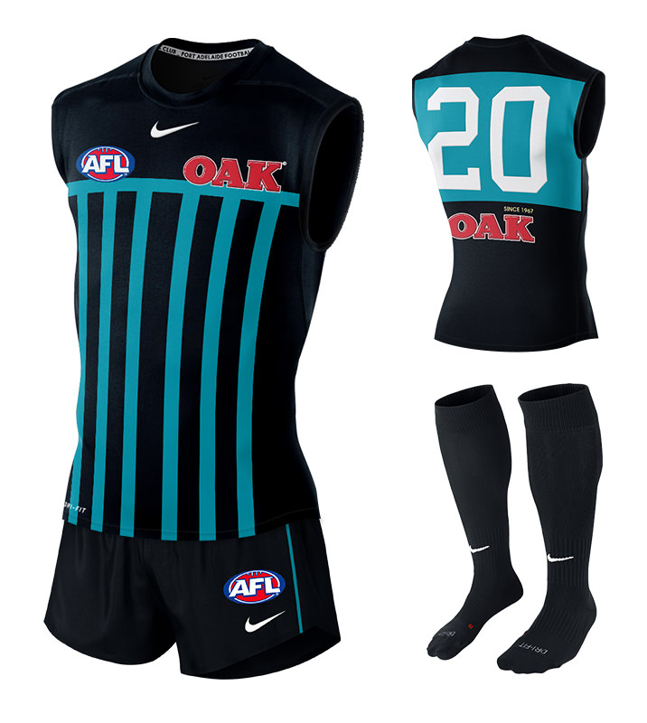
In 1996 someone taps the graphic designers on the shoulder and convinces them that teal is enough, and that we don't need to go super modern with our design, we could go for something more conventional. We'd had almost certainly gone back to the most Port Adelaide design that exists, the PBs. Something like this:
This design would have strengthened our visual links to our heritage and would have quelled a lot of the herpiest derp that ever derped "If you guys are the real Port Adelaide why do the Port Magpies wear your guernsey?" arguments that were almost a daily occurence in the mid 2000s. We would have been visually Port Adelaide, and it would have been far easier for the supporter base to accept the change of guernsey.
I'll argue that the identity crisis would have been significantly lessened by the wearing of this guernsey from day 1. Given the lesser identity crisis, we wouldn't have had the furnace of pressure that made the black and white PBs so sacrosanct, and we would have been far more accepting of the teal PBs design.
Think about it. If one of the three of Delaney, Ginevar or Hodges walked out in 1996 wearing the teal PBs, it would instantly have struck the biggest chord with the supporter base and if it wasn't the home jumper then, would have been so within a few years, and it very likely would still be our home jumper today.
I'd be in on this.I've posted this in another thread, but i'm a big believer that if we'd introduced the teal PBs in 1996, they would have been by far more popular than our other efforts and we'd still be wearing them today.
The reason we consider the black and white PBs so sacrosanct is because we had our identity absolutely slammed in the mid 2000s and we had to fight tooth and nail not only to defend our club, but even just to argue that we were who we were. We were banned from using the PBs and then had our rights to our heritage trashed from pillar to post. Through that enormous amount of stress, the classic black and white PBs became the enduring symbol of our club and became so important to us because they represented everything the outside world (and often our own administration) were trying to take away from us.
Clearly, in 1996, the club went full on 1990s modern. We introduced teal which was THE sports colour of the era (the other big modern colour was purple, but Freo had gotten in first). We also totally abandoned classic football design and went totally garish, in your face 90s with our design. The combination of a new modern colour AND an OTT design was too much and there was a lot of consternation, especially from the older supporters, about how ridiculous we looked, while the rest of us, not foreseeing the identity crisis, were happy that our club was looking to the future and pushing the modern angle.
Let's do a thought experiment.
In 1996 someone taps the graphic designers on the shoulder and convinces them that teal is enough, and that we don't need to go super modern with our design, we could go for something more conventional. We'd had almost certainly gone back to the most Port Adelaide design that exists, the PBs. Something like this:
This design would have strengthened our visual links to our heritage and would have quelled a lot of the herpiest derp that ever derped "If you guys are the real Port Adelaide why do the Port Magpies wear your guernsey?" arguments that were almost a daily occurence in the mid 2000s. We would have been visually Port Adelaide, and it would have been far easier for the supporter base to accept the change of guernsey.
I'll argue that the identity crisis would have been significantly lessened by the wearing of this guernsey from day 1. Given the lesser identity crisis, we wouldn't have had the furnace of pressure that made the black and white PBs so sacrosanct, and we would have been far more accepting of the teal PBs design.
Think about it. If one of the three of Delaney, Ginevar or Hodges walked out in 1996 wearing the teal PBs, it would instantly have struck the biggest chord with the supporter base and if it wasn't the home jumper then, would have been so within a few years, and it very likely would still be our home jumper today.
I'd be in on this.
That would be ideal, but I'd take it either way.Scorch presents a good case about strolling out in this back in ‘97 but I think any variation of the PBs can now only exist in conjunction with the original.
I can confirm this would be good.So, any confirmation that we will be wearing the PBs permanently from 2020 onwards?
I was thinking "why is that circle so ****en wobbly, musta done it in paint, bit lazy but maybe thats the point..."Central Australia Power campaigners
View attachment 584454
With that bolt across his face it took me a couple of glances to work out who he was.Done and done
View attachment 584244
I like that you didn’t even change the Gold Coast sponsor .Central Australia Power campaigners
View attachment 584454
In this universe we replace the Suns as the team that fills the 2nd Qld-NT spot since their state teams were combined during the 90s or so.I like that you didn’t even change the Gold Coast sponsor .


