Remove this Banner Ad

Portfolio EA AFL 2000

🥰 Love BigFooty? Join now for free.

Log in to remove this Banner Ad

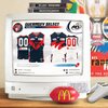
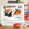
That black diamond pirate logo is spectacular.

Thank you! I tried to keep the same sort of energies as the 1990’s fistbolt, whilst creating something that felt more “Port Adelaide”.

100% a hill that I’ll die on is that Port should have been always been the Pirates. If this is how they had have entered the league, there wouldn't be as much discussion today around the brand, because it’s a stronger choice of identity, has clear imagery and ties into Port being nautical and a “foreign invader” to the league. Just gotta use those historical elements like the black diamond, the SANFL inception date etc to create those links.
 

Remove this Banner Ad

🥰 Love BigFooty? Join now for free.

Remove this Banner Ad

Portfolio EA AFL 2000

🥰 Love BigFooty? Join now for free.

Back
Top