


Looks red but is more like burnt orange on the video
View attachment 1133461
Edit - salmon actually
View attachment 1133464
This is a kit I can definitely get around.
Follow along with the video below to see how to install our site as a web app on your home screen.
Note: This feature may not be available in some browsers.
Looks red but is more like burnt orange on the video
View attachment 1133461
Edit - salmon actually
View attachment 1133464
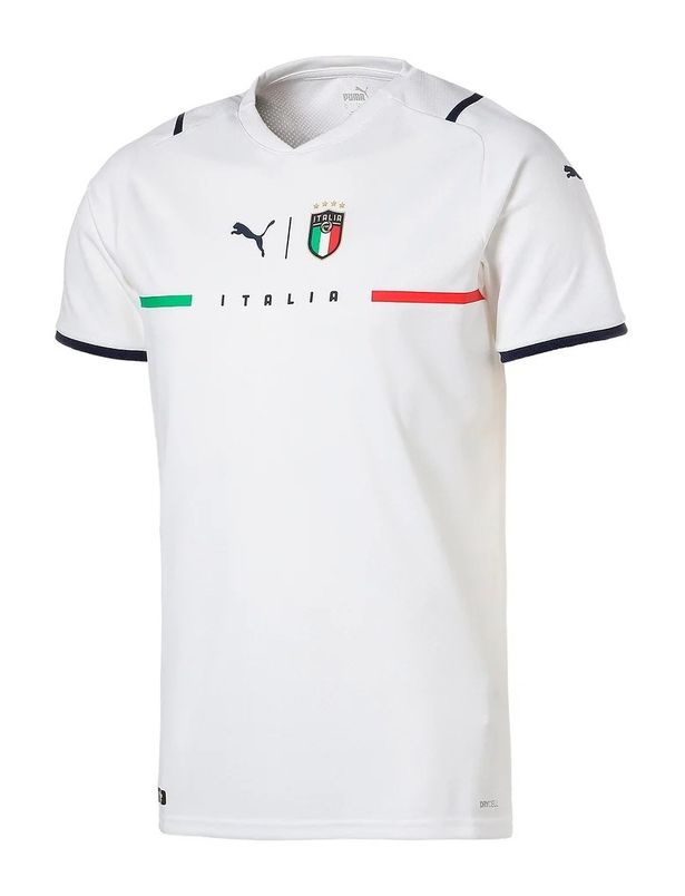
Completely white this year with a simple, clean design, to mark 100 years of the cockerel on the shirtThis is nice, it's simple.
Blue trim on sleeve cuffs would have been a nice addition.
Completely white this year with a simple, clean design, to mark 100 years of the cockerel on the shirt
it looks plain, but on a person it looks really good. The green and red, and but extension the white in the middle pops


shocking uniform
the London teams should do the same!The new Hibernian kit is getting uniformly praised. Has a map of Edinburgh on it, with the location of the ground being exactly where the club crest is.
View attachment 1154018
'Mon the CabbageThe new Hibernian kit is getting uniformly praised. Has a map of Edinburgh on it, with the location of the ground being exactly where the club crest is.
View attachment 1154018

Both nice kits. Jealous.Carlisle's home (Blue) and away (Black) kits for the 2021 season.
The home kit is inspired by the 1974/75 kit worn in our only season in the top flight.
I'm not sure how I feel about the home kit at the moment, hopefully it will grow on me, but I do like the away kit.
View attachment 1163291
Looking very Caley Thistle like DEVOCarlisle's home (Blue) and away (Black) kits for the 2021 season.
The home kit is inspired by the 1974/75 kit worn in our only season in the top flight.
I'm not sure how I feel about the home kit at the moment, hopefully it will grow on me, but I do like the away kit.
View attachment 1163291

INSULT of the highest magnitude.Looking very Caley Thistle like DEVO


