


Ochre
Stop the Steal!
closes 19:00 WST 23rd August
2 Entries max
1 Image per entry
etc etc
2 Entries max
1 Image per entry
etc etc
Follow along with the video below to see how to install our site as a web app on your home screen.
Note: This feature may not be available in some browsers.


")


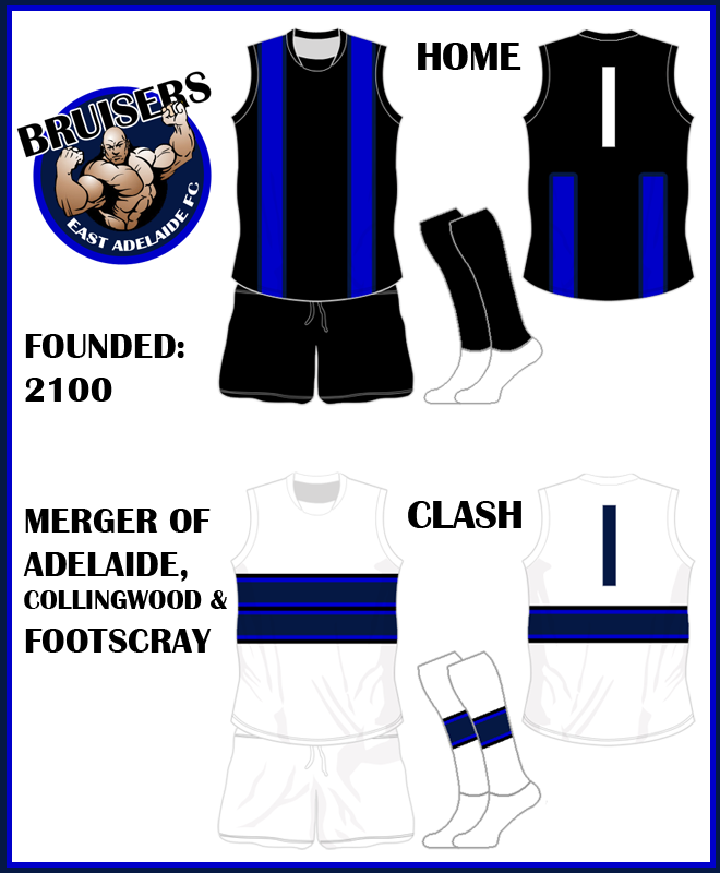
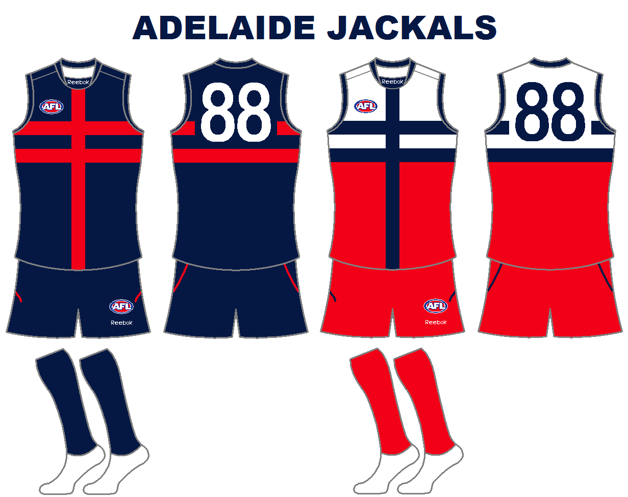
feedback??It was decided that at the end of the 2099 season the two lowest finishing Victorian teams would merge with the lowest finishing interstate team. This brought on the East Adelaide Bruisers. East Adelaide is still the only part of Adelaide not to be represented by a team named after them. Bruisers comes from the colours the three clubs chose; black, navy and royal which is the main colour of all three teams with white as a secondary colour.
Adelaide got the good part of the deal because they were able to stay put, Collingwood and Eddie III brought all the money to the merger so they were able to demand their colours be used as much as posible and Footscray, as they are known now, have brought nothing to the merger but Adelaide and Collingwood decide to give them something and use a variation of their 2003 Heritage jumper as their home jumper and then a variation of their 1975-1996 home as their clash.
right click and select 'view image' to see full size.
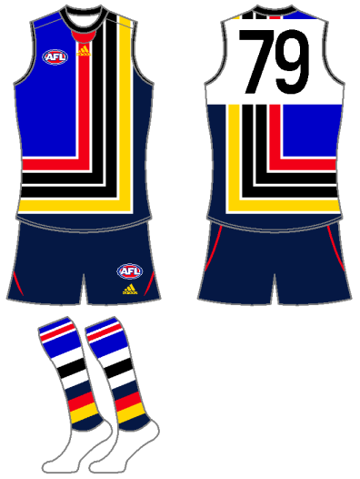
Just had look at the new entries (last couple) and your away craegus reminds me of Fitzroy's pre-season with the striped side panels.


feedback??

There was a whole back story behind that one a put up as well. Collingwood will never merge with anyone so I thought Id just put it as a date none of us will live too anyway.My first thought? 2099 is kinda ridiculous.
Yeh it doesnt really but they only other option was swap the colours around and put white where the navy is then have a royal blue clash, and as we know a royal jumper just wont cut it as a clash with the AFL.Don't like the away jumper as the blue-in-blue doesn't work.
Yeh I like the three teams but I wouldve rathered it was set up like the MOTW where it was Freo, Brisbane and North and you only had to merge two of the teams.Unfortunately having Collingwood thrust into this merger comp has affected the quality of what everyone's produced... in an attempt to get every club covered, the jumpers are looking kind of drab and dull.
Yeh thats what Ive been like for a long time looking and admiring but not saying much, but I will try and give comments to most, if not all, of the designs I see from now on and hopefully others will follow suitI rarely get feedback on the jumpers I do... I figure people just don't want to comment, they will if they want to, but it's up to them. There's always a lot of people watching, even if they say nothing.
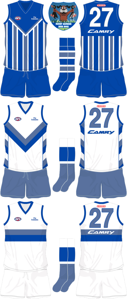
but you know what they say, great minds think alike. My second entry was going to be along these lines minus the dog, trying to emulate Port's PB design but I moved the hoops up to high and it looked like crap. The last thing is that the royal blue dog on the clash blends in too much to the navy and black, ohh and maybe a bit busy.lol*The year 1990 doesn't exist in this alternate reality!

I like this, reminds me of Essendon, which isnt a bad thing.


