Navigation
Install the app
How to install the app on iOS
Follow along with the video below to see how to install our site as a web app on your home screen.
Note: This feature may not be available in some browsers.
More options
Style variation

-
 Soccer Notice Image
Premier League - Matchday 32
FA Cup Semi-Finals ⚽ 2026 FIFA Series A - Socceroos friendlies ⚽ Europa - Rd of 16 ⚽ The Matildas x 2026 Womens Asia Cup ⚽ Conference League - KNOCKOUTS! ⚽ Conference League - Rd of 16 ⚽ Socceroos Internat'l Friendlies ⚽ Champs League - League Phase ⚽
-
 Fantasy Footy Notice Image Round 5
SuperCoach Rd 5 SC Talk - Trade Talk - Capt/VC ,//, AFL Fantasy Rd 5 AFF Talk - AF Trades - Capt/VC


You are using an out of date browser. It may not display this or other websites correctly.
You should upgrade or use an alternative browser.
You should upgrade or use an alternative browser.
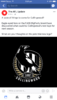
Rumour NEW LOGO
- Thread starter Matt_352
- Start date
- Tagged users None
🥰 Love BigFooty? Join now for free.

TTRRAAVVIISS
All Australian
- Joined
- Jun 24, 2014
- Posts
- 746
- Reaction score
- 1,299
- AFL Club
- Collingwood
- Banned
- #2
Is this official now? Saw it on the footy jumpers Board a few days back
- Joined
- Aug 28, 2014
- Posts
- 17,911
- Reaction score
- 20,728
- AFL Club
- Collingwood
- Thread starter
- #3
Looking like it could be.Is this official now? Saw it on the footy jumpers Board a few days back
Cousin of Daicos
HEY MAGPIE ARMY!
- Joined
- Sep 17, 2007
- Posts
- 33,634
- Reaction score
- 43,955
- Location
- Melbourne
- AFL Club
- Collingwood
- Other Teams
- Chicago Bulls, Ολυμπιακός
Much better than the trash 125 one with the GAPING gap in the middle of it.
Log in to remove this Banner Ad
jackcass
Cancelled
I don't mind it.
TTRRAAVVIISS
All Australian
- Joined
- Jun 24, 2014
- Posts
- 746
- Reaction score
- 1,299
- AFL Club
- Collingwood
- Banned
- #7
Looking like it could be.
I like it.
I always liked the 80's one with the magpie on the fence more than the one with the Aussie flag on it.
Especially when they had to change it around as the Oz flag was the wrong way or whatever the reason was.
- Joined
- Apr 20, 2015
- Posts
- 6,710
- Reaction score
- 10,605
- AFL Club
- Collingwood
I actually quite like it
TTRRAAVVIISS
All Australian
- Joined
- Jun 24, 2014
- Posts
- 746
- Reaction score
- 1,299
- AFL Club
- Collingwood
- Banned
- #9

I'm surprised no one mentioned it when it leaked out last week...
Great pick up
TTRRAAVVIISS
All Australian
- Joined
- Jun 24, 2014
- Posts
- 746
- Reaction score
- 1,299
- AFL Club
- Collingwood
- Banned
- #10
Much better than the trash 125 one with the GAPING gap in the middle of it.
I remember in like 04 the club did a poll about a new crest. Two magpies on it. Something to do with the nursery rhyme of two magpies for luck or happiness. Cause one magpie was sorrow or something like that... anyways ... not much luck brought by the two magpies on this years logo
Why change it? I thought it was awesome how old our logo was in comparing to some of the cartoon character ones other clubs have. But anyway, don't hate it.
- Joined
- Apr 18, 2015
- Posts
- 21,055
- Reaction score
- 25,582
- AFL Club
- Collingwood
- Other Teams
- PAOK of SALONIKA LIVERPOOL
Not sure I like it.. I don't like the design of the gold. Makes it look tacky. Visualising it without the gold.. much better.
Much better than the trash 125 one with the GAPING gap in the middle of it.
Trash was it? Over reaction much as always!
On iPhone using BigFooty.com mobile app
- Joined
- Apr 18, 2015
- Posts
- 21,055
- Reaction score
- 25,582
- AFL Club
- Collingwood
- Other Teams
- PAOK of SALONIKA LIVERPOOL
Had to count the gold feathers just to make sure there wasn't 33 of em to represent McGuire's 33 rank Grandmaster Freemasonry.
So McGuire didn't have a say in the design. He's involved himself in everything else.. pos etsi Mcguire.. you missed this finger in the pie job buddy.
So McGuire didn't have a say in the design. He's involved himself in everything else.. pos etsi Mcguire.. you missed this finger in the pie job buddy.
It looks good. Needed an update.
- Joined
- Nov 26, 2007
- Posts
- 9,138
- Reaction score
- 3,913
- Location
- melbourne
- AFL Club
- Collingwood
- Other Teams
- Man utd, miami dolphins
mattys123
Hall of Famer
- Joined
- Mar 24, 2008
- Posts
- 31,426
- Reaction score
- 20,290
- Location
- Melbourne
- AFL Club
- Collingwood
- Other Teams
- LAK, NUFC, SAS, SFGiants, 49ers,
The Magpie looks lonely. Like it's missing something. Like finals.
So its quite fitting really. One bird. Sitting alone contemplating if we will ever play finals again.
So its quite fitting really. One bird. Sitting alone contemplating if we will ever play finals again.
🥰 Love BigFooty? Join now for free.

BoxMatrix
Premium Platinum
- Joined
- Jul 15, 2014
- Posts
- 5,683
- Reaction score
- 8,793
- AFL Club
- Collingwood
- Other Teams
- Los Angeles Lakers, Deontay Wilder
Not a fan. The old logo was timeless.
AD2010
Senior List
I'm not surprised as I went to a paid focus group earlier this year to discuss whether they should go back to the old one or keep the 125 year one.
Although everyone present liked the old one it was apparent that Collingwood FC was keen to have a new emblem without the Australian flag.
Not surprised at all!
Although everyone present liked the old one it was apparent that Collingwood FC was keen to have a new emblem without the Australian flag.
Not surprised at all!
Cousin of Daicos
HEY MAGPIE ARMY!
- Joined
- Sep 17, 2007
- Posts
- 33,634
- Reaction score
- 43,955
- Location
- Melbourne
- AFL Club
- Collingwood
- Other Teams
- Chicago Bulls, Ολυμπιακός
You'll find that even in the thread where the 125 logo was revealed, the gap between the 2 magpies ruined the entire logo from a design perspective.
But maybe it's just me as a former graphic designer being pickier than most.
- Joined
- Jan 22, 2011
- Posts
- 10,792
- Reaction score
- 20,990
- AFL Club
- Collingwood
- Other Teams
- Collingwood VFL, #TeamBatman
I'm not surprised as I went to a paid focus group earlier this year to discuss whether they should go back to the old one or keep the 125 year one.
Although everyone present liked the old one it was apparent that Collingwood FC was keen to have a new emblem without the Australian flag.
Not surprised at all!
Problem solved, then.

I'll give you this one for free, lukem. In the service of my club, of course...
Last edited:
Similar threads


- Replies
- 63
- Views
- 6K