Portfolio NSL '99 - Design Project - 16/16 TEAMS COMPLETE

NSL99.png


NSL '99

In a not-so-distant alternate reality, in a time not so long ago, it was the verge of the millennium for the Australian National Soccer League...

In line with my AFL '99 portfolio, I'll be presenting sixteen teams of the National Soccer League for the 1999-2000 season. Some clubs will stay true to their designs, and some will go in a completely different direction. In this portfolio, Adidas will be the official kit supplier of the NSL.​
 
Last edited:
  • Thread starter
  • Moderator
  • #2
Adelaide City.png


ADELAIDE CITY
The Zebras

In a design fitting for "The Zebras", Adelaide City wear an almost outrageous zebra pattern in place of the traditional vertical black and white stripes. The home kit is predominately black with white detailing, whereas the away is a simple inverse.​
 
Last edited:
  • Thread starter
  • Moderator
  • #3
Auckland Kingz.png


AUCKLAND KINGZ

Gold - fit for a king, or kingz. Using the classic Columbia style shoulder stripes - the Kingz roll out in a relatively modest design, with a black home and white away design.​
 
Last edited:
  • Thread starter
  • Moderator
  • #5
Nice work on the Kingz, never understood that whole don't want them mixed up with the NBL Kings.

Would like to see a Gold set.

I did originally go with gold as the away but it just didn't look as good as the white IMO. Plus most teams will end up with a white away anyway.

Gold works better as an accent than a base colour.
 
View attachment 426416

ADELAIDE CITY
The Zebras

In a design fitting for "The Zebras", Adelaide City wear an almost outrageous zebra pattern in place of the traditional vertical black and white stripes. The home kit is predominately black with white detailing, whereas the away is a simple inverse.​

656.gif
 
  • Thread starter
  • Moderator
  • #7
Brisbane Strikers.png


BRISBANE STRIKERS

On a personal note, my favourite memory with my late grandma was seeing these guys get thrashed 7-2 by the Glory. On a design note, the Strikers have kept with the lightning bolt moniker through their kits, and have gone with a royal blue home instead of the traditional yellow base.​
 
  • Thread starter
  • Moderator
  • #9

Silent Alarm

sack Lyon
10k Posts
Jul 9, 2010
24,163
26,535
AFL Club
Fremantle
Trefoil matches the retro vibe better - plus it was still used, just nowhere near as much as the 80s.
Not being a prick – your portfolio so do what you want, but what examples are there of the trefoil being used past about 1992? Curious and not being patronising.
 
  • Thread starter
  • Moderator
  • #11
Not being a prick – your portfolio so do what you want, but what examples are there of the trefoil being used past about 1992? Curious and not being patronising.

I should clarify - I don't believe it was used for on-field apparel but it was used in casual wear etc.

So you're right in that the mountain logo would have been more accurate, but given how modern the template looks it just made them look like current designs. Plus I have a hard-on for the trefoil and I'm my alternate universe Adidas never let go of the trefoil. ;)
 
Not being a prick – your portfolio so do what you want, but what examples are there of the trefoil being used past about 1992? Curious and not being patronising.
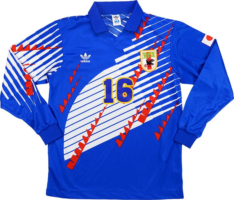
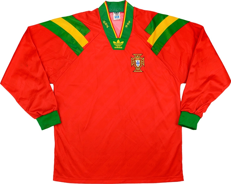
Japan and Portugals 1993 kits.
adidas-1993-japan-match-worn-home-shirt-a.jpg
adidas_1993_portugal_match_worn_home_shirt_nogueira_a.jpg
 
The trefoil seems to suit the designs pretty well imo, but that’s probably because I’m not old enough to remember a time when it was actually in use.
EDIT: also, this is a design project and not a historical database so it doesn’t really even matter.
 

Silent Alarm

sack Lyon
10k Posts
Jul 9, 2010
24,163
26,535
AFL Club
Fremantle
So weird seeing the trefoil in that pure mid-90s collar
Especially since this was the collar that launched the current logo.

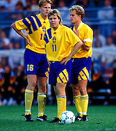
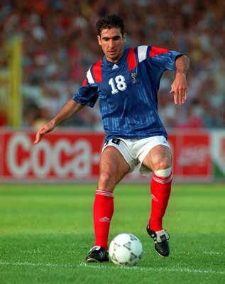
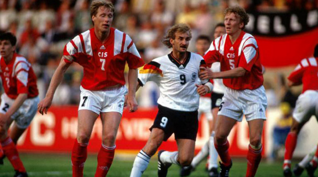
The Adidas Equipment line came out for Euro '92 and obviously a heap of teams wore it.

I0000ck5.9tkOPj0.jpg

CwrOLLAWQAEZtmv.jpg

european-championships-1992-sweden-v-germany-stockholm-jurgen-picture-id174038307

140933803152589545.png


Pretty weird Euro though... held in Sweden? Place is tiny. And it was their first ever European Championship? Strange to think only eight teams played in it as well and half of them wore Adidas. Then CIS (white males) playing as some hybrid made up placeholder for the USSR which basically only existed for this comp... I guess it proves just how ludicrously overhyped the Denmark qualification/win story is. Not that hard to win in an eight team comp and when a relatively high number of teams were average. Was also the first comp to mandate front of shirt numbers and also change the pass back rules for keepers. Two points for a win... Cantona actually playing for France... Weird s**t.
 
  • Thread starter
  • Moderator
  • #16
Canberra Cosmos.png


CANBERRA COSMOS

In the first real move away from existing branding in this portfolio, the Canberra Cosmos swapped away the blue and yellow for green and black. The design features the classic USA '94 star design, with a primarily green and black design at home and white with green on the road.​
 
  • Thread starter
  • Moderator
  • #17
Carlton SC.png


CARLTON SC

I struggled with doing something interesting for Carlton - but I couldn't resist rolling out the classic gradient tessellation. Navy with white shorts (white shorts are underrated) for the home, and the inverse for the away.​
 

SeanyDogs13

In the Kennel
Sep 25, 2017
84
109
Wyndham Vale, Victoria
AFL Club
Western Bulldogs
Other Teams
Liverpool & Adelaide Strikers
View attachment 427739

CANBERRA COSMOS

In the first real move away from existing branding in this portfolio, the Canberra Cosmos swapped away the blue and yellow for green and black. The design features the classic USA '94 star design, with a primarily green and black design at home and white with green on the road.​
Loving the Ansett Australia Sponsorship
 

Gibbsy

Cakewalk
Oct 12, 2009
23,613
27,536
Geetroit
AFL Club
Collingwood
View attachment 428148

CARLTON SC

I struggled with doing something interesting for Carlton - but I couldn't resist rolling out the classic gradient tessellation. Navy with white shorts (white shorts are underrated) for the home, and the inverse for the away.​

This is so smooth. I always thought that Carlton SC font used at the time was pretty modern.
 

chibimatty

Club Legend
Nov 15, 2010
2,407
2,154
Western Australia
AFL Club
Fremantle
Other Teams
WACA, Western Force, Arsenal, Glory
View attachment 427739

CANBERRA COSMOS

In the first real move away from existing branding in this portfolio, the Canberra Cosmos swapped away the blue and yellow for green and black. The design features the classic USA '94 star design, with a primarily green and black design at home and white with green on the road.​

Must admit, I'd like to see your version with the old Cosmos colours. If I remember correctly, it was very much like the Eagles' ochre and navy colour scheme. I thought you may have had a field-day with that...

16602829_1729175647393881_812689851481916561_n.jpg
 
  • Thread starter
  • Moderator
  • #21
Must admit, I'd like to see your version with the old Cosmos colours. If I remember correctly, it was very much like the Eagles' ochre and navy colour scheme. I thought you may have had a field-day with that...

View attachment 429004

tempting.

very tempting.
 
  • Thread starter
  • Moderator
  • #23
i would have liked seeing u use calvin klein as the supplier

Well, y'know, there's nothing stopping you making your own Calvin Klein football portfolio. :)
 
  • Thread starter
  • Moderator
  • #25
Back