Navigation
Install the app
How to install the app on iOS
Follow along with the video below to see how to install our site as a web app on your home screen.
Note: This feature may not be available in some browsers.
More options


You are using an out of date browser. It may not display this or other websites correctly.
You should upgrade or use an alternative browser.
You should upgrade or use an alternative browser.
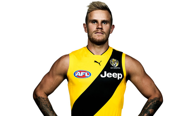
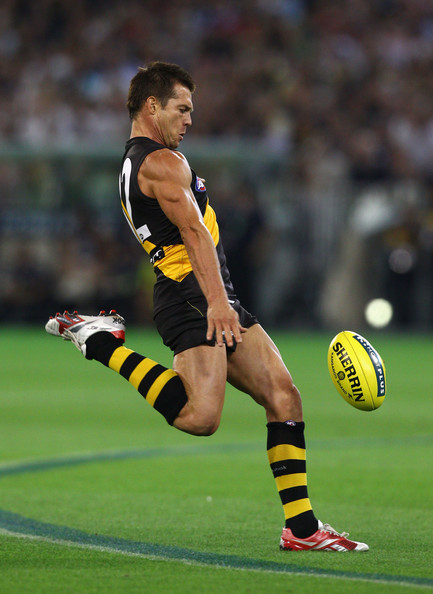
News RICHMOND PARTNER WITH PUMA
- Thread starter Punt rd end
- Start date
- Tagged users None
- Status
- Not open for further replies.

michaelj004
Senior List
- Sep 25, 2013
- 203
- 533
- AFL Club
- Richmond
rfctiger74 brings up an excellent point about brand continuity in another thread.
My main worry is it might seem too straining for the club to update all their branding. Personally I don't think it's too difficult as most of the merchandise uses the current yellow anyway. In terms of digital, that too is an easy change.
My main worry is it might seem too straining for the club to update all their branding. Personally I don't think it's too difficult as most of the merchandise uses the current yellow anyway. In terms of digital, that too is an easy change.
Groupie_
time to return the traditional Richmond yellow
thats flurogreen
Groupie_
time to return the traditional Richmond yellow
wtf bro get outta here with that s**trfctiger74 brings up an excellent point about brand continuity in another thread.
My main worry is it might seem too straining for the club to update all their branding. Personally I don't think it's too difficult as most of the merchandise uses the current yellow anyway. In terms of digital, that too is an easy change.
#fluro1yearonly
#backtotherealyellowandblacknextyear
#putyourhighlightersout
prodigy
Sonsie Fan Boy
- Jun 20, 2013
- 17,776
- 56,366
- AFL Club
- Richmond
- Other Teams
- Liverpool
I'd like someone to do a real life comparison. Get their new jumper, put a yellow stabilo highlighter pen on the sash, if it's the same, we will know.
Sent from my iPhone using Tapatalk
Sent from my iPhone using Tapatalk
Well it's notthats flurogreen
Poor RFC, read the BLK thread and saw the people wanted Dortmund Y&B from Puma, delivered to the people.
Now the people have changed their mind
Now the people have changed their mind
michaelj004
Senior List
- Sep 25, 2013
- 203
- 533
- AFL Club
- Richmond
wtf bro get outta here with that s**t
#fluro1yearonly
#backtotherealyellowandblacknextyear
#putyourhighlightersout
Embrace change
TheLoungeLizard
The world's most handsome man
- Aug 25, 2014
- 7,718
- 11,772
- AFL Club
- Richmond
I got that one too and the black has got a weird greeny look to it. Puma is much better.a nab cup jumper
Groupie_
time to return the traditional Richmond yellow
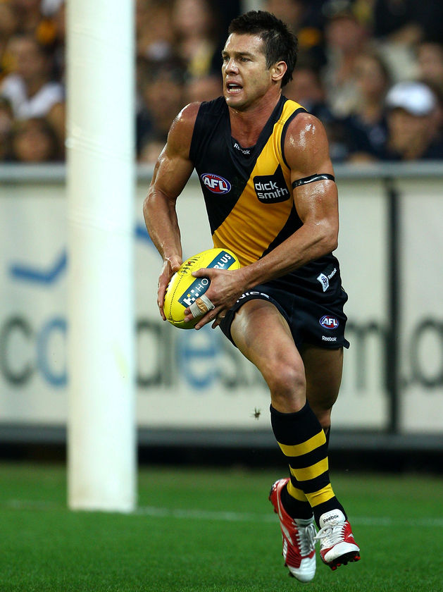
2009 or 10 ? they have different materialI got that one too and the black has got a weird greeny look to it. Puma is much better.
- Aug 25, 2014
- 7,718
- 11,772
- AFL Club
- Richmond
20102009 or 10 ? they have different material
Groupie_
time to return the traditional Richmond yellow
the yellow shits on puma tho2010
- Aug 25, 2014
- 7,718
- 11,772
- AFL Club
- Richmond
Nahhhh no way.the yellow shits on puma tho
TheLoungeLizard
The world's most handsome man
UpTheTigs
Club Legend
Don't mind the Yellow, maybe one shade too bright (not sure of genuine colour terms). My biggest dislike with the jersey is the yellow on the collar. Unnecessary.
Nostradumbass
BigFooty Legend
- Oct 2, 2007
- 47,196
- 115,992
- AFL Club
- Richmond
- Other Teams
- Everton FC Williamstown FC
hahah nahas
Groupie_
time to return the traditional Richmond yellow
cherry picker
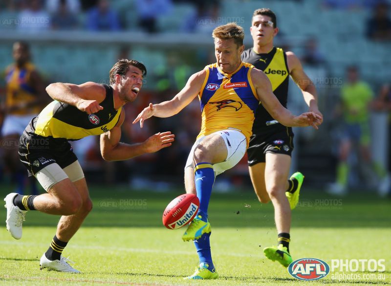
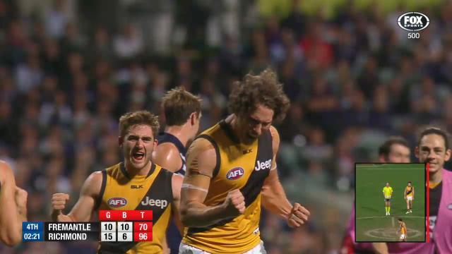
the new yellow looks especially shocking here, the fluro look makes it look cheap:
prodigy
Sonsie Fan Boy
- Jun 20, 2013
- 17,776
- 56,366
- AFL Club
- Richmond
- Other Teams
- Liverpool
Don't mind the Yellow, maybe one shade too bright (not sure of genuine colour terms). My biggest dislike with the jersey is the yellow on the collar. Unnecessary.
I like it.
Sent from my iPhone using Tapatalk
TheLoungeLizard
The world's most handsome man
cherry picker
the new yellow looks especially shocking here, the fluro look makes it look cheap:
I actually agree with you about the yellow (and the collar piping, although the actual collar is excellent)
I was just showing how all yellows by all manufacturers can look faded/light/wrong (chose your word) in certain lighting and whilst I fundamentally prefer the richer Reebok yellow, I'm not throwing the toys out of the cot with the Puma yellow either.
Groupie_
time to return the traditional Richmond yellow
me neither its ok for 1 season. hopefully gale doesnt want us to look like giant highlighter pens for 2018 and beyondI actually agree with you about the yellow (and the collar piping, although the actual collar is excellent)
I was just showing how all yellows by all manufacturers can look faded/light/wrong (chose your word) in certain lighting and whilst I fundamentally prefer the richer Reebok yellow, I'm not throwing the toys out of the cot with the Puma yellow either.
cherry picker
the new yellow looks especially shocking here, the fluro look makes it look cheap:
Again the yellow of the "ME Bank" Centre in the background manipulates the perception of the yellow.
I also think the green Bingle logo doesn't help. There's not too much wrong with it but ideally the shade that we get in proper lighting would be the shade we get in the worst lighting. If you get what I mean.
TheLoungeLizard
The world's most handsome man
I don't see it changing after one season though.me neither its ok for 1 season. hopefully gale doesnt want us to look like giant highlighter pens for 2018 and beyond
You would think at a minimum it's here for two, not many clubs have made drastic changes to the Guernseys after one season that would require supporters spending another $100+ on a jumper/training gear/polos
Unless the sale's of this years haven't been all that flash - but I think they have.
- Status
- Not open for further replies.
Similar threads
- Locked
- Replies
- 952
- Views
- 10K
- Replies
- 1K
- Views
- 13K
