- Banned
- #151
looks shiteIt’s a really nice shade, very similar to the mid-00s Nike. Looks great
too fluro
Follow along with the video below to see how to install our site as a web app on your home screen.
Note: This feature may not be available in some browsers.
looks shiteIt’s a really nice shade, very similar to the mid-00s Nike. Looks great
The thing is, Adidas made 3 pairs of shorts for Essendon.Not sure if it looks as bad as essendon did for 1 or 2 games with their grey shorts
On clashing Shaun Grigg has a handball directly to a Carlton player in the last quarter and gave a bit of a shocked look when said player ran off in the opposite direction.
Now given the game Grigg had I’d say it’s generous to call the handball an error because of a jumper clash but still seems odd Carlton weren’t in the grey given both jumpers are predominantly one very dark color.
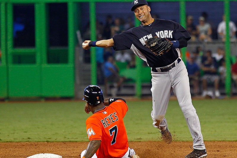
The wolf grey shorts just need some loops on the waist for a belt. If it's good enough for the Yankees...

That works because of their length. Make it shorts and it looks s**t - even with a belt
I think it’s more the fact that “New York” and the side panels are also grey so the top, you know, actually matches the pants.
Adelaide CrowsAside from the "Adelaide Crows" and "Geelong Cats", what other clubs keep their mascot name in their team name on channel 7?
Simple solution, only wear the silver top with them, problem solved!The shorts really arent the worst thing in the world, as people seem to make it out to be. They are bad, but not terrible. And it makes sense. Their clash kit is all grey, Nike wouldnt make white shorts for some games that Carlton play
Well it was pretty embarrassing for the eyewear companies that sponsored them.View attachment 473247
Umpires are without a sponsor.... oh dear!
Why? I reckon it was great marketing.Well it was pretty embarrassing for the eyewear companies that sponsored them.
Gold Coast with the special privilege of having suns capitalised as wellAdelaide Crows
Brisbane Lions
Carlton
Collingwood
Essendon
Fremantle
Geelong Cats
Gold Coast Suns
GWS Giants
Hawthorn
Melbourne
North Melbourne
Port Adelaide
Richmond
St. Kilda
Sydney Swans
West Coast Eagles
Western Bulldogs
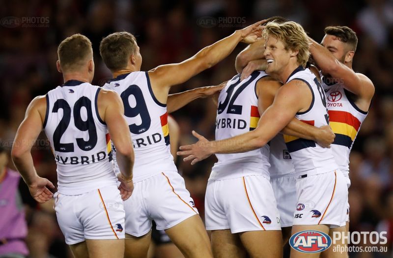
It looks really clean but I wonder the effectiveness of just the word without the logo. Hybrid what? He is a hybrid man-machine?I reckon the "Hybrid" wordmark looks really neat on the Crows. Really tidy sponsorship.
I reckon the "Hybrid" wordmark looks really neat on the Crows. Really tidy sponsorship.
View attachment 473247
Umpires are without a sponsor.... oh dear!
I thought it was the same height as last year but they've brought the font in line with the players jumpers. Looks better but should be higher on the shirt.Is it just me or are the umpires' numbers significantly lower than last year? Looks like they're almost getting tucked in to their shorts!
When they play WCE/Freo will they have it facing west?
It's the same height, just looks lower without a sponsor above it. And it can't go higher cos the back is in two panels, there's an old-school Adidas-style arch across the back.I thought it was the same height as last year but they've brought the font in line with the players jumpers. Looks better but should be higher on the shirt.
Can't really mirror it with the wording underneath the rapter thing