Last edited by a moderator:
Follow along with the video below to see how to install our site as a web app on your home screen.
Note: This feature may not be available in some browsers.
The Geelong ANZAC jumper is exactly what all clubs should do. None of this unnecessary tacky silhouette rubbish. Keep it simple and respectful and clash free, and nothing more.
two simple but brilliant designs


Think someone left it out in the sunQuite like our ANZAC kit again this year.
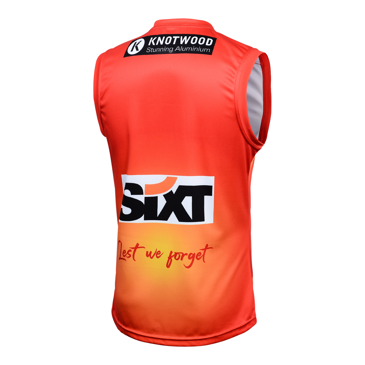
View attachment 1663237SUNS launch 2023 ANZAC guernsey
The Gold Coast SUNS has unveiled its 2023 ANZAC guernsey to be worn in the match against North Melbourne in Round 6.www.goldcoastfc.com.au
on one hand like the simplicity of it on the other are they just trying to be like collingwood now having special guernseys that really arent different to there main guernsey

Quite like our ANZAC kit again this year.
View attachment 1663237SUNS launch 2023 ANZAC guernsey
The Gold Coast SUNS has unveiled its 2023 ANZAC guernsey to be worn in the match against North Melbourne in Round 6.
I knew I had been putting off buying my new Cats jumper for a reason.
i don’t mind it, but only for 300+ plus game milestones. it’s a team effort yes, but these players sacrifice a lot to make it to 300 games and it’s only fitting they have a special logo on the guernsey in their milestone game. norths done it for everyone of their players since these sort of logos on jumpers became a thing.Hmm. I’m not massive on individualised logos in a team game.
Maaaaybe if they’re breaking the club record.
Somehow don’t think we’ll be seeing a Steele Sidebottom 300 custom logo in six weeks’ time but I’m happy to be proven wrong.
Priorities?
View from Suns back

The tasmanian sponsorship really hurts me
The brown bottom of the jumper feels awkward
The tasmanian sponsorship really hurts me
It is, but makes it look more like a jumpsuit than pant and top. I think it feels a bit awkward.Is it not the ground the soldier is standing on?
Sent from my iPhone using BigFooty.com
Maybe it does respect the space on the right side - it's just getting caught on his massive pectorals?It’s a shocker. Putting aside the garishness of the guernsey (which I’m sure the Facebook crowd think is ‘a beautiful tribute’), they’ve decided to respect the Tasmanian logo’s clear space on the left side and then completely forgo it on the right side. It looks terribly unbalanced.