Simon Phoenix
Senior List
- Oct 1, 2013
- 262
- 462
- AFL Club
- Western Bulldogs
Follow along with the video below to see how to install our site as a web app on your home screen.
Note: This feature may not be available in some browsers.
I doubt they will, City just released a red and white New Era cap which looks amazing.I keep thinking "this is the year they ditch the candy strpies...."
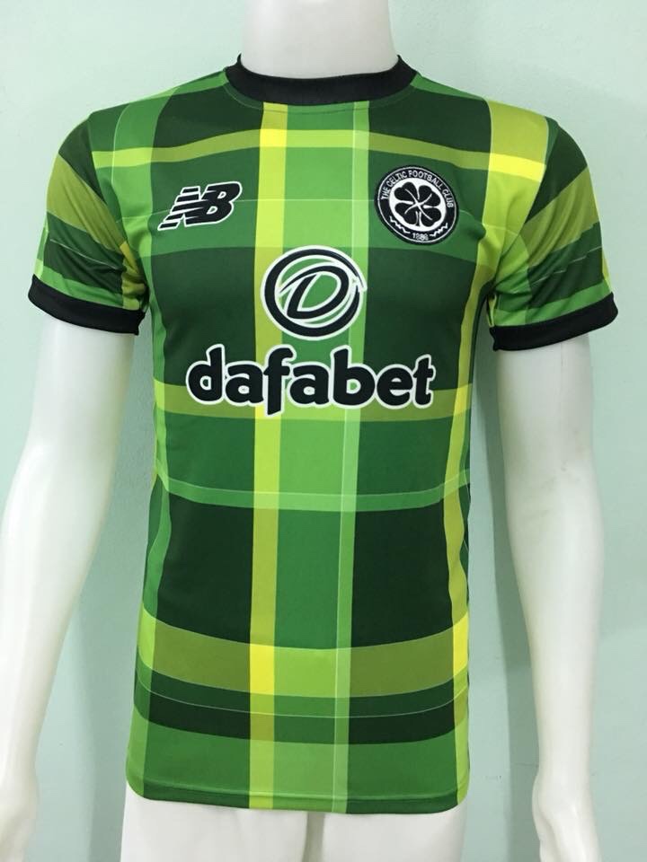
Not sure where you found that monstrosityApparent Celtic 3rd kit
Gie it laldy


Man City to Puma apparently on next season
Man City to Puma apparently on next season
Home kit has leaked.
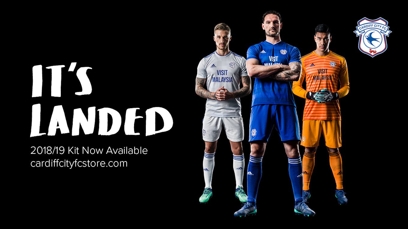
Home kit has leaked.
Home kit has leaked.
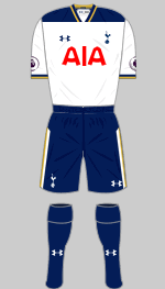
What's wrong with the font lol. Really inoffensive sponsor logo, that. Definitely return the white shorts though.
The font for the sponsor is ridiculous, they used the same last year as well!
Shorts should also be white!!!
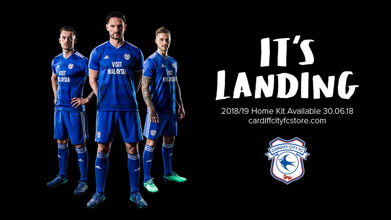
Malaysia's their sponsor, not Wales.What about something that said “Visit Wales”, seeing they are the leading clubs in the EPL.
I don't mind it. But really it's the away kit that gets interesting.Home kit has leaked.
I'm just happy it doesn't have that strange button collar thing Nike have subjected some other clubs to.Home kit has leaked.
We have a Malaysian owner (and politician), who uses the club to advertise his country.I understand that. But there’s a whole marketing area that Cardiff could be taking advantage of.
I think it's just so banal and dull, like if you had a barebones version of Word that'd be one of the 10 fonts you could choose from. Or it's like Pro Evo where you can manually write a sponsor out and choose between a sans and serifed font.What's wrong with the font lol. Really inoffensive sponsor logo, that. Definitely return the white shorts though.
Actually the Sydney one is missing the stripe down the middle which was on last years.I think it's just so banal and dull, like if you had a barebones version of Word that'd be one of the 10 fonts you could choose from. Or it's like Pro Evo where you can manually write a sponsor out and choose between a sans and serifed font.
The whole Cardiff set is so bad. Good they're back in blue but jesus christ, it's just so phoned in. There are League Two clubs with smarter use of templates. Between that and their stadium it's a real generic look.
Also that Sydney FC shirt... ******* hell, it's the same, exact same, as the last one but with a sleeve pattern from last year's Arsenal shirts. Far out that is lazy. Though it low key suits em that they're at the SCG. Presume they're playing games there, but it's a nice conducive look for Sydney FC. They ain't a Jubilee Oval team.
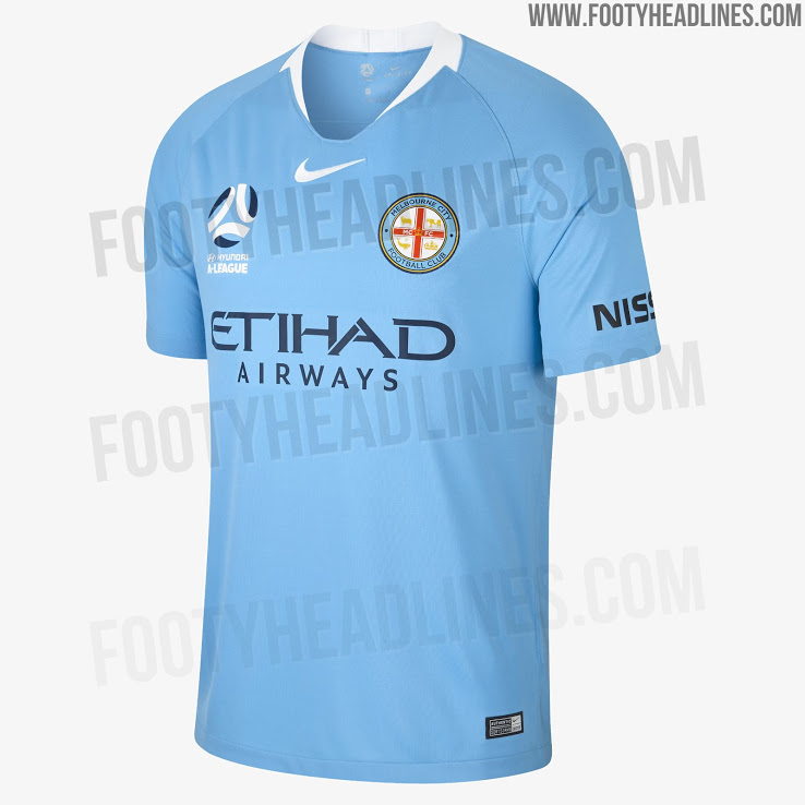
Also can't tell you how much I love the current Nike template. I was a bit eh on the previous version but I think it's the perfect template. It's identifiable, has 3-4 collars that work well (the angular one on the Melbsity shirt is so sick, 2002 Brazil, 03/04 Invincibles vibe), the sleeve pattern idea is so obvious it's amazing it wasn't used before as a manufacturer calling card, and it can really balance the outlandish with the simple.
A real shame Arsenal are no longer with Nike because that collar screams up and the template makes sense. The current yellow and blue Chelsea away kit should be ours. Also a pity that Nike don't just grab the A-League sponsorship... Brisbane, Wellington eh but imagine some chevrons going down the sleeve for Victory? Even just plain red with the navy collar, some yellow swooshes and numbers, would be a nice look for Adelaide. And the Glory with all purple and an orange collar? Man.