Portfolio SPANNA ATHLETIC PRESENTS- 30 Days Of Sports Design | Day 30 completed!

Remove this Banner Ad

Day 8 sees a merger between Port and Adelaide to become the SA Thunderbirds. I admit -this one is an absolute mess.

I've bastardised Port's chevrons into a different kind of design, and incorporated both teams colours. I added teal only to add some more of the Power's identity into the concept, but do you guys think the design would still work without it? Let me know below.
View attachment 317579
I feel ill

"Chevron" design/shape looks good (but either Crows or Port alone please!)
 
Day 8 sees a merger between Port and Adelaide to become the SA Thunderbirds. I admit -this one is an absolute mess.

I've bastardised Port's chevrons into a different kind of design, and incorporated both teams colours. I added teal only to add some more of the Power's identity into the concept, but do you guys think the design would still work without it? Let me know below.
View attachment 317579
Should have used black and white from Port only...
 
Day 8 sees a merger between Port and Adelaide to become the SA Thunderbirds. I admit -this one is an absolute mess.

I've bastardised Port's chevrons into a different kind of design, and incorporated both teams colours. I added teal only to add some more of the Power's identity into the concept, but do you guys think the design would still work without it? Let me know below.
View attachment 317579
A bit OT but here's a possible away/clash jumper for your hypothetical team:

BLK.png
 

Log in to remove this ad.

A third of the way through!

Gold Coast are on the chopping board for Day 10. Their actual logo is crappy and generic, so I thought giving them the European treatment might make them more attractive. Just a simple design, but effective IMO.
day10.png
 
A third of the way through!

Gold Coast are on the chopping board for Day 10. Their actual logo is crappy and generic, so I thought giving them the European treatment might make them more attractive. Just a simple design, but effective IMO.
View attachment 318075
You could have made the actual logo a roundel by having 'Gold Coast Football Club' on the yellow at the top, much like you have for 'The Suns' now :)
 
Day 11 is here, this time with another logo design.

A fictional Australian Football club is on the canvas today, and for this I've decided to go with the Sheffield Hammers, a name chosen to reflect the area's reputation of quality steel making during the Industrial Revolution. I'd like some feedback on the Hammer in the logo, as it took me quite a while to get something I actually liked.
day11.png
C&C appreciated as usual.
 
Day 11 is here, this time with another logo design.

A fictional Australian Football club is on the canvas today, and for this I've decided to go with the Sheffield Hammers, a name chosen to reflect the area's reputation of quality steel making during the Industrial Revolution. I'd like some feedback on the Hammer in the logo, as it took me quite a while to get something I actually liked.
View attachment 318493
C&C appreciated as usual.

f**king love it, dude.
 
Going with the trend of A-League stuff on this board, Day 12 sees a logo redesign for Sydney FC. I felt as though they needed a bit of an update, and I've basically just carried the elements of their previous badge onto something that looks a little less 2004ish.
day12.png
What do y'all think?
 

(Log in to remove this ad.)

The middle just reads "FSC" to me, but I like the rest of it.

I'm just so impressed that you've been so consistent with not only your posting every day, but also your quality. Our new MIMP :hearts:
 
Going with the trend of A-League stuff on this board, Day 12 sees a logo redesign for Sydney FC. I felt as though they needed a bit of an update, and I've basically just carried the elements of their previous badge onto something that looks a little less 2004ish.
View attachment 318866
What do y'all think?
nice, it's a bit of a shame there isn't any orange in there because it can work quite nicely with the blues imo but I get why you've dropped it.
 
Just on another thing (Btw, thanks to all for the C&C, I'll be making the suggested amendments happen soon)

I need some ideas/expression of interest for people interested in final day's Collaboration. Looking forward to your input.
 
Tasmania will most likely have the next AFL team, so they were the perfect fit for Day 13's AFL expansion. For this one I just evolved on the traditional Tasmanian state jumper, and introduced maroon to complement the green jumper base. Not tooo much to say on this one.
day13.png
 
That's really nice, and refreshing to see a Tassie concept that doesn't include yellow. Not sure our friends on Flinders and King Islands would be too impressed though!!
 
That's really nice, and refreshing to see a Tassie concept that doesn't include yellow. Not sure our friends on Flinders and King Islands would be too impressed though!!
The price to pay for simplicity:D

Today we see the first of two local club redesigns as we approach the half way mark of this series, firstly with the Scarborough Sea Eagles.
footy-scarb-flogo.jpg

At the moment they use a ripped off Philadelphia Eagles logo as seen above, something which I felt as though I had to change with my design. Originality is something to be cherished in my opinion. So Instead of the current side on Eagle, I went for a swooping and aggressive look for the bird, and put the design on an oval base. I kept the eagle pretty basic for easy recolouring and so it would also look on a jumper.
day14.png
Thoughts?
 
Moving on considering the last design wasn't too popular.

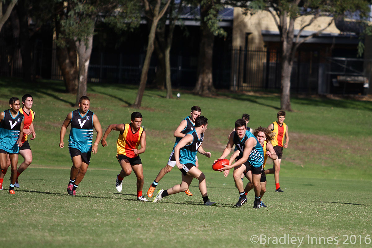
Today the Kingsway Rockets' jumper is in the firing line. Most merger jumpers look pretty sub par, and I'd say this one continues the trend here on Day 15.

The club website of the Rockets describes this "merger" design as
"In 2004 an agreement was reached with Kingsway Football Club, for the Landsdale Rockets to become the junior link club with that senior community club", which resulted in the combined jumper of both teams shown below.
deaef437458823.57412456454e8.jpg

Personally, I've never been a big fan of the Rockets' jumper- It really looks to me as more of an identity crisis compared to a unified jumper that it's meant to be. With my design, I tried to keep the same basic theme of the existing jumper, but instead creating a more traditional design. I decided in keeping the all teal back, as I think it makes for a really nice jumper match up, providing contrast against lighter colored teams as shown above.
day15.png
 
Moving on considering the last design wasn't too popular.

Today the Kingsway Rockets' jumper is in the firing line. Most merger jumpers look pretty sub par, and I'd say this one continues the trend here on Day 15.

The club website of the Rockets describes this "merger" design as
"In 2004 an agreement was reached with Kingsway Football Club, for the Landsdale Rockets to become the junior link club with that senior community club", which resulted in the combined jumper of both teams shown below.
deaef437458823.57412456454e8.jpg

Personally, I've never been a big fan of the Rockets' jumper- It really looks to me as more of an identity crisis compared to a unified jumper that it's meant to be. With my design, I tried to keep the same basic theme of the existing jumper, but instead creating a more traditional design. I decided in keeping the all teal back, as I think it makes for a really nice jumper match up, providing contrast against lighter colored teams as shown above.
View attachment 319656

So what significance do those horizontal claws/stripes have? Are they from a previous club's jumper? If they're just there for show, I'd get rid of them entirely; if not, I'd leave the V untouched and try and incorporate the stripes as thin two-tone stripes below the V until the bottom of the guernsey
 
So what significance do those horizontal claws/stripes have? Are they from a previous club's jumper? If they're just there for show, I'd get rid of them entirely; if not, I'd leave the V untouched and try and incorporate the stripes as thin two-tone stripes below the V until the bottom of the guernsey
Yeah, the Rockets wore the design before the merger. I found It hard to incorporate that part, so thanks for the suggestion.
 

Remove this Banner Ad

Back
Top