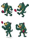
I for one, welcome our marsupial overlord and will round up other peasants to toil in his underground torture den.
Navigation
Install the app
How to install the app on iOS
Follow along with the video below to see how to install our site as a web app on your home screen.
Note: This feature may not be available in some browsers.
More options
-
Mobile App Discontinued
Due to a number of factors, support for the current BigFooty mobile app has been discontinued. Your BigFooty login will no longer work on the Tapatalk or the BigFooty App - which is based on Tapatalk.
Apologies for any inconvenience. We will try to find a replacement.
You are using an out of date browser. It may not display this or other websites correctly.
You should upgrade or use an alternative browser.
You should upgrade or use an alternative browser.
Discussion Tasmania AFL Jumper Design
- Thread starter fargothegreat
- Start date
- Tagged users None
🥰 Love BigFooty? Join now for free.
- May 3, 2004
- 804
- 1,612
- AFL Club
- Geelong
When I first saw the thumbnail of the mascot, I thought Marty Monster had an ice addiction...
- Feb 5, 2018
- 17,077
- 43,165
- AFL Club
- Hawthorn
- Other Teams
- Chicago Blackhawks Melb Renegades
A mascot made of recycled school unfirims and materials that can eat opposition club merchandise and shit it out on command is actually iconic.
Unlike the Gold Coast Red rebrand, this a unique risk that has paid off IMO.
My 5 year old son watched the Marmalade video on repeat of Rum'un eating and popping out a footy about 20 times in a row, and thought it was hilarious every time. This is how you engage with your target audience!
Unlike the Gold Coast Red rebrand, this a unique risk that has paid off IMO.
My 5 year old son watched the Marmalade video on repeat of Rum'un eating and popping out a footy about 20 times in a row, and thought it was hilarious every time. This is how you engage with your target audience!
SaadyArmy
Team Captain
- Jan 31, 2017
- 466
- 609
- AFL Club
- Gold Coast
A mascot made of recycled school unfirims and materials that can eat opposition club merchandise and shit it out on command is actually iconic.
Unlike the Gold Coast Red rebrand, this a unique risk that has paid off IMO.
My 5 year old son watched the Marmalade video on repeat of Rum'un eating and popping out a footy about 20 times in a row, and thought it was hilarious every time. This is how you engage with your target audience!
A pink jumper was also a unique risk that paid off. I’d be waiting until Tassie release their jumper design before you claim you’ve built an iconic brand
Sent from my iPhone using BigFooty.com
Log in to remove this Banner Ad
Daaanieeel
Draftee
- Jun 17, 2019
- 2
- 4
- AFL Club
- West Coast
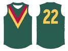
Ok, first thing's first: I am not a designer and I don't have Photoshop or anything of the sort, so I acknowledge this is very amateurish and the colours aren't 'official' either. If someone with more ability wants to turn this into a cleaner design with updated templates, be my guest. This is just to show the concept more than anything.
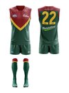
Here's a concept that's been playing in my head for a bit, based partly on the Peel Thunder jumper but more strongly inspired by the tuft of white hair on a devil's chest. I'm imagining a rounded yellow 'V' splitting the jumper into green and red sections. A clash/away jumper could just swap the colours around.

Here's a concept that's been playing in my head for a bit, based partly on the Peel Thunder jumper but more strongly inspired by the tuft of white hair on a devil's chest. I'm imagining a rounded yellow 'V' splitting the jumper into green and red sections. A clash/away jumper could just swap the colours around.

- Thread starter
- #1,082
I've had a similar idea before, but I left the 'devil stripe' a bit lower to create a map of Tasmania shape above it. I think this looks more like a football club jumper, whereas the foundation jumper looks more like a representative team jumper.Ok, first thing's first: I am not a designer and I don't have Photoshop or anything of the sort, so I acknowledge this is very amateurish and the colours aren't 'official' either. If someone with more ability wants to turn this into a cleaner design with updated templates, be my guest. This is just to show the concept more than anything.
Here's a concept that's been playing in my head for a bit, based partly on the Peel Thunder jumper but more strongly inspired by the tuft of white hair on a devil's chest. I'm imagining a rounded yellow 'V' splitting the jumper into green and red sections. A clash/away jumper could just swap the colours around.

- May 3, 2004
- 804
- 1,612
- AFL Club
- Geelong
I've had a similar idea before, but I left the 'devil stripe' a bit lower to create a map of Tasmania shape above it. I think this looks more like a football club jumper, whereas the foundation jumper looks more like a representative team jumper.
Completely agree. To adopt the Tasmanian state jumper as the team's jumper is lazy. It's also boring as hell.
Your concept is is clean, symmetrical (as most jumpers tend to be), without gimmick, and I think would stand up long-term without issue.
Nice job
Daaanieeel
Draftee
- Jun 17, 2019
- 2
- 4
- AFL Club
- West Coast
Looks clean!I've had a similar idea before, but I left the 'devil stripe' a bit lower to create a map of Tasmania shape above it. I think this looks more like a football club jumper, whereas the foundation jumper looks more like a representative team jumper.
View attachment 2308593
Ashman23
Club Legend
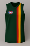
Taking your idea with a slight tweak, I don't mind the following.Think they need a nice traditional Jumper, I'd love to see vertical stripes like North, Hawthorn and Collingwood, but be the first to do it in the Tri colours of Green, Red and Yellow
Attachments
So… Port Adelaide ?I'd like to see this. Classy and simple.
I think the AFL already has an issue with too many teams having recoloured versions of the same designs, Tassie need to have something unique .
Saucy
Debutant
- Sep 25, 2016
- 138
- 230
- AFL Club
- Essendon
Port can just go with the Prison Bars. No issues.So… Port Adelaide ?
I think the AFL already has an issue with too many teams having recoloured versions of the same designs, Tassie need to have something unique .
Last edited:
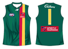
They would use the one above right?Do they play in the jumper they have on ice for the AFL or just run around in the state on for a year or two?
View attachment 2417458
- Thread starter
- #1,093
Who says they have another jumper on ice? :ODo they play in the jumper they have on ice for the AFL or just run around in the state one for a year or two?
View attachment 2417458
Time to change the name Victorian Football League (VFL) to Australian Football Association (AFA)
🥰 Love BigFooty? Join now for free.
Teen Wolf
Brownlow Medallist
- Jul 5, 2011
- 10,695
- 11,438
- AFL Club
- North Melbourne
- Other Teams
- Afghanistan women's cricket team
- Thread starter
- #1,097
Going to be a bespoke jumper for the VFL — not the map.Surely they wear the state jumper in the VFL, you don’t want the actual guernsey being two years old and not feeling fresh by the time they actually play an AFL game.
- Dec 13, 2016
- 1,215
- 2,639
- AFL Club
- Brisbane Lions

- Other Teams
- Arsenal, Melb City, Storm, Stars
RedmanWasHere
Rarely in kitchens at parties.
- Aug 23, 2010
- 30,604
- 37,902
- AFL Club
- Essendon
- Other Teams
- Exers, Gryffindor, Rich+Ess AFLW, Tassie
A rogue Lachie Hansen appears.
Last edited:
RedmanWasHere
Rarely in kitchens at parties.
- Aug 23, 2010
- 30,604
- 37,902
- AFL Club
- Essendon
- Other Teams
- Exers, Gryffindor, Rich+Ess AFLW, Tassie
one of my previous ideas was similarView attachment 2319675
How TF have I just glossed over this?
This looks sick and the ripples which looks like fur adds to it.


