- Jul 29, 2008
- 7,463
- 9,686
- AFL Club
- Tasmania
- Other Teams
- BOMBERS and Browns
Primrose instead of white, and I'm down.
Follow along with the video below to see how to install our site as a web app on your home screen.
Note: This feature may not be available in some browsers.

Due to a number of factors, support for the current BigFooty mobile app has been discontinued. Your BigFooty login will no longer work on the Tapatalk or the BigFooty App - which is based on Tapatalk.
Apologies for any inconvenience. We will try to find a replacement.
Found this on one of the forums, think this is I near perfect.
Log in to remove this Banner Ad
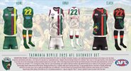
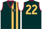
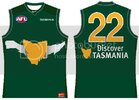
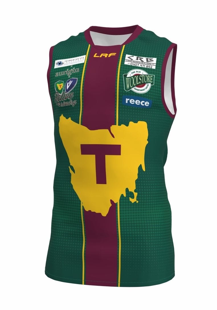
The first one reminds me of a Tassie state jumper they wore in the late 1970's. I think they played Fitzroy in some pre season comp. Maybe someone might remember seeing it.
Yep, Similar design.
Its a club side, not a state side. State sides play against others states.It's going to be a state side, so wear the state jumper.
Yeah, remove the map. Do the numbers in primrose.I like this, without the state on it. Simple, but unique.
A club side called Tasmania, ok.Its a club side, not a state side. State sides play against others states.
State colours are fine, but never The Map in club football. (edit: and yes, I know they already cheapened it in the VFL)
Eeeeeeeyup, you got it.A club side called Tasmania, ok.
Tell us all which club it will be named after?Eeeeeeeyup, you got it.
Point 1. Just wait & all will be revealed.Tell us all which club it will be named after?
Or will be named after the state?
")
.jpeg")
Far too busy for a footy jumper, imo. The logo could be the logo (if the boringly predictable Tasmania Devils is used). Footy demands simple patterns.
The alternative is something we could get sick of anyway with no previous attachment...plenty of abstract nouns that haven't been snapped up by sporting teams yet. This is one of the few areas that personally I want blatantly obvious, not creatively original...!...if the boringly predictable Tasmania Devils is used...
The alternative is something we could get sick of anyway with no previous attachment...plenty of abstract nouns that haven't been snapped up by sporting teams yet. This is one of the few areas that personally I want blatantly obvious, not creatively original...!
Two headed dark green state sporting monster, two state icons in the Tigers and Devils, mashing mainlanders alternatively during summer and winter...added bonus is basketball, something none of us previously followed but we're now all over it...! The more predictably imminent the better...I want them to know who we are through dreaded familiarity the second we exist..
Totally agree with this. It should be a representative side. Same colours is fine. Primrose, forest green and maroon.Its a club side, not a state side. State sides play against others states.
State colours are fine, but never The Map in club football. (edit: and yes, I know they already cheapened it in the VFL)
Totally agree with this. It should be a representative side. Same colours is fine. Primrose, forest green and maroon.
Bottle green, rose and primrose as I recall. (primrose is yellow)Tasmanian jumper colour was Bottle Green, Primrose & Gold as I remember it.
Oops, yes, my memory failed me!Bottle green, rose and primrose as I recall. (primrose is yellow)
).